 View review
Logo score
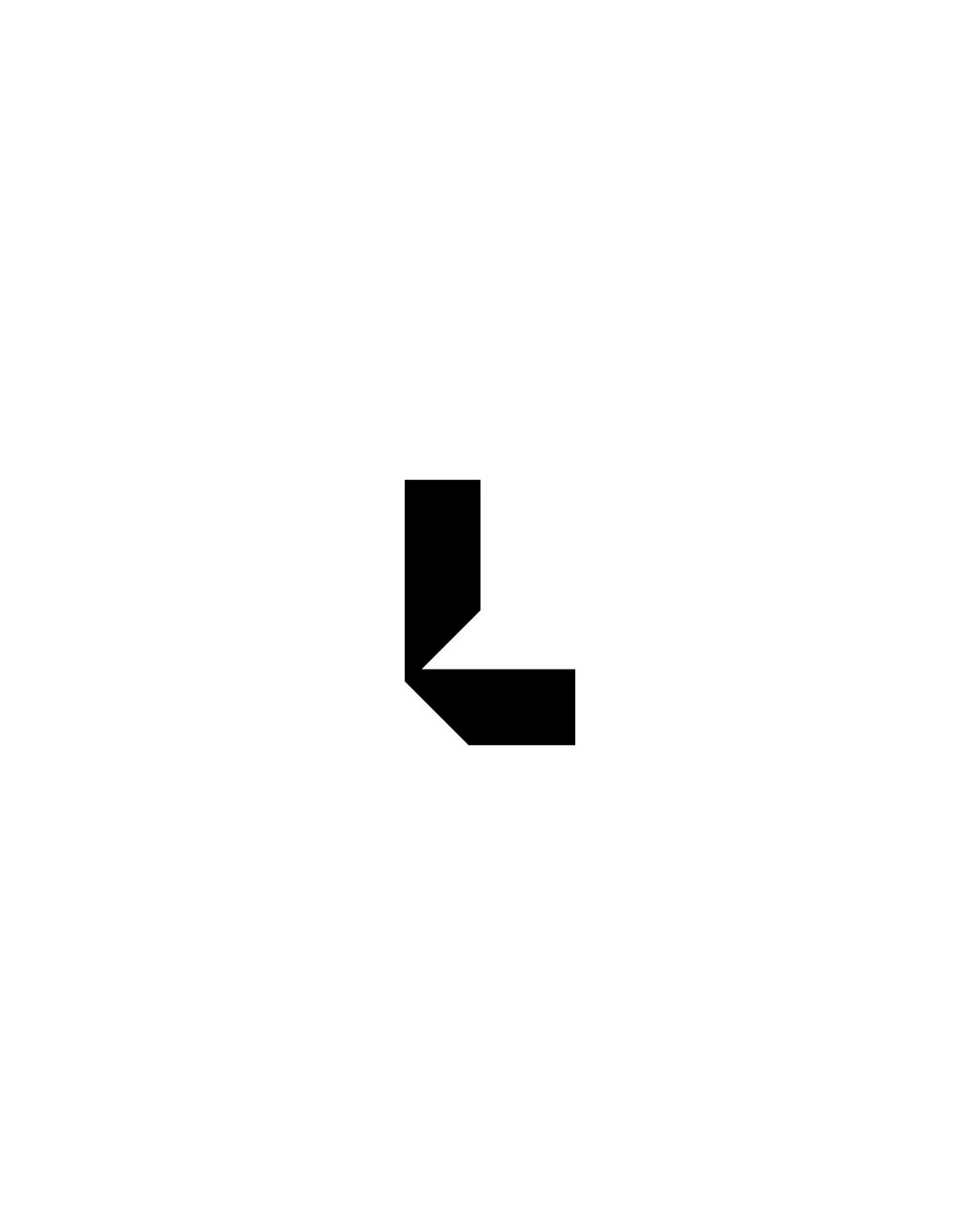
Logo review ofL Shaped Monogram
Review the detailed scores below to see what is working and what should be refined first.
Originality
Balance
Scale
Detailed review
Logo performance breakdown
Originality
![]() The geometric form adds a unique touch to the simple 'L' shape.
The geometric form adds a unique touch to the simple 'L' shape.
![]() It may still resemble other 'L' shaped symbols to some extent.
It may still resemble other 'L' shaped symbols to some extent.
Color harmony
![]() The solid black color ensures strong visibility and adaptability.
The solid black color ensures strong visibility and adaptability.
Balance alignment
![]() The monogram is well-balanced within its space.
The monogram is well-balanced within its space.

Scalability
![]() The simple design ensures excellent scalability across various sizes.
The simple design ensures excellent scalability across various sizes.
200x250 px
100×125 px
50×62 px
Try your own review
Review my logo
Wondering how your logo performs?
Get a clear logo score, key risks, and priority fix ideas before your client or audience sees it.
Keep exploring


