Wondering how your logo performs? 🧐
Get professional logo reviews in seconds and catch design issues in time.
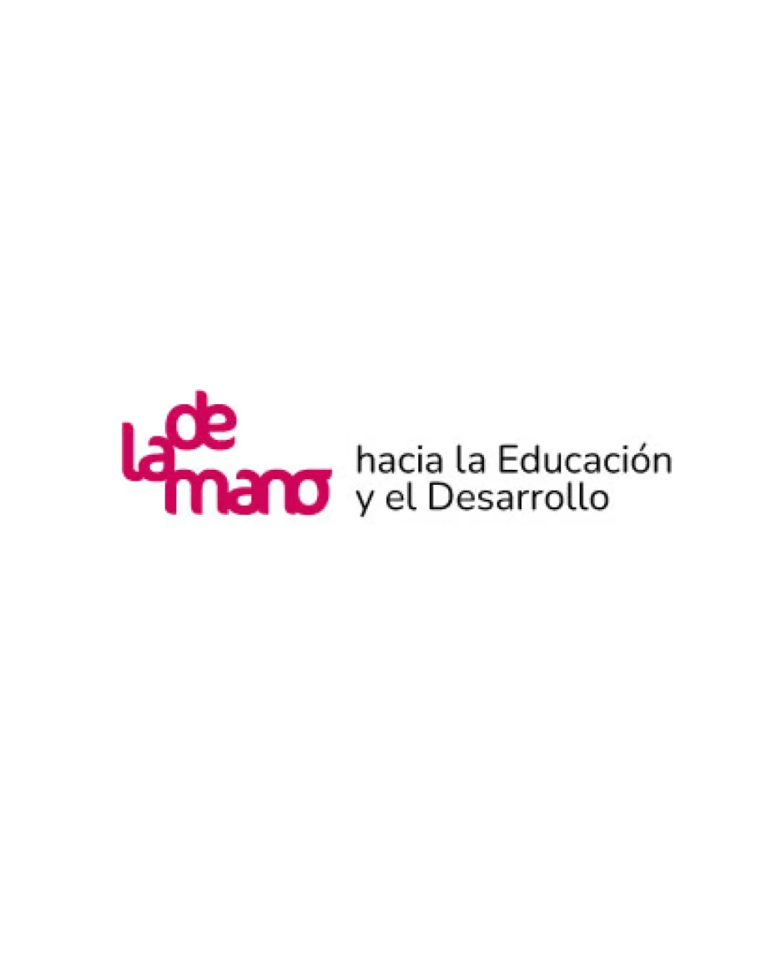
Try it Now!Logo review of la de mano hacia la Educación y el Desarrollo
 Logo analysis by AI
Logo type:
Style:
Detected symbol:
Detected text:
Business industry:
Review requested by Isa2025bel
**If AI can recognize or misinterpret it, so can people.
Structured logo review
Legibility
![]() Primary supporting text ('hacia la Educación y el Desarrollo') is clear and easy to read.
Primary supporting text ('hacia la Educación y el Desarrollo') is clear and easy to read.![]() Contrasting color helps the tagline stand out.
Contrasting color helps the tagline stand out.
![]() 'la de mano' stacked arrangement reduces legibility due to close letter spacing, especially between 'la', 'de', and 'mano'.
'la de mano' stacked arrangement reduces legibility due to close letter spacing, especially between 'la', 'de', and 'mano'.![]() The playful font choice for 'la de mano' may confuse quick reading, especially at small sizes or from a distance.
The playful font choice for 'la de mano' may confuse quick reading, especially at small sizes or from a distance.
Scalability versatility
![]() Simple color palette would allow for easy adaptation to monochrome or black and white versions.
Simple color palette would allow for easy adaptation to monochrome or black and white versions.
![]() The stacked, tightly spaced 'la de mano' will lose legibility at reduced sizes (favicons, pens, embroidery).
The stacked, tightly spaced 'la de mano' will lose legibility at reduced sizes (favicons, pens, embroidery).![]() Fine shapes in the unique wordmark risk merging into each other on small applications.
Fine shapes in the unique wordmark risk merging into each other on small applications.![]() Long horizontal tagline limits logo adaptability on square or vertical formats.
Long horizontal tagline limits logo adaptability on square or vertical formats.
200x250 px
100×125 px
50×62 px
Balance alignment
![]() Main logo elements are left-aligned, which provides a sense of unity.
Main logo elements are left-aligned, which provides a sense of unity.
![]() Visual weight heavily favors the left side with the thick stacked pink wordmark, making the right tagline feel like an afterthought.
Visual weight heavily favors the left side with the thick stacked pink wordmark, making the right tagline feel like an afterthought.![]() No clear horizontal or vertical alignment between the wordmark and tagline—leads to a disjointed composition.
No clear horizontal or vertical alignment between the wordmark and tagline—leads to a disjointed composition.![]() Stacked wordmark and horizontal tagline create imbalance that is visually jarring.
Stacked wordmark and horizontal tagline create imbalance that is visually jarring.

Originality
![]() Playful stacking and integration of the phrase 'la de mano' as a wordmark offer some uniqueness.
Playful stacking and integration of the phrase 'la de mano' as a wordmark offer some uniqueness.![]() Font choice for main brand creates a distinctive, informal tone.
Font choice for main brand creates a distinctive, informal tone.
![]() No distinct symbol or icon—relies solely on text for recognition.
No distinct symbol or icon—relies solely on text for recognition.![]() Stacked wordmark trend is not highly original and can be seen in other education or charity programs.
Stacked wordmark trend is not highly original and can be seen in other education or charity programs.![]() No creative integration of negative space or memorable iconography.
No creative integration of negative space or memorable iconography.
Aesthetic look
![]() Color choices are friendly and energetic.
Color choices are friendly and energetic.![]() The rounded typeface communicates approachability and guidance.
The rounded typeface communicates approachability and guidance.
![]() Stacked, bold pink letters combined with more business-like tagline create visual dissonance.
Stacked, bold pink letters combined with more business-like tagline create visual dissonance.![]() Looks slightly too busy with phrase stacking and a lengthy subtitle.
Looks slightly too busy with phrase stacking and a lengthy subtitle.![]() Feels less premium and less polished compared to high-end educational brands.
Feels less premium and less polished compared to high-end educational brands.
Dual meaning and misinterpretations
![]() No inappropriate or confusing dual meanings detected.
No inappropriate or confusing dual meanings detected.
Color harmony
![]() Balanced two-color scheme supports brand mood.
Balanced two-color scheme supports brand mood.![]() Strong contrast between wordmark and tagline.
Strong contrast between wordmark and tagline.
Razzmatazz
#D11B67
Black
#000000
White
#FFFFFF


