Wondering how your logo performs? 🧐
Get professional logo reviews in seconds and catch design issues in time.
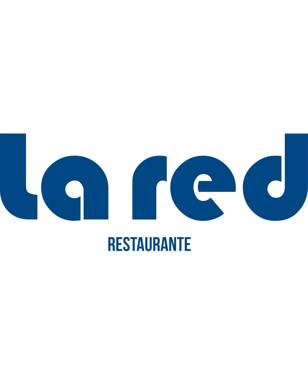
Try it Now!Logo review of la red RESTAURANTE
 Logo analysis by AI
Logo type:
Style:
Detected text:
Business industry:
Review requested by SuP4y
**If AI can recognize or misinterpret it, so can people.
Structured logo review
Legibility
![]() Primary business name 'la red' is mostly readable.
Primary business name 'la red' is mostly readable.![]() Secondary text 'RESTAURANTE' is clear due to conventional typeface.
Secondary text 'RESTAURANTE' is clear due to conventional typeface.
![]() The geometric stylization of certain letters (notably 'a', 'e', and 'd') impedes instant legibility, especially at smaller sizes.
The geometric stylization of certain letters (notably 'a', 'e', and 'd') impedes instant legibility, especially at smaller sizes.![]() Overly stylized shapes could confuse first-time viewers, particularly with the lowercase 'a' and 'e'.
Overly stylized shapes could confuse first-time viewers, particularly with the lowercase 'a' and 'e'.
Scalability versatility
![]() Bold, simple form works well for signage and larger formats.
Bold, simple form works well for signage and larger formats.![]() Secondary text will retain legibility at moderate reductions.
Secondary text will retain legibility at moderate reductions.
![]() Unusual letterforms may lose clarity at favicon, embroidery, or small merchandise scale.
Unusual letterforms may lose clarity at favicon, embroidery, or small merchandise scale.![]() Secondary text could become too small to read at minimal sizes.
Secondary text could become too small to read at minimal sizes.
200x250 px
100×125 px
50×62 px
Balance alignment
![]() Letter spacing and overall horizontal balance are strong.
Letter spacing and overall horizontal balance are strong.![]() Visual weight is distributed evenly.
Visual weight is distributed evenly.
![]() Top-heavy wordmark could feel slightly bottom-light due to lack of any grounding line or graphic beneath main text.
Top-heavy wordmark could feel slightly bottom-light due to lack of any grounding line or graphic beneath main text.

Originality
![]() Custom geometric letterforms provide original character.
Custom geometric letterforms provide original character.![]() No overused industry symbols present.
No overused industry symbols present.
![]() Concept is not highly unique; geometric sans-serif wordmarks are common in modern branding.
Concept is not highly unique; geometric sans-serif wordmarks are common in modern branding.![]() Letter styling is creative but doesn't convey specific meaning tied to the restaurant industry.
Letter styling is creative but doesn't convey specific meaning tied to the restaurant industry.
Aesthetic look
![]() Modern and clean aesthetic.
Modern and clean aesthetic.![]() Limited color palette ensures visual cohesion.
Limited color palette ensures visual cohesion.![]() Consistent boldness makes it visually striking.
Consistent boldness makes it visually striking.
![]() Geometric forms border on generic; lacks memorable visual hook or personality.
Geometric forms border on generic; lacks memorable visual hook or personality.![]() Absence of imagery means brand relies solely on typographic style for recognition.
Absence of imagery means brand relies solely on typographic style for recognition.
Dual meaning and misinterpretations
![]() No accidental inappropriate shapes or unintentional negative connotations detected.
No accidental inappropriate shapes or unintentional negative connotations detected.
Color harmony
![]() Simple two-color palette ensures high contrast and preserves brand consistency.
Simple two-color palette ensures high contrast and preserves brand consistency.![]() No clashing or excessive colors.
No clashing or excessive colors.
Dark Blue
#005892
White
#FFFFFF


