Wondering how your logo performs? 🧐
Get professional logo reviews in seconds and catch design issues in time.
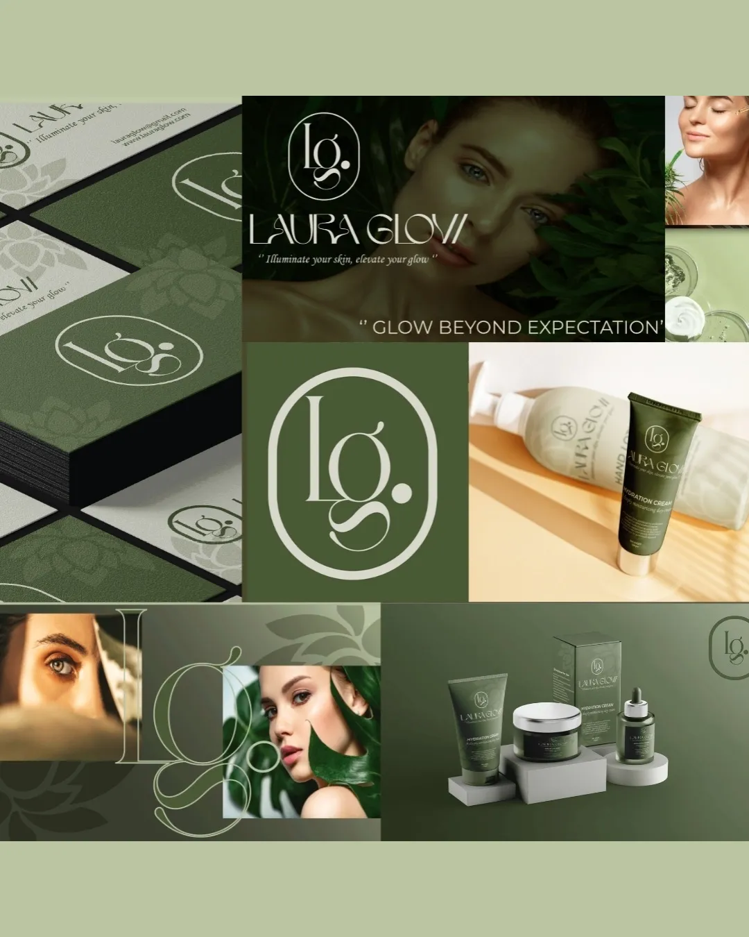
Try it Now!Logo review of Laura Glow
 Logo analysis by AI
Logo type:
Style:
Detected symbol:
Detected text:
Business industry:
Review requested by JIAK
**If AI can recognize or misinterpret it, so can people.
Structured logo review
Legibility
![]() Easily readable font with a unique flair
Easily readable font with a unique flair![]() Good contrast with background
Good contrast with background
Scalability versatility
![]() Clear at different sizes
Clear at different sizes![]() Works well on various marketing materials like packaging and business cards
Works well on various marketing materials like packaging and business cards
![]() Might be too detailed for very small applications like favicon
Might be too detailed for very small applications like favicon
200x250 px
100×125 px
50×62 px
Balance alignment
![]() Well-aligned logo elements
Well-aligned logo elements![]() Balances monogram and text effectively
Balances monogram and text effectively

Originality
![]() Stylized letterform demonstrating creativity
Stylized letterform demonstrating creativity
![]() Monogram style is somewhat common
Monogram style is somewhat common
Aesthetic look
![]() Elegant and clean design
Elegant and clean design![]() Suits the beauty industry well
Suits the beauty industry well
Dual meaning and misinterpretations
![]() No inappropriate symbols detected
No inappropriate symbols detected
Color harmony
![]() Coordinated color palette
Coordinated color palette![]() Harmonious with the overall luxurious theme
Harmonious with the overall luxurious theme
Finlandia
#5C6E58
Tana
#D5D8CC
Gold Sand
#EBD9A9


