 View review
Logo score
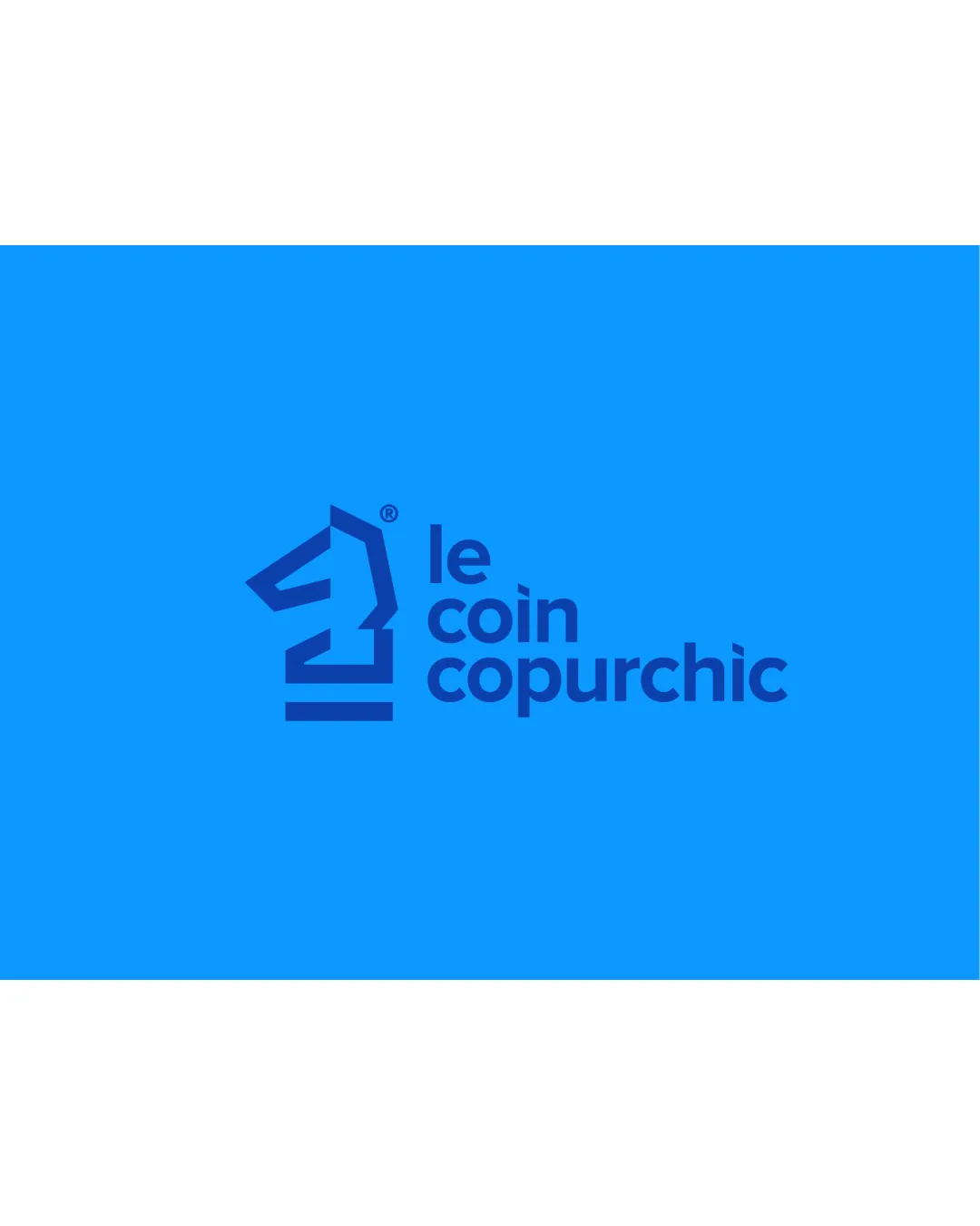
Logo review ofLe Coin Copurchic
Review the detailed scores below to see what is working and what should be refined first.
Legibility
Originality
Misread
Balance
Scale
Detailed review
Logo performance breakdown
Legibility
![]() Clear and readable text
Clear and readable text![]() Good contrast between text and background
Good contrast between text and background
![]() Slightly compact text spacing may affect readability at smaller sizes
Slightly compact text spacing may affect readability at smaller sizes
Originality
![]() Unique take on a chess knight design
Unique take on a chess knight design
![]() Horsehead icon could be seen as somewhat common in design
Horsehead icon could be seen as somewhat common in design
Color harmony
![]() Harmonious color usage
Harmonious color usage![]() Strong visual impact
Strong visual impact
Blue
#007BFF
White
#FFFFFF
Balance alignment
![]() Well-balanced symbol and text alignment
Well-balanced symbol and text alignment

Scalability
![]() Simple icon ensures clarity at smaller sizes
Simple icon ensures clarity at smaller sizes![]() Suitable for various applications like signage and business cards
Suitable for various applications like signage and business cards
![]() Complex text arrangement could challenge very small applications like pins
Complex text arrangement could challenge very small applications like pins
200x250 px
100×125 px
50×62 px
Misinterpretations
![]() No inappropriate or misleading symbols
No inappropriate or misleading symbols
Symbol & text fit
![]() Symbol and wordmark are stylistically consistent
Symbol and wordmark are stylistically consistent
![]() Symbol slightly overshadows the text due to its boldness
Symbol slightly overshadows the text due to its boldness
Try your own review
Review my logo
Wondering how your logo performs?
Get a clear logo score, key risks, and priority fix ideas before your client or audience sees it.
Keep exploring


