Wondering how your logo performs? 🧐
Get professional logo reviews in seconds and catch design issues in time.
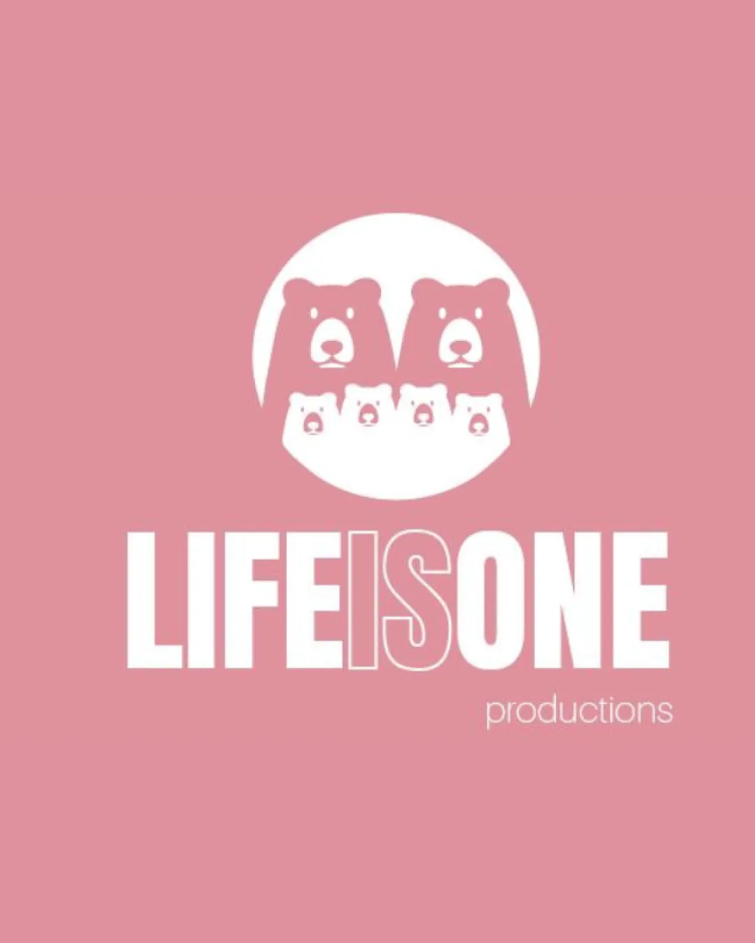
Try it Now!Logo review of LIFE IS ONE productions
 Logo analysis by AI
Recognized style:
Logo type:
Detected symbol:
Detected text:
Business industry:
Review requested by Soffilaffi
**If AI can recognize or misinterpret it, so can people.
Structured logo review
Legibility
![]() The business name 'LIFE IS ONE' is clear and prominent.
The business name 'LIFE IS ONE' is clear and prominent.
![]() The word 'productions' is small and could be difficult to read at a distance.
The word 'productions' is small and could be difficult to read at a distance.
Scalability versatility
![]() The simple design ensures good scalability across different sizes.
The simple design ensures good scalability across different sizes.
![]() The intricate bear details may become less distinct when scaled down.
The intricate bear details may become less distinct when scaled down.
200x250 px
100×125 px
50×62 px
Balance alignment
![]() The alignment between the symbol and text is well balanced.
The alignment between the symbol and text is well balanced.
![]() The size contrast between 'LIFE IS ONE' and 'productions' is noticeable.
The size contrast between 'LIFE IS ONE' and 'productions' is noticeable.

Originality
![]() The bear family concept is unique and memorable.
The bear family concept is unique and memorable.
![]() Animal motifs are relatively common in logos.
Animal motifs are relatively common in logos.
Aesthetic look
![]() The logo has an appealing aesthetic with a cohesive color scheme.
The logo has an appealing aesthetic with a cohesive color scheme.
![]() The background color and white text may reduce contrast.
The background color and white text may reduce contrast.
Cultural sensitivity dual meaning
![]() No cultural sensitivity issues detected.
No cultural sensitivity issues detected.
Color harmony
![]() The pink and white colors work well together, creating a soft and approachable feel.
The pink and white colors work well together, creating a soft and approachable feel.
![]() The color scheme might not appeal to all demographics.
The color scheme might not appeal to all demographics.


