 View review
Logo score
Logo review ofLifemap Solutions
Review the detailed scores below to see what is working and what should be refined first.
Legibility
Originality
Misread
Balance
Scale
Detailed review
Logo performance breakdown
Legibility
![]() Primary brand name 'LifeMap' is clear and easy to read
Primary brand name 'LifeMap' is clear and easy to read![]() Distinct colors help differentiate the words
Distinct colors help differentiate the words
![]() The word 'SOLUTIONS' is relatively small and may become hard to read at very small sizes
The word 'SOLUTIONS' is relatively small and may become hard to read at very small sizes
Originality
![]() Integration of map marker and human figure is creative and clear for industry
Integration of map marker and human figure is creative and clear for industry
![]() Map pin symbols are very common in technology/solution sectors, reducing overall uniqueness
Map pin symbols are very common in technology/solution sectors, reducing overall uniqueness![]() Color palette is trendy but not unique to the brand; multiple similar healthcare/tech logos exist
Color palette is trendy but not unique to the brand; multiple similar healthcare/tech logos exist
Color harmony
![]() Colors are lively and contrast well, supporting the logo’s energy and health focus
Colors are lively and contrast well, supporting the logo’s energy and health focus
![]() Three strong colors plus purple for 'SOLUTIONS' may feel too busy for some applications
Three strong colors plus purple for 'SOLUTIONS' may feel too busy for some applications![]() Lack of neutral color makes adaptation to all backgrounds more difficult
Lack of neutral color makes adaptation to all backgrounds more difficult
lime green
#7AC143
blue
#00AEEF
purple
#662D91
white
#FFFFFF
Color may be holding this logo back. Explore stronger palette options with Colorfly.design before updating the logo.
Explore palettesBalance alignment
![]() Centralized layout with mark stacked above wordmark feels visually grounded
Centralized layout with mark stacked above wordmark feels visually grounded![]() The integration of colors between symbol and text feels cohesive
The integration of colors between symbol and text feels cohesive
![]() The color distribution (solid green and blue for 'Life' and 'Map') creates a slightly uneven visual weight
The color distribution (solid green and blue for 'Life' and 'Map') creates a slightly uneven visual weight![]() The green ellipse under the pin feels unnecessary and drops the balance downward
The green ellipse under the pin feels unnecessary and drops the balance downward

Scalability
![]() Bold, simple shapes for the mark and main words will reproduce well in most sizes
Bold, simple shapes for the mark and main words will reproduce well in most sizes![]() Clear, contrasting palette aids visibility on digital and print uses
Clear, contrasting palette aids visibility on digital and print uses
![]() Fine detail in the human figure within the pin risks loss at small scales
Fine detail in the human figure within the pin risks loss at small scales![]() 'SOLUTIONS' may disappear in embroidered or very small applications
'SOLUTIONS' may disappear in embroidered or very small applications![]() Complexity of color combination may hinder legibility on single-color backgrounds
Complexity of color combination may hinder legibility on single-color backgrounds
200x250 px
100×125 px
50×62 px
Misinterpretations
![]() No accidental inappropriate imagery; symbol is universally positive
No accidental inappropriate imagery; symbol is universally positive
Symbol & text fit
![]() Geometric and rounded style of logomark matches typeface's friendly feel
Geometric and rounded style of logomark matches typeface's friendly feel
![]() Consistent color treatment ties symbol and wordmark together
Consistent color treatment ties symbol and wordmark together
![]() Mark feels a touch heavier than wordmark, especially above the thinner 'SOLUTIONS'
Mark feels a touch heavier than wordmark, especially above the thinner 'SOLUTIONS'
Presentation kit
Finalize and present this logo
Logo description
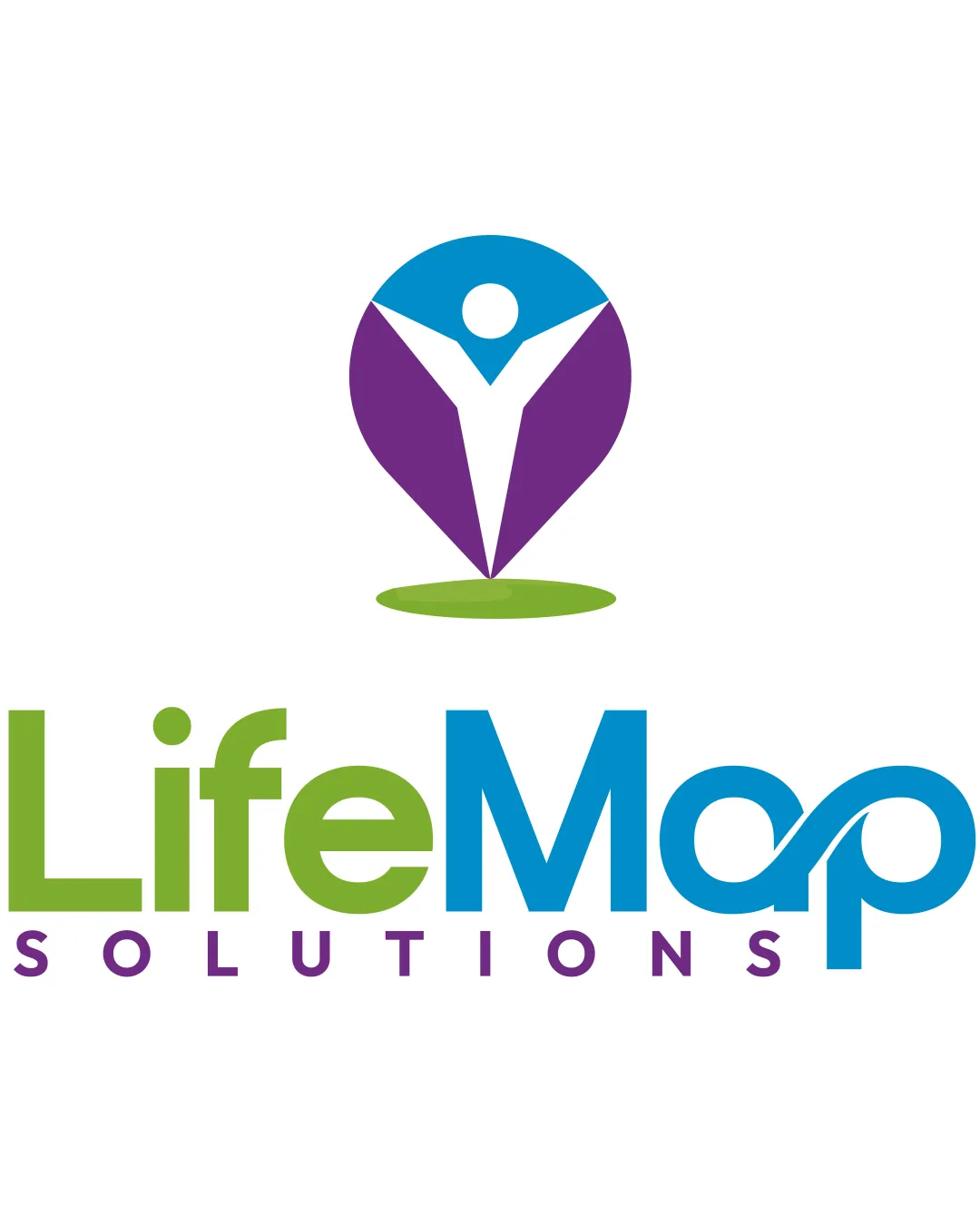
The LifeMap Solutions logo combines a dynamic abstract map pin with a human figure reaching upward, symbolizing connection, guidance, and well-being. The vibrant color palette—lime green, blue, and purple—reflects freshness, trust, and health-centric innovation, while the clean geometric forms communicate approachability. The wordmark is modern and bold, with playful letterforms that underscore the brand's optimism and forward-thinking attitude. Together, the elements create a cohesive visual identity relevant for the healthcare and technology industries, ensuring recognition across both digital and physical platforms. The use of negative space to form the human figure adds meaning, reinforcing that LifeMap Solutions is about navigating life with personal empowerment and support.
Tips for the logo presentation
Mockup ideas
- Healthcare app splash screen with gradient background.
- Business card with both vertical and horizontal logo orientations.
- Office signage or glass entry door etching.
- Apparel mockup featuring embroidered logomark on polo shirts.
- Medical device interface footer or packaging.
- Social media profile and banner image.
- Brochure or flyer for health technology solutions.
Try your own review
Review my logo
Wondering how your logo performs?
Get a clear logo score, key risks, and priority fix ideas before your client or audience sees it.
Keep exploring


