Wondering how your logo performs? 🧐
Get professional logo reviews in seconds and catch design issues in time.
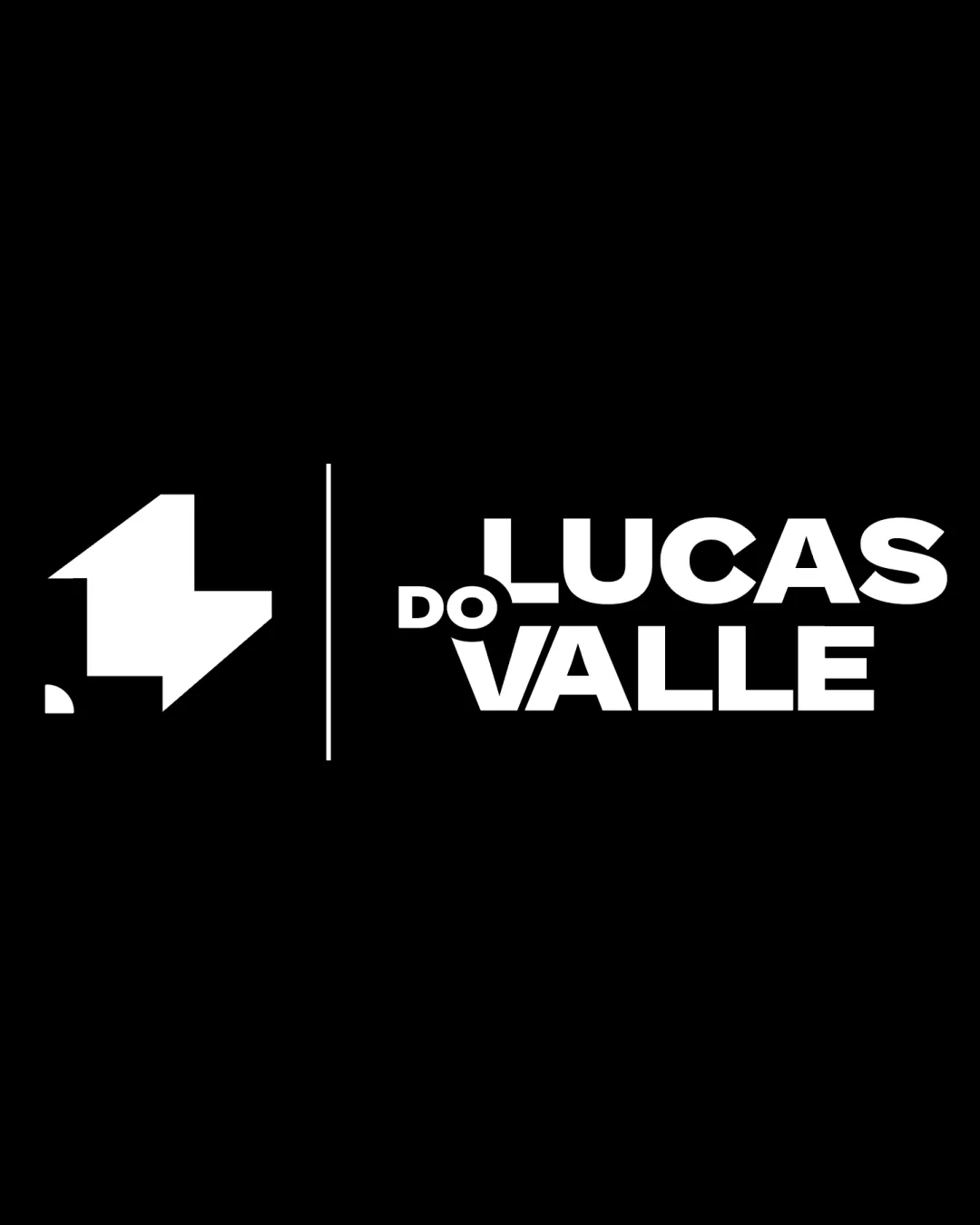
Try it Now!Logo review of LUCAS DO VALLE
 Logo analysis by AI
Recognized style:
Logo type:
Detected symbol:
Detected text:
Business industry:
Review requested by Isabellacfs
**If AI can recognize or misinterpret it, so can people.
Structured logo review
Legibility
![]() Text is bold and clear, easy to read against the black background.
Text is bold and clear, easy to read against the black background.
Scalability versatility
![]() The bold design is versatile and recognizable at different sizes.
The bold design is versatile and recognizable at different sizes.
![]() The detailed geometric shape may lose clarity when scaled down significantly.
The detailed geometric shape may lose clarity when scaled down significantly.
200x250 px
100×125 px
50×62 px
Balance alignment
![]() The elements are well-balanced overall.
The elements are well-balanced overall.
![]() The separation line may cause a slight imbalance depending on placement.
The separation line may cause a slight imbalance depending on placement.

Originality
![]() The abstract geometric shape adds a unique touch.
The abstract geometric shape adds a unique touch.
Logomark wordmark fit
![]() The symbol and text complement each other well.
The symbol and text complement each other well.
![]() Size relationship could be slightly adjusted for better cohesion.
Size relationship could be slightly adjusted for better cohesion.
Aesthetic look
![]() The design is clean and professional.
The design is clean and professional.
Cultural sensitivity dual meaning
![]() No cultural sensitivity issues detected.
No cultural sensitivity issues detected.
Color harmony
![]() Monochrome palette ensures clarity and professionalism.
Monochrome palette ensures clarity and professionalism.


