Wondering how your logo performs? 🧐
Get professional logo reviews in seconds and catch design issues in time.
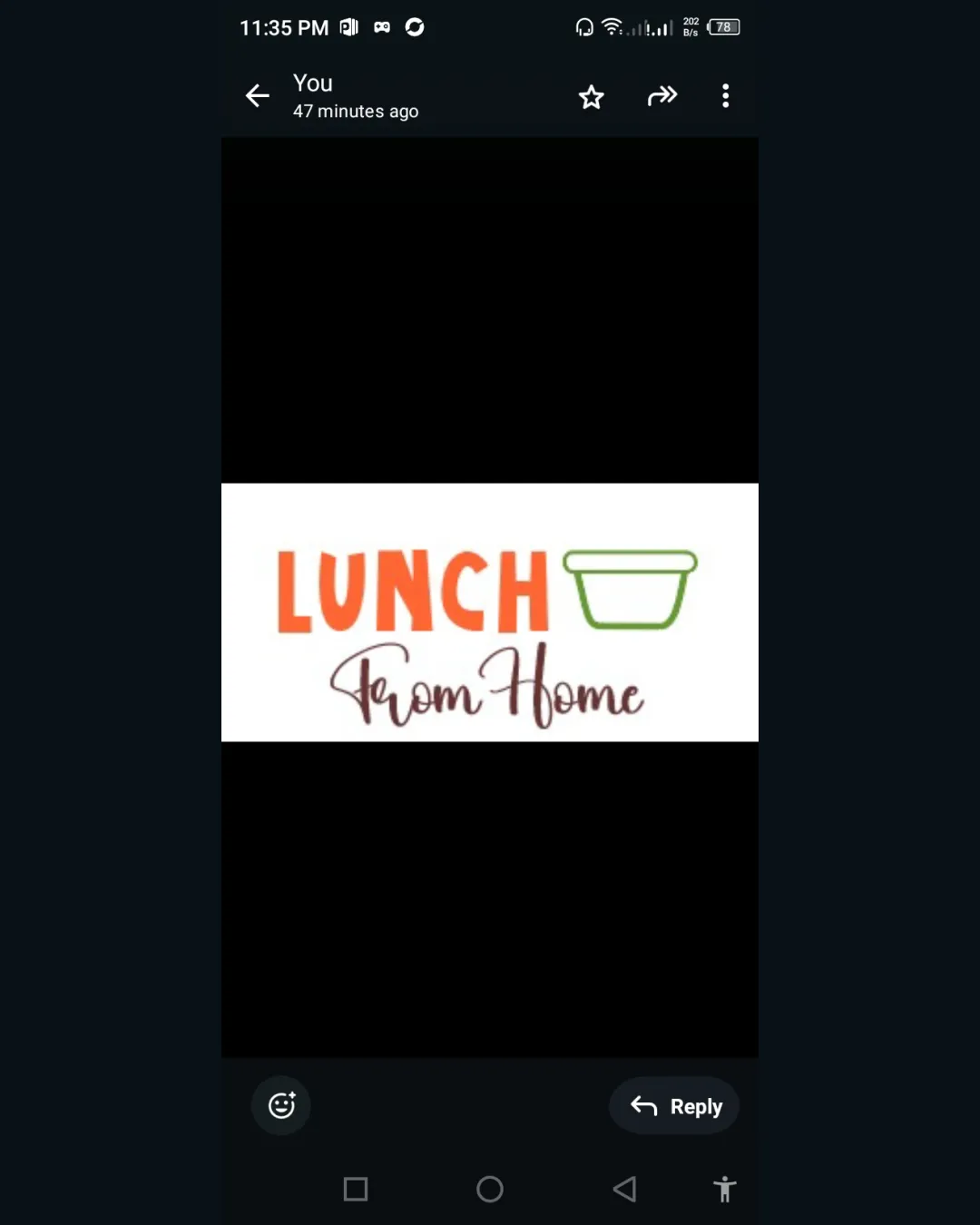
Try it Now!Logo review of LUNCH From Home
 Logo analysis by AI
Logo type:
Style:
Detected symbol:
Detected text:
Business industry:
Review requested by Zoyakamal
**If AI can recognize or misinterpret it, so can people.
Structured logo review
Legibility
![]() 'LUNCH' is bold and highly legible.
'LUNCH' is bold and highly legible.![]() 'From Home' is decorative but still readable at medium sizes.
'From Home' is decorative but still readable at medium sizes.
![]() 'From Home' may lose clarity at small sizes due to script font and thin strokes.
'From Home' may lose clarity at small sizes due to script font and thin strokes.
Scalability versatility
![]() Simple forms and bold type are generally scalable.
Simple forms and bold type are generally scalable.![]() Works on banners, social media, and packaging.
Works on banners, social media, and packaging.
![]() Fine script in 'From Home' is problematic for favicon or monochrome embroidery.
Fine script in 'From Home' is problematic for favicon or monochrome embroidery.![]() Food container outline may be too thin for small format applications.
Food container outline may be too thin for small format applications.
200x250 px
100×125 px
50×62 px
Balance alignment
![]() Good hierarchy between 'LUNCH' and 'From Home'.
Good hierarchy between 'LUNCH' and 'From Home'.![]() Container icon aligned with text baseline.
Container icon aligned with text baseline.
![]() Container outline feels loosely attached to text, creating a visual disconnect.
Container outline feels loosely attached to text, creating a visual disconnect.![]() 'From Home' centering under two left-heavy elements looks misaligned.
'From Home' centering under two left-heavy elements looks misaligned.

Originality
![]() Mixes script and bold sans-serif to create some distinction.
Mixes script and bold sans-serif to create some distinction.![]() Container outline is somewhat recognizable and ties into the message.
Container outline is somewhat recognizable and ties into the message.
![]() Food container is extremely generic for the industry.
Food container is extremely generic for the industry.![]() Typography pairing, while decent, is not unique or memorable.
Typography pairing, while decent, is not unique or memorable.
Logomark wordmark fit
![]() Uses icon directly tied to 'LUNCH'.
Uses icon directly tied to 'LUNCH'.![]() Wordmark and logomark are easy to separate for alternate uses.
Wordmark and logomark are easy to separate for alternate uses.
![]() Icon feels like a literal afterthought next to 'LUNCH' with little style integration.
Icon feels like a literal afterthought next to 'LUNCH' with little style integration.![]() No shared design characteristics between icon and typography.
No shared design characteristics between icon and typography.
Aesthetic look
![]() Bright color usage gives energy.
Bright color usage gives energy.![]() Loosely casual vibe appropriate for the industry.
Loosely casual vibe appropriate for the industry.
![]() Font pairing lacks refinement.
Font pairing lacks refinement.![]() Script font use appears less intentional and aesthetic balance suffers.
Script font use appears less intentional and aesthetic balance suffers.![]() Icon visually dull and doesn't enhance the visual appeal.
Icon visually dull and doesn't enhance the visual appeal.
Dual meaning and misinterpretations
![]() No inappropriate or confusing symbolism detected.
No inappropriate or confusing symbolism detected.
Color harmony
![]() Colors are limited and harmonious.
Colors are limited and harmonious.![]() Bright orange is well balanced by soft green and brown.
Bright orange is well balanced by soft green and brown.
![]() Script color may get lost on darker backgrounds.
Script color may get lost on darker backgrounds.![]() Vivid orange can feel aggressive if overused in smaller placements.
Vivid orange can feel aggressive if overused in smaller placements.
Vivid Orange
#FF6F2C
Green
#42B049
Dark Brown
#66302F
White
#FFFFFF


