 View review
Logo score
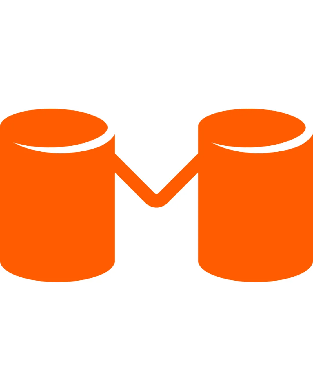
Logo review ofM Monogram With Two Connected Cylindrical Shapes
Review the detailed scores below to see what is working and what should be refined first.
Legibility
Originality
Misread
Balance
Scale
Detailed review
Logo performance breakdown
Legibility
![]() Clear depiction of the letter M
Clear depiction of the letter M![]() Minimalistic and easy to understand
Minimalistic and easy to understand
![]() Cylindrical elements may slightly distract from the letter M at first glance
Cylindrical elements may slightly distract from the letter M at first glance
Originality
![]() Cylindrical elements add a unique touch
Cylindrical elements add a unique touch
![]() M monograms are common, reducing uniqueness
M monograms are common, reducing uniqueness
Color harmony
![]() Single color ensures simplicity and clarity
Single color ensures simplicity and clarity
Balance alignment
![]() Symmetrically balanced with equal weight on both sides
Symmetrically balanced with equal weight on both sides
![]() Potential imbalance from the different perception of cylindrical elements
Potential imbalance from the different perception of cylindrical elements

Scalability
![]() Simple shape ensures clarity at all sizes
Simple shape ensures clarity at all sizes![]() Effective in monochrome and color
Effective in monochrome and color
200x250 px
100×125 px
50×62 px
Misinterpretations
Try your own review
Review my logo
Wondering how your logo performs?
Get a clear logo score, key risks, and priority fix ideas before your client or audience sees it.
Keep exploring


