Mandy's Bounty Basket logo review
4.0 / 5
Logo score
Logo review of

Mandy's Bounty Basket

Review the detailed scores below to see what is working and what should be refined first.

Objective AI feedback. Your creative decision.

Combination Mark Organic, Friendly Grocery Or Organic Food
4/5
Legibility
3/5
Originality
4/5
Balance
3/5
Scale
Detailed review

Logo performance breakdown

4/5

Legibility

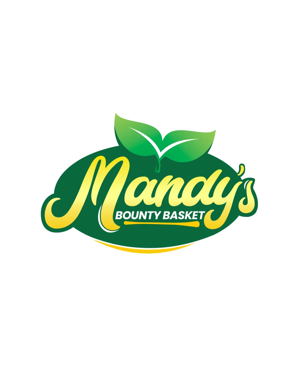
Checkmark icon Text is readable with a friendly, cursive style.

Warning icon The tagline 'Bounty Basket' is smaller and could be less readable from a distance.
3/5

Originality

Checkmark icon Leaf symbol adds a thematic touch.

Warning icon Leaf motif is common in the organic/food industry.

5/5

Color harmony

Checkmark icon Green and yellow create a vibrant, natural harmony.

4/5

Balance alignment

Checkmark icon Elements are well-balanced with good visual alignment.

Warning icon The large leaf above can slightly throw off symmetry.

logo 200x250 pixels scalability test alignment grid overlay
3/5

Scalability

Checkmark icon Bold design is generally versatile for different sizes.

Warning icon Detailing in the leaf and cursive text may not scale down well.

logo 200x250 pixels scalability test

200x250 px

logo 100x125 pixels scalability test

100×125 px

logo 50x62 pixels scalability test

50×62 px

Try your own review

Wondering how your logo performs?

Get a clear logo score, key risks, and priority fix ideas before your client or audience sees it.

Review my logo




