 View review
Logo score
Logo review of
Atelier Marta
Review the detailed scores below to see what is working and what should be refined first.
Objective AI feedback. Your creative decision.
Legibility
Originality
Misread
Balance
Scale
Detailed review
Logo performance breakdown
Legibility
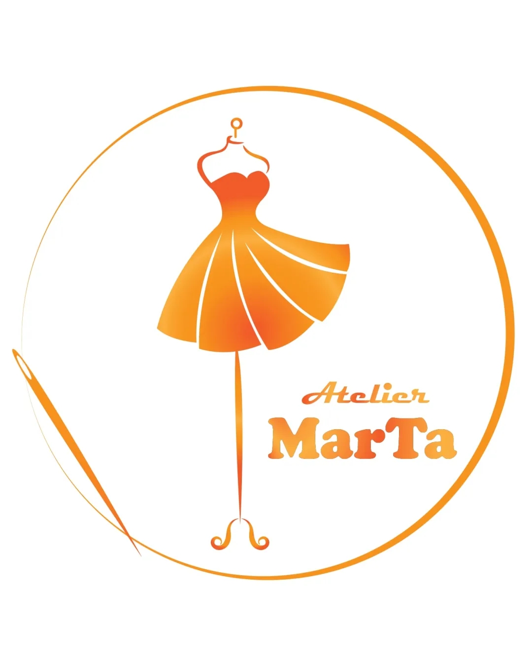
 Clear font choice for 'MarTa' Good contrast against the background
 'Atelier' could be slightly more legible with a different font or size
Originality
Unique combination of elements Stylized dress form
Somewhat common theme within fashion industry
Color harmony
Consistent color scheme Orange gradient adds warmth and energy
Balance alignment
Well-balanced between text and symbol Symmetrical composition
Slight imbalance with the needle element on the left

Scalability
Elegant design suitable for larger formats like signage Simple enough for medium sizes
Thin lines may lose clarity in small formats like business cards or embroidery
200x250 px
100×125 px
50×62 px
Misinterpretations
No inappropriate symbols
Symbol & text fit
Harmonious design language between logomark and wordmark
Some visual tension due to different font styles
Try your own review
Review my logo
Wondering how your logo performs?
Get a clear logo score, key risks, and priority fix ideas before your client or audience sees it.
Keep exploring


