Wondering how your logo performs? 🧐
Get professional logo reviews in seconds and catch design issues in time.
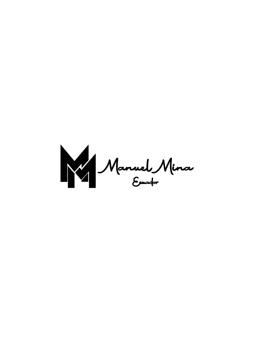
Try it Now!Logo review of Manuel Mina Ecuador
 Logo analysis by AI
Recognized style:
Logo type:
Detected symbol:
Detected text:
Business industry:
Review requested by Traianbraulete
**If AI can recognize or misinterpret it, so can people.
Structured logo review
Legibility
![]() Text is mostly legible, especially the name.
Text is mostly legible, especially the name.
![]() The script font of the tagline is slightly harder to read.
The script font of the tagline is slightly harder to read.
Scalability versatility
![]() Simplistic design aids scalability across various platforms.
Simplistic design aids scalability across various platforms.
![]() The thin lines in the script font might lose clarity at smaller sizes.
The thin lines in the script font might lose clarity at smaller sizes.
200x250 px
100×125 px
50×62 px
Balance alignment
![]() Well-balanced between monogram and wordmark.
Well-balanced between monogram and wordmark.
![]() Slight misalignment between the monogram and text might affect symmetry.
Slight misalignment between the monogram and text might affect symmetry.

Originality
![]() Lightning bolt integration into the monogram adds a unique touch.
Lightning bolt integration into the monogram adds a unique touch.
![]() Monogram concept is common and slightly reduces originality.
Monogram concept is common and slightly reduces originality.
Logomark wordmark fit
![]() The styles of the monogram and text complement each other.
The styles of the monogram and text complement each other.
![]() The scripted wordmark, while stylish, contrasts with the bold monogram.
The scripted wordmark, while stylish, contrasts with the bold monogram.
Aesthetic look
![]() Professional and modern aesthetic.
Professional and modern aesthetic.
![]() The script font might not align with modern minimalism.
The script font might not align with modern minimalism.
Cultural sensitivity dual meaning
![]() No cultural sensitivity issues detected.
No cultural sensitivity issues detected.
Color harmony
![]() Monochrome design ensures simplicity and elegance.
Monochrome design ensures simplicity and elegance.


