 View review
Logo score
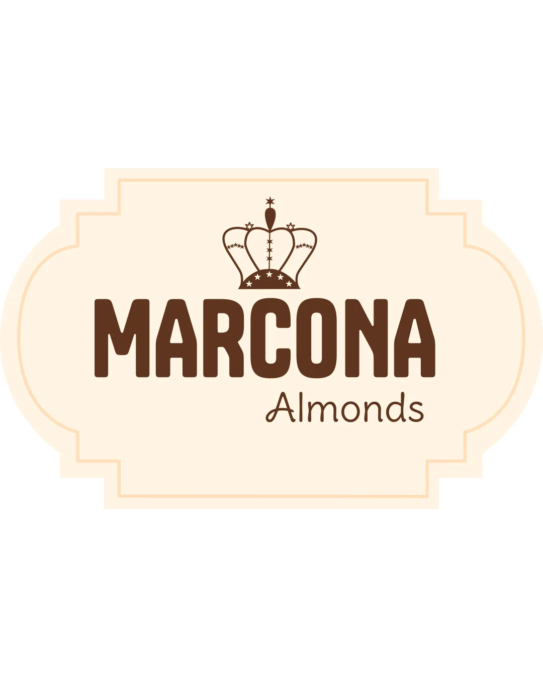
Logo review ofMarcona Almonds
Review the detailed scores below to see what is working and what should be refined first.
Legibility
Originality
Misread
Balance
Scale
Detailed review
Logo performance breakdown
Legibility
![]() Clear and bold text for 'MARCONA'
Clear and bold text for 'MARCONA'![]() Readable secondary text 'Almonds'
Readable secondary text 'Almonds'
![]() Slight size contrast between 'MARCONA' and 'Almonds' could be distracting
Slight size contrast between 'MARCONA' and 'Almonds' could be distracting
Originality
![]() Crown adds a regal touch relevant to the brand
Crown adds a regal touch relevant to the brand
![]() Crown symbol is common and not highly original
Crown symbol is common and not highly original
Color harmony
![]() Warm colors that complement the product theme
Warm colors that complement the product theme
![]() Limited contrast between the brown text and beige background
Limited contrast between the brown text and beige background
Your palette is close. Explore sharper color combinations with Colorfly.design before updating the logo.
Explore palettesBalance alignment
![]() Well-balanced overall design
Well-balanced overall design![]() Text and emblem are centered
Text and emblem are centered

Scalability
![]() Simple design that scales well
Simple design that scales well
![]() Detailed crown may lose clarity at smaller sizes
Detailed crown may lose clarity at smaller sizes![]() Complex shape might not fit well in all layouts
Complex shape might not fit well in all layouts
200x250 px
100×125 px
50×62 px
Misinterpretations
![]() No inappropriate symbols detected
No inappropriate symbols detected
Try your own review
Review my logo
Wondering how your logo performs?
Get a clear logo score, key risks, and priority fix ideas before your client or audience sees it.
Keep exploring


