Wondering how your logo performs? 🧐
Get professional logo reviews in seconds and catch design issues in time.
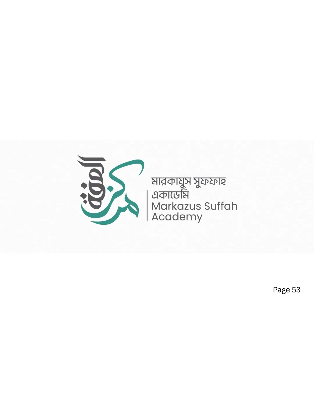
Try it Now!Logo review of Markazus Suffah Academy, Arabic and Bengali text
 Logo analysis by AI
Logo type:
Style:
Detected symbol:
Detected text:
Business industry:
Review requested by Fxx6
**If AI can recognize or misinterpret it, so can people.
Structured logo review
Legibility
![]() English portion is clear and easy to read.
English portion is clear and easy to read.![]() Hierarchy between Academy name and subtitle is maintained.
Hierarchy between Academy name and subtitle is maintained.
![]() Bangla text is small and might be hard to read at a distance or in smaller sizes.
Bangla text is small and might be hard to read at a distance or in smaller sizes.![]() Arabic calligraphy is stylized and may be hard to decipher for those unfamiliar with the script.
Arabic calligraphy is stylized and may be hard to decipher for those unfamiliar with the script.
Scalability versatility
![]() Symbol's solid lines hold up decently at moderate sizes.
Symbol's solid lines hold up decently at moderate sizes.![]() Will reproduce fairly well on print media and digital applications with the current colorway.
Will reproduce fairly well on print media and digital applications with the current colorway.
![]() Thin detailing in calligraphy may get lost in embroidery or favicon formats.
Thin detailing in calligraphy may get lost in embroidery or favicon formats.![]() Multiple script types make it challenging to scale down for small applications like pens or badges.
Multiple script types make it challenging to scale down for small applications like pens or badges.
200x250 px
100×125 px
50×62 px
Balance alignment
![]() Good separation between mark and text creates an organized layout.
Good separation between mark and text creates an organized layout.![]() Vertical alignment is handled well between symbol and text blocks.
Vertical alignment is handled well between symbol and text blocks.
![]() The calligraphic symbol slightly outweighs the text, making the composition feel left-heavy.
The calligraphic symbol slightly outweighs the text, making the composition feel left-heavy.

Originality
![]() Creative use of Arabic calligraphy as a monogram is visually distinct.
Creative use of Arabic calligraphy as a monogram is visually distinct.![]() Combination of three languages increases uniqueness for the context.
Combination of three languages increases uniqueness for the context.
![]() Calligraphic monograms for academies or Islamic institutions are a common regional trope.
Calligraphic monograms for academies or Islamic institutions are a common regional trope.
Logomark wordmark fit
![]() Both parts reference cultural authenticity.
Both parts reference cultural authenticity.
![]() Font style and thickness of wordmark do not perfectly harmonize with the more dynamic strokes of the monogram symbol.
Font style and thickness of wordmark do not perfectly harmonize with the more dynamic strokes of the monogram symbol.![]() There’s a delicate mismatch between the crispness of digital text and the flowy mark.
There’s a delicate mismatch between the crispness of digital text and the flowy mark.
Aesthetic look
![]() Overall elegant appearance, contemporary yet culturally rooted.
Overall elegant appearance, contemporary yet culturally rooted.![]() Muting of green and gray gives a professional, matured look.
Muting of green and gray gives a professional, matured look.
![]() Visual busyness occurs due to inclusion of three different scripts together.
Visual busyness occurs due to inclusion of three different scripts together.
Dual meaning and misinterpretations
![]() No accidental inappropriate shapes or ambiguous interpretations detected.
No accidental inappropriate shapes or ambiguous interpretations detected.
Color harmony
![]() Restrained palette; green, gray, and black work cohesively.
Restrained palette; green, gray, and black work cohesively.![]() Contrast between logo colors and white background is excellent for clarity.
Contrast between logo colors and white background is excellent for clarity.
Pine Green
#379C8E
Gunmetal
#303030
White
#FFFFFF


