Wondering how your logo performs? 🧐
Get professional logo reviews in seconds and catch design issues in time.
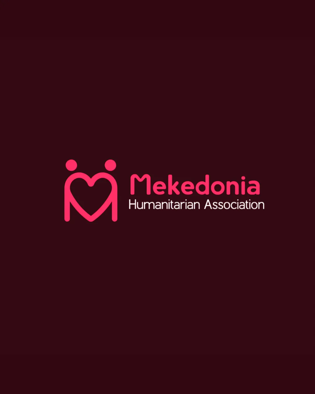
Try it Now!Logo review of Mekedonia Humanitarian Association
 Logo analysis by AI
Logo type:
Style:
Detected symbol:
Negative space:
Detected text:
Business industry:
Review requested by EKD
**If AI can recognize or misinterpret it, so can people.
Structured logo review
Legibility
![]() Mekedonia is clear and easy to read in rounded sans-serif type
Mekedonia is clear and easy to read in rounded sans-serif type![]() Good contrast between text and background
Good contrast between text and background
![]() ‘Humanitarian Association’ is less legible due to lighter weight and smaller size
‘Humanitarian Association’ is less legible due to lighter weight and smaller size
Scalability versatility
![]() Icon is simple and scalable for many uses like app icons, website headers, and print
Icon is simple and scalable for many uses like app icons, website headers, and print![]() Strong shape recognition at small scales
Strong shape recognition at small scales
![]() Thin type for the tagline risks disappearing on small formats (business cards, favicons, embroidery)
Thin type for the tagline risks disappearing on small formats (business cards, favicons, embroidery)![]() Color gradients and double-line weight in the icon may not reproduce well in all print scenarios
Color gradients and double-line weight in the icon may not reproduce well in all print scenarios
200x250 px
100×125 px
50×62 px
Balance alignment
![]() Icon and type are horizontally aligned and well balanced
Icon and type are horizontally aligned and well balanced![]() Good proximity between symbol and wordmark
Good proximity between symbol and wordmark
![]() Slight visual tension between bolder icon and lighter tagline
Slight visual tension between bolder icon and lighter tagline![]() The left alignment of 'Humanitarian Association' can feel disconnected from the main 'Mekedonia' name
The left alignment of 'Humanitarian Association' can feel disconnected from the main 'Mekedonia' name

Originality
![]() Creative use of heart shape with figures, visual duality of embrace
Creative use of heart shape with figures, visual duality of embrace![]() Friendly tone appropriate for a humanitarian brand
Friendly tone appropriate for a humanitarian brand
![]() Heart and figures are somewhat common in nonprofit/charity imagery, though executed with a unique stroke style
Heart and figures are somewhat common in nonprofit/charity imagery, though executed with a unique stroke style
Logomark wordmark fit
![]() Icon style matches rounded, modern typeface of wordmark
Icon style matches rounded, modern typeface of wordmark![]() Colors and thickness establish visual harmony
Colors and thickness establish visual harmony
![]() Some dissonance between heavier icon and the lighter, fine tagline type
Some dissonance between heavier icon and the lighter, fine tagline type
Aesthetic look
![]() Contemporary, inviting color palette
Contemporary, inviting color palette![]() Friendly, approachable shapes without clutter
Friendly, approachable shapes without clutter
![]() Visual simplicity borders on being overly typical for the sector
Visual simplicity borders on being overly typical for the sector
Dual meaning and misinterpretations
![]() Embrace/heart metaphor is clear and appropriate
Embrace/heart metaphor is clear and appropriate![]() No inappropriate forms detected
No inappropriate forms detected
Color harmony
![]() Consistent, harmonious use of two bold colors
Consistent, harmonious use of two bold colors![]() Good readability and visual consistency
Good readability and visual consistency
![]() Limited versatility; lighter pink may not work optimally on all backgrounds
Limited versatility; lighter pink may not work optimally on all backgrounds
Vivid Cerise
#FF4F85
Very Dark Red
#2D0409


