 View review
Logo score
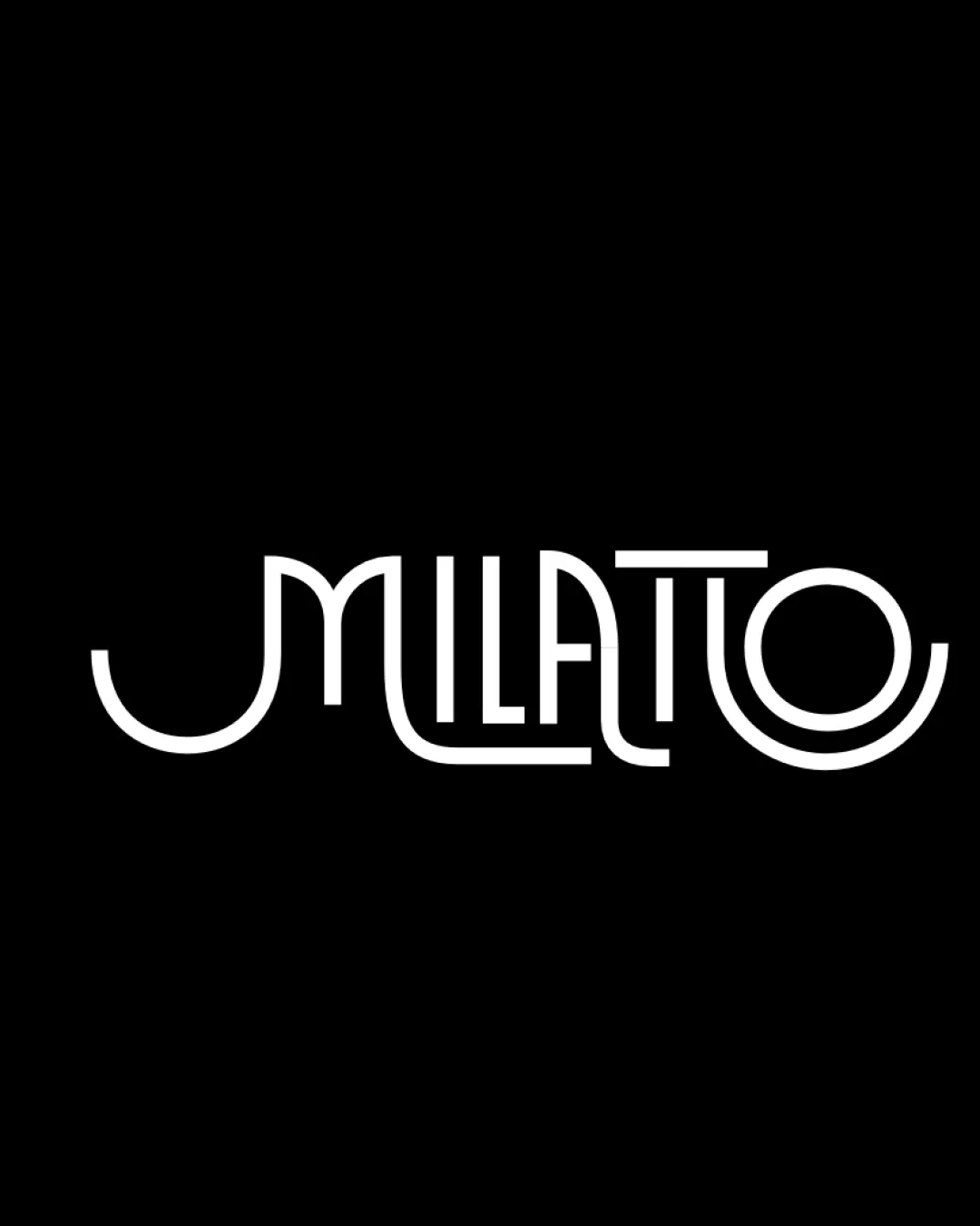
Logo review ofMilatto
Review the detailed scores below to see what is working and what should be refined first.
Legibility
Originality
Misread
Balance
Scale
Detailed review
Logo performance breakdown
Legibility
![]() Unique typographic style.
Unique typographic style.![]() Good color contrast with background.
Good color contrast with background.
![]() Some letters, particularly 'M' and 'T', might be hard to read due to stylization.
Some letters, particularly 'M' and 'T', might be hard to read due to stylization.![]() Letter spacing could affect legibility.
Letter spacing could affect legibility.
Originality
![]() Unique combination of letters and stylization.
Unique combination of letters and stylization.![]() Creative integration of letters for a modern look.
Creative integration of letters for a modern look.
![]() Lacks additional symbolic elements for deeper meaning.
Lacks additional symbolic elements for deeper meaning.
Color harmony
![]() Effective use of a monochromatic scheme.
Effective use of a monochromatic scheme.![]() Contrast enhances the clarity.
Contrast enhances the clarity.
Balance alignment
![]() Visually balanced with symmetrical design.
Visually balanced with symmetrical design.![]() Consistent line width throughout.
Consistent line width throughout.

Scalability
![]() Simple color scheme aids scalability.
Simple color scheme aids scalability.![]() Distinctive enough to be recognizable at various sizes.
Distinctive enough to be recognizable at various sizes.
![]() Thin lines may lose clarity in very small sizes.
Thin lines may lose clarity in very small sizes.
200x250 px
100×125 px
50×62 px
Misinterpretations
![]() No dual meanings detected in the design.
No dual meanings detected in the design.
Try your own review
Review my logo
Wondering how your logo performs?
Get a clear logo score, key risks, and priority fix ideas before your client or audience sees it.
Keep exploring


