Wondering how your logo performs? 🧐
Get professional logo reviews in seconds and catch design issues in time.
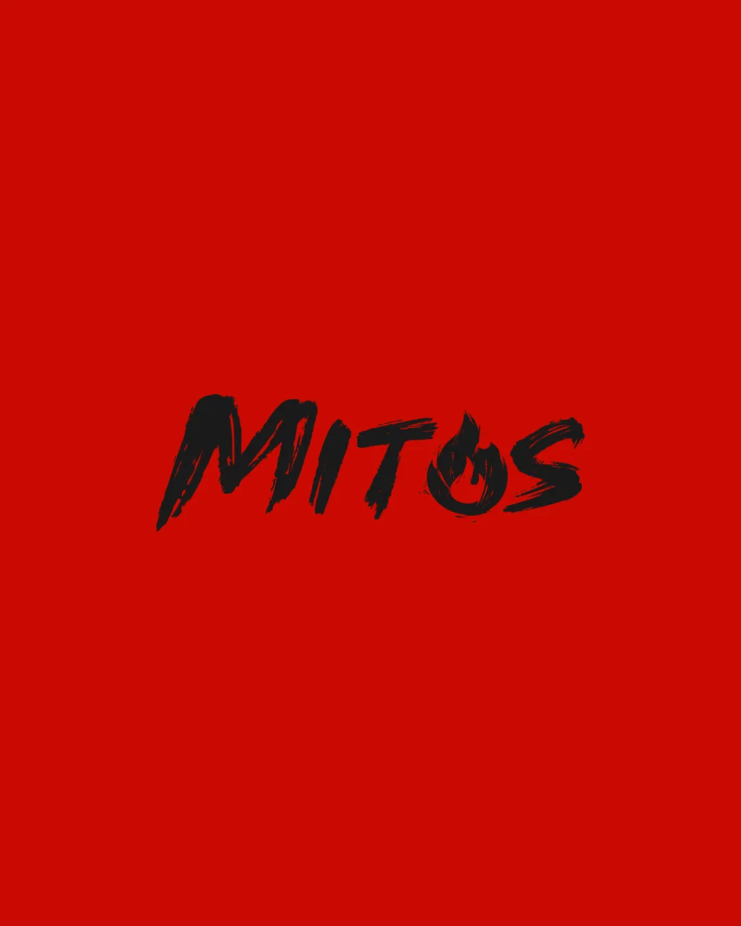
Try it Now!Logo review of MITOS
 Logo analysis by AI
Logo type:
Style:
Detected symbol:
Negative space:
Detected text:
Business industry:
Review requested by Saamd
**If AI can recognize or misinterpret it, so can people.
Structured logo review
Legibility
![]() Text is mostly readable and bold.
Text is mostly readable and bold.![]() Distinct brush style adds energy to the logo.
Distinct brush style adds energy to the logo.
![]() Brush script makes some letters ('M' and 'O') harder to read at a glance.
Brush script makes some letters ('M' and 'O') harder to read at a glance.![]() The flame detail in the 'O' slightly reduces clarity, especially at smaller sizes.
The flame detail in the 'O' slightly reduces clarity, especially at smaller sizes.
Scalability versatility
![]() Bold design stands out on large formats such as banners or restaurant signage.
Bold design stands out on large formats such as banners or restaurant signage.
![]() Fine brush details and the flame in 'O' will blur or disappear when scaled down (e.g., business cards, mobile app icon, embroidery).
Fine brush details and the flame in 'O' will blur or disappear when scaled down (e.g., business cards, mobile app icon, embroidery).![]() Single-color contrast may not always hold up, especially if reproduced in grayscale.
Single-color contrast may not always hold up, especially if reproduced in grayscale.
200x250 px
100×125 px
50×62 px
Balance alignment
![]() Letter placement is visually balanced across the wordmark.
Letter placement is visually balanced across the wordmark.![]() No major alignment issues between elements.
No major alignment issues between elements.
![]() Some slight unevenness in brush pressure causes minor imbalance, but not critical.
Some slight unevenness in brush pressure causes minor imbalance, but not critical.

Originality
![]() The flame integration in the 'O' is a creative feature.
The flame integration in the 'O' is a creative feature.![]() Brush script is less conventional for food industry logos, lending individuality.
Brush script is less conventional for food industry logos, lending individuality.
![]() Brush script is becoming more common in branding trends, slightly reducing uniqueness.
Brush script is becoming more common in branding trends, slightly reducing uniqueness.![]() Other brands may use similar flame motifs in food industry.
Other brands may use similar flame motifs in food industry.
Aesthetic look
![]() Energetic, striking aesthetic fits fiery or bold food branding.
Energetic, striking aesthetic fits fiery or bold food branding.![]() Minimal color palette keeps it from looking overly busy.
Minimal color palette keeps it from looking overly busy.
![]() Red and black is a common color pairing in food/spicy branding, making the concept less fresh.
Red and black is a common color pairing in food/spicy branding, making the concept less fresh.![]() Brush style can appear messy or amateurish if not refined further.
Brush style can appear messy or amateurish if not refined further.
Dual meaning and misinterpretations
![]() No inappropriate symbolism or double meanings detected in overall composition.
No inappropriate symbolism or double meanings detected in overall composition.
Color harmony
![]() Strong contrast between black text and red background.
Strong contrast between black text and red background.![]() Two-color palette is bold and cohesive.
Two-color palette is bold and cohesive.
![]() May lack versatility if placed on lighter or neutral backgrounds.
May lack versatility if placed on lighter or neutral backgrounds.![]() Limited color adaptability for monochrome needs.
Limited color adaptability for monochrome needs.
Red
#C20000
Ebony
#171008


