Wondering how your logo performs? 🧐
Get professional logo reviews in seconds and catch design issues in time.
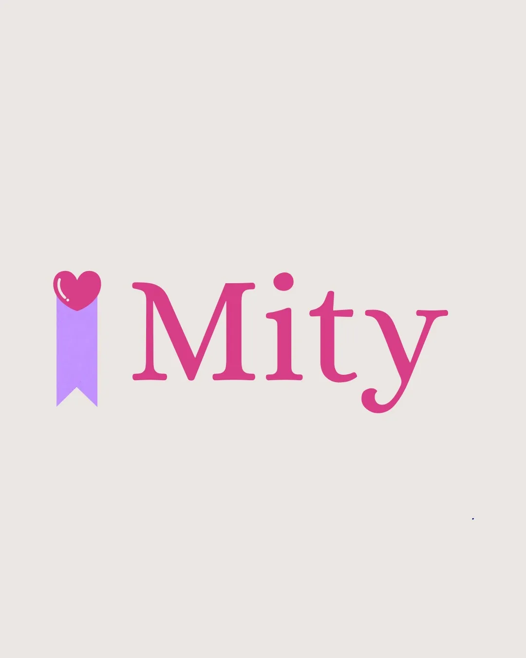
Try it Now!Logo review of Mity
 Logo analysis by AI
Logo type:
Style:
Detected symbol:
Detected text:
Business industry:
Review requested by Daianny
**If AI can recognize or misinterpret it, so can people.
Structured logo review
Legibility
![]() Text is highly legible, clean, and readable.
Text is highly legible, clean, and readable.![]() Font style is modern and friendly, appealing to its likely target audience.
Font style is modern and friendly, appealing to its likely target audience.
Scalability versatility
![]() Simple shapes and clear typography ensure visibility on small and large surfaces.
Simple shapes and clear typography ensure visibility on small and large surfaces.![]() Strong enough to appear on web, print, and packaging.
Strong enough to appear on web, print, and packaging.
![]() Heart-with-bookmark icon may lose clarity at favicon or embroidery scale due to fine separation between heart and shape.
Heart-with-bookmark icon may lose clarity at favicon or embroidery scale due to fine separation between heart and shape.
200x250 px
100×125 px
50×62 px
Balance alignment
![]() Symbol and wordmark weight are relatively well-matched.
Symbol and wordmark weight are relatively well-matched.![]() Even placement and whitespace create a pleasant, balanced look.
Even placement and whitespace create a pleasant, balanced look.
![]() Heart/bookmark symbol feels slightly taller than the capital 'M', causing a minor imbalance in vertical alignment.
Heart/bookmark symbol feels slightly taller than the capital 'M', causing a minor imbalance in vertical alignment.

Originality
![]() Pleasant combination of a heart and ribbon, which is not uncommon, but used in a clean way.
Pleasant combination of a heart and ribbon, which is not uncommon, but used in a clean way.![]() The heart icon with a shiny accent adds a bit of character.
The heart icon with a shiny accent adds a bit of character.
![]() Heart icons and ribbons are frequently used symbols, giving an overall impression that isn't unique.
Heart icons and ribbons are frequently used symbols, giving an overall impression that isn't unique.![]() No advanced use of negative space or typographic creativity within the wordmark itself.
No advanced use of negative space or typographic creativity within the wordmark itself.
Logomark wordmark fit
![]() Symbolic heart fits the playful typeface and the general brand tone.
Symbolic heart fits the playful typeface and the general brand tone.![]() Colors are harmonized between the logomark and the wordmark.
Colors are harmonized between the logomark and the wordmark.
![]() The height discrepancy between the logomark and the wordmark creates minor dissonance.
The height discrepancy between the logomark and the wordmark creates minor dissonance.
Aesthetic look
![]() Logo uses a tasteful color palette suitable for youthful or family-oriented products.
Logo uses a tasteful color palette suitable for youthful or family-oriented products.![]() Smoothed, modern font and cheerful icon together create a friendly mood.
Smoothed, modern font and cheerful icon together create a friendly mood.
![]() Simplicity sometimes drifts toward generic compared to more distinctive, custom logotypes.
Simplicity sometimes drifts toward generic compared to more distinctive, custom logotypes.
Dual meaning and misinterpretations
![]() Heart and bookmark shape are universally recognized, with no inappropriate implications.
Heart and bookmark shape are universally recognized, with no inappropriate implications.
Color harmony
![]() Two main colors create a well-balanced, cheerful harmony.
Two main colors create a well-balanced, cheerful harmony.![]() Contrast between text, symbol and background is strong and visually pleasing.
Contrast between text, symbol and background is strong and visually pleasing.
Amaranth Pink
#ED4C90
Ripe Lavender
#A98DFB
Isabelline
#F7F5F1


