 View review
Logo score
Logo review ofMizterious, Precision In Choas Isn't It Mizterio..
Review the detailed scores below to see what is working and what should be refined first.
Legibility
Originality
Misread
Balance
Scale
Detailed review
Logo performance breakdown
Legibility
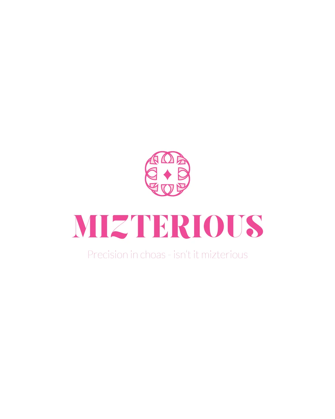
![]() Main brand word 'MIZTERIOUS' is mostly readable with a distinct bold serif typeface.
Main brand word 'MIZTERIOUS' is mostly readable with a distinct bold serif typeface.
![]() Decorative elements inside the letters ('Z', 'E') diminish legibility.
Decorative elements inside the letters ('Z', 'E') diminish legibility.![]() Supporting tagline text is extremely faint and nearly illegible due to poor color contrast and thin, small font size.
Supporting tagline text is extremely faint and nearly illegible due to poor color contrast and thin, small font size.![]() Typo in the tagline ('choas' instead of 'chaos') impacts professionalism.
Typo in the tagline ('choas' instead of 'chaos') impacts professionalism.
Originality
![]() Custom ornamental symbol offers some uniqueness.
Custom ornamental symbol offers some uniqueness.![]() Brand name is a creative twist on the word 'mysterious.'
Brand name is a creative twist on the word 'mysterious.'
![]() The circular emblem, while decorative, uses fairly common geometric motifs seen in fashion and luxury branding.
The circular emblem, while decorative, uses fairly common geometric motifs seen in fashion and luxury branding.![]() No unique concept in the negative space or integration with the wordmark.
No unique concept in the negative space or integration with the wordmark.![]() The serif wordmark does not have any particularly novel typographic features beyond basic custom cuts.
The serif wordmark does not have any particularly novel typographic features beyond basic custom cuts.
Color harmony
![]() Restrained color palette (one main pink and white background) maintains visual unity.
Restrained color palette (one main pink and white background) maintains visual unity.![]() Good choice for elegance and fashionable appeal.
Good choice for elegance and fashionable appeal.
Pink
#F85BA8
White
#FFFFFF
Balance alignment
![]() Symbol and text are vertically aligned and spaced well, creating a visually pleasing hierarchy.
Symbol and text are vertically aligned and spaced well, creating a visually pleasing hierarchy.![]() Text and symbol weight are relatively harmonious, with neither overpowering the other.
Text and symbol weight are relatively harmonious, with neither overpowering the other.
![]() The circular symbol feels slightly disconnected from the boldness of the wordmark, which might create a minor disjointed effect.
The circular symbol feels slightly disconnected from the boldness of the wordmark, which might create a minor disjointed effect.

Scalability
![]() Could be effective on large-scale applications (e.g., banners, store signage), and in digital use when scaled up.
Could be effective on large-scale applications (e.g., banners, store signage), and in digital use when scaled up.
![]() Thin, detailed ornamentation in the emblem is likely to blur or disappear at small sizes such as business cards or app icons.
Thin, detailed ornamentation in the emblem is likely to blur or disappear at small sizes such as business cards or app icons.![]() Tagline text cannot be scaled down and remain legible in most practical contexts.
Tagline text cannot be scaled down and remain legible in most practical contexts.![]() Intricate symbol may not reproduce well in embroidery, foil, or small merchandise tags.
Intricate symbol may not reproduce well in embroidery, foil, or small merchandise tags.
200x250 px
100×125 px
50×62 px
Misinterpretations
![]() No inappropriate or problematic shapes detected in the composition.
No inappropriate or problematic shapes detected in the composition.
Symbol & text fit
![]() The visual weight of the emblem and the bold serif wordmark are somewhat consistent.
The visual weight of the emblem and the bold serif wordmark are somewhat consistent.
![]() The decorative, intricate style of the emblem does not fully harmonize with the sharper, blockier wordmark, causing a minor stylistic clash.
The decorative, intricate style of the emblem does not fully harmonize with the sharper, blockier wordmark, causing a minor stylistic clash.
![]() The emblem is much more detailed than the relatively plain lettering, making the composition feel uneven.
The emblem is much more detailed than the relatively plain lettering, making the composition feel uneven.
Try your own review
Review my logo
Wondering how your logo performs?
Get a clear logo score, key risks, and priority fix ideas before your client or audience sees it.
Keep exploring


