Wondering how your logo performs? 🧐
Get professional logo reviews in seconds and catch design issues in time.
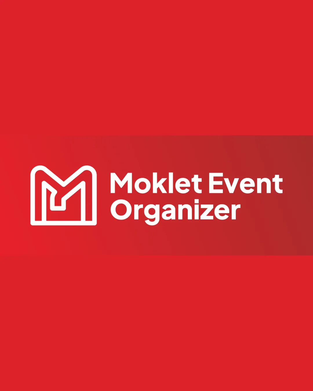
Try it Now!Logo review of Moklet Event Organizer
 Logo analysis by AI
Logo type:
Style:
Detected symbol:
Detected text:
Business industry:
Review requested by Brezizi
**If AI can recognize or misinterpret it, so can people.
Structured logo review
Legibility
![]() Clear and readable text.
Clear and readable text.![]() Good contrast against a red background.
Good contrast against a red background.
Scalability versatility
![]() Simple design allows for use on various scales.
Simple design allows for use on various scales.![]() Bold lines ensure visibility.
Bold lines ensure visibility.
![]() May require adaptation for very small applications like favicons.
May require adaptation for very small applications like favicons.
200x250 px
100×125 px
50×62 px
Balance alignment
![]() Well balanced between the monogram and text.
Well balanced between the monogram and text.![]() Centered alignment enhances the design.
Centered alignment enhances the design.

Originality
![]() Unique monogram usage for the letter M.
Unique monogram usage for the letter M.![]() Modern styling fits the event industry.
Modern styling fits the event industry.
![]() Monogram style could be interpreted as generic without more distinctive elements.
Monogram style could be interpreted as generic without more distinctive elements.
Logomark wordmark fit
![]() Monogram and wordmark complement each other well.
Monogram and wordmark complement each other well.![]() Consistent styling between elements.
Consistent styling between elements.
Aesthetic look
![]() Clean and modern aesthetic.
Clean and modern aesthetic.![]() Professional and appealing design.
Professional and appealing design.
Dual meaning and misinterpretations
![]() No misleading symbols present.
No misleading symbols present.![]() Clear representation of event organizing industry.
Clear representation of event organizing industry.
Color harmony
![]() Good use of a single color scheme.
Good use of a single color scheme.![]() Contrast is sufficient with white text on red background.
Contrast is sufficient with white text on red background.
![]() Limited color palette may not stand out in diverse contexts.
Limited color palette may not stand out in diverse contexts.


