Wondering how your logo performs? 🧐
Get professional logo reviews in seconds and catch design issues in time.
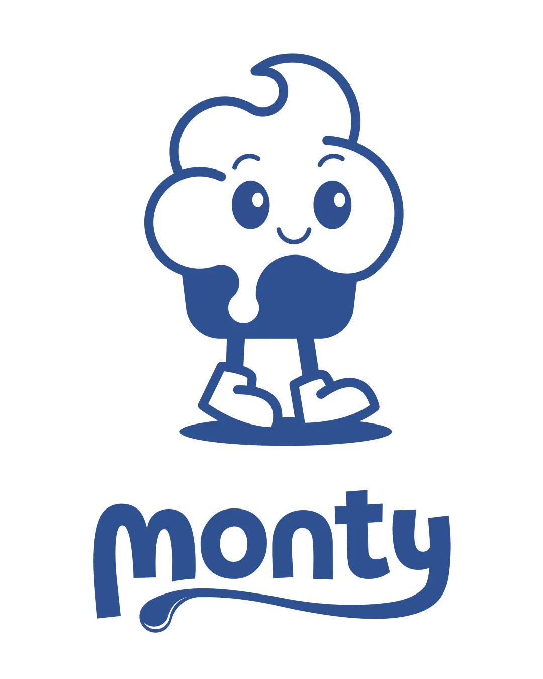
Try it Now!Logo review of monty
 Logo analysis by AI
Logo type:
Style:
Detected symbol:
Detected text:
Business industry:
Review requested by Shahriaz0331
**If AI can recognize or misinterpret it, so can people.
Structured logo review
Legibility
![]() Wordmark 'monty' is clear and easily readable.
Wordmark 'monty' is clear and easily readable.![]() Friendly, playful custom typography matches the mascot style.
Friendly, playful custom typography matches the mascot style.
![]() Slight exaggeration of the lowercase 'm' and 'y' terminal flourish could be less readable at extremely small sizes.
Slight exaggeration of the lowercase 'm' and 'y' terminal flourish could be less readable at extremely small sizes.
Scalability versatility
![]() Mascot is bold and simple enough for moderate size reductions.
Mascot is bold and simple enough for moderate size reductions.![]() Works well on large print media, playful packaging, and signage.
Works well on large print media, playful packaging, and signage.
![]() Mascot contains fine line details (faces, feet) that may blur or lose clarity at small sizes like favicons or small embroidery.
Mascot contains fine line details (faces, feet) that may blur or lose clarity at small sizes like favicons or small embroidery.![]() Wordmark's tail on 'y' may not scale well for tiny applications.
Wordmark's tail on 'y' may not scale well for tiny applications.
200x250 px
100×125 px
50×62 px
Balance alignment
![]() Good visual balance between the mascot and the wordmark.
Good visual balance between the mascot and the wordmark.![]() Well-centered, with mascot offering a friendly focal point above the name.
Well-centered, with mascot offering a friendly focal point above the name.
![]() Logo would benefit from slightly tightening the spacing between mascot and wordmark to improve unity.
Logo would benefit from slightly tightening the spacing between mascot and wordmark to improve unity.

Originality
![]() Mascot design adds personality and approachability to the brand.
Mascot design adds personality and approachability to the brand.![]() Custom facial features and shoe detail show character-specific design.
Custom facial features and shoe detail show character-specific design.
![]() Mascot as a happy dessert is somewhat common in the food and sweets industry; concept not highly original.
Mascot as a happy dessert is somewhat common in the food and sweets industry; concept not highly original.
Logomark wordmark fit
![]() Typography style matches the playful, rounded curves of the mascot.
Typography style matches the playful, rounded curves of the mascot.![]() Unified blue color and bold lines integrate the mark and name smoothly.
Unified blue color and bold lines integrate the mark and name smoothly.
Aesthetic look
![]() Overall cute and friendly visual appeal.
Overall cute and friendly visual appeal.![]() Consistent single-color palette maintains brand coherence.
Consistent single-color palette maintains brand coherence.
![]() The drip underline under the wordmark may not appeal in all contexts and could feel slightly forced.
The drip underline under the wordmark may not appeal in all contexts and could feel slightly forced.
Dual meaning and misinterpretations
![]() No inappropriate or misleading elements detected.
No inappropriate or misleading elements detected.![]() Mascot communicates sweetness and approachability clearly.
Mascot communicates sweetness and approachability clearly.
Color harmony
![]() Consistent one-color palette keeps the logo visually simple and strong.
Consistent one-color palette keeps the logo visually simple and strong.![]() Good contrast between blue and white ensures visibility.
Good contrast between blue and white ensures visibility.
Tory Blue
#325594
White
#FFFFFF


