 View review
Logo score
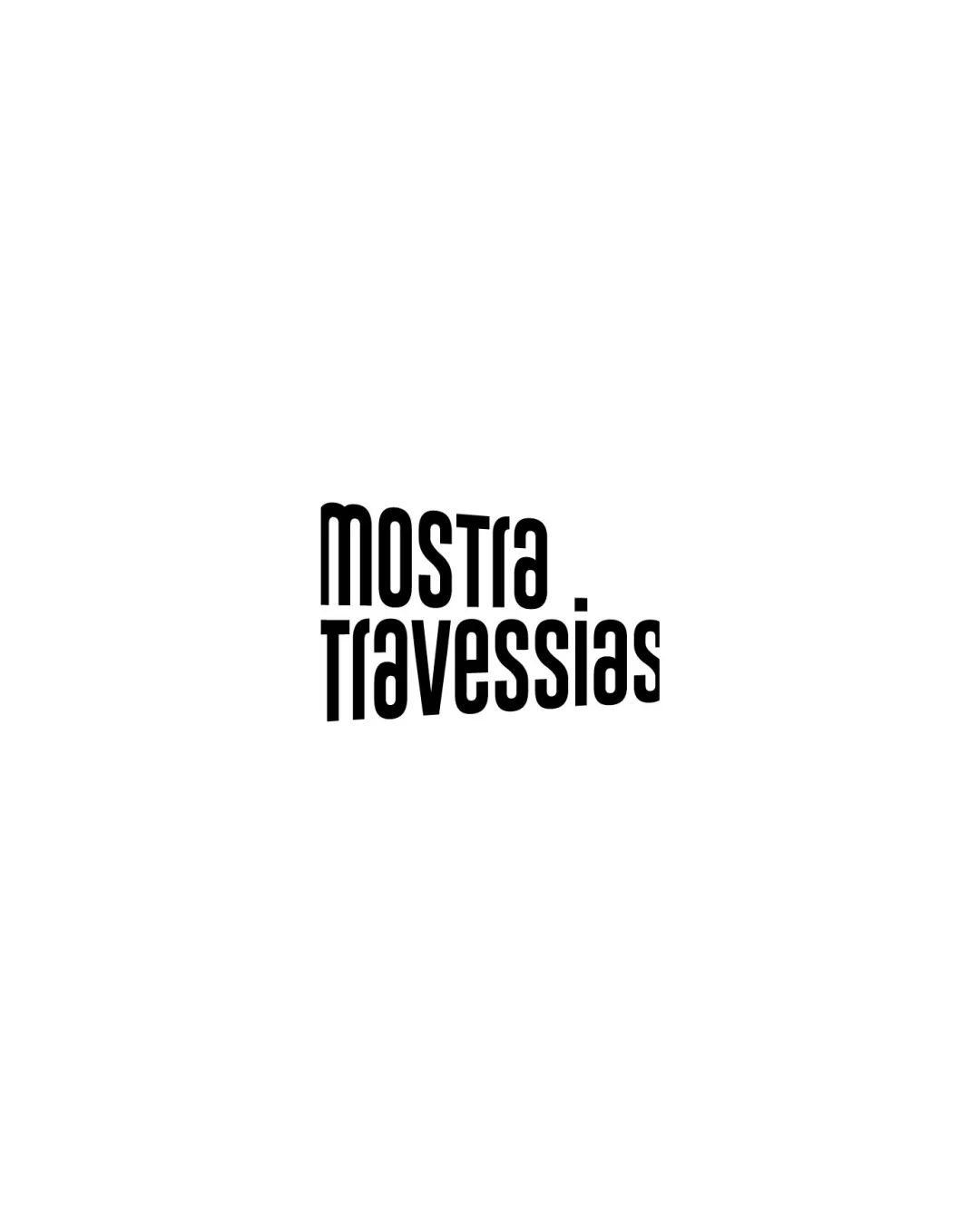
Logo review ofMostra Travessias
Review the detailed scores below to see what is working and what should be refined first.
Legibility
Originality
Misread
Balance
Scale
Detailed review
Logo performance breakdown
Legibility
![]() Text is bold and relatively easy to read even at a distance.
Text is bold and relatively easy to read even at a distance.![]() Consistent capitalization and kerning add to clarity.
Consistent capitalization and kerning add to clarity.
![]() Some letterforms ('r', 'a', 'i', 's') are unusually styled, slightly impacting fast legibility at small sizes.
Some letterforms ('r', 'a', 'i', 's') are unusually styled, slightly impacting fast legibility at small sizes.
Originality
![]() Unconventional, highly condensed geometric font is memorable.
Unconventional, highly condensed geometric font is memorable.![]() Unique construction compared to most generic wordmarks in the arts industry.
Unique construction compared to most generic wordmarks in the arts industry.
![]() Lack of an accompanying symbol or distinctive visual twist limits uniqueness.
Lack of an accompanying symbol or distinctive visual twist limits uniqueness.![]() Typography is interesting but could be further differentiated for stronger brand identity.
Typography is interesting but could be further differentiated for stronger brand identity.
Color harmony
![]() Black and white color scheme is versatile and harmonious.
Black and white color scheme is versatile and harmonious.![]() Excellent contrast ensures strong visibility.
Excellent contrast ensures strong visibility.
Black
#000000
White
#FFFFFF
Balance alignment
![]() Stacked wordmark provides a well-centered, vertical balance.
Stacked wordmark provides a well-centered, vertical balance.![]() Overall symmetry is visually appealing.
Overall symmetry is visually appealing.
![]() Heavily condensed type and tight line spacing could feel cramped; more breathing room would enhance balance.
Heavily condensed type and tight line spacing could feel cramped; more breathing room would enhance balance.

Scalability
![]() Simple structure translates well to small and large formats.
Simple structure translates well to small and large formats.![]() Would work efficiently in digital media, print, and signage.
Would work efficiently in digital media, print, and signage.
![]() Tight spacing and tall forms may reduce clarity in extremely small applications (e.g., favicons, embroidery).
Tight spacing and tall forms may reduce clarity in extremely small applications (e.g., favicons, embroidery).
200x250 px
100×125 px
50×62 px
Misinterpretations
![]() The design has no unfortunate secondary meanings.
The design has no unfortunate secondary meanings.![]() Safe, straightforward wordmark presentation.
Safe, straightforward wordmark presentation.
Try your own review
Review my logo
Wondering how your logo performs?
Get a clear logo score, key risks, and priority fix ideas before your client or audience sees it.
Keep exploring


