Wondering how your logo performs? 🧐
Get professional logo reviews in seconds and catch design issues in time.
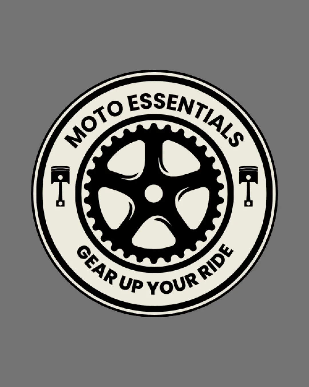
Try it Now!Logo review of MOTO ESSENTIALS, GEAR UP YOUR RIDE
 Logo analysis by AI
Logo type:
Style:
Detected symbol:
Detected text:
Business industry:
Review requested by Shelar_1818
**If AI can recognize or misinterpret it, so can people.
Structured logo review
Legibility
![]() Bold sans-serif font ensures strong readability.
Bold sans-serif font ensures strong readability.![]() High contrast between text and background enhances clarity.
High contrast between text and background enhances clarity.
Scalability versatility
![]() Simple, thick outlines help retain clarity in medium scales.
Simple, thick outlines help retain clarity in medium scales.![]() Would work well on stickers, apparel patches, or signage.
Would work well on stickers, apparel patches, or signage.
![]() Fine details within the sprocket shape and pistons could get lost at very small sizes, such as business cards or favicon.
Fine details within the sprocket shape and pistons could get lost at very small sizes, such as business cards or favicon.![]() Circular badge design may not easily adapt for narrow horizontal or vertical applications.
Circular badge design may not easily adapt for narrow horizontal or vertical applications.
200x250 px
100×125 px
50×62 px
Balance alignment
![]() The layout is symmetrical and elements are well-centered.
The layout is symmetrical and elements are well-centered.![]() Consistent spacing around the border maintains visual stability.
Consistent spacing around the border maintains visual stability.

Originality
![]() Direct industry references with sprocket and piston elements.
Direct industry references with sprocket and piston elements.
![]() Sprocket and piston motifs are generic and commonly used in automotive/motorcycle logos.
Sprocket and piston motifs are generic and commonly used in automotive/motorcycle logos.![]() No unique or creative twist on the standard emblem style.
No unique or creative twist on the standard emblem style.
Logomark wordmark fit
![]() The text integrates well inside the border, complementing the central gear.
The text integrates well inside the border, complementing the central gear.
![]() Pistons on both sides can feel redundant, making the logo busy.
Pistons on both sides can feel redundant, making the logo busy.
Aesthetic look
![]() Cohesive color palette gives a clean, classic look.
Cohesive color palette gives a clean, classic look.![]() Emblem format is visually appealing for the automotive sector.
Emblem format is visually appealing for the automotive sector.
![]() Logo has a busy feel due to multiple mechanical icons.
Logo has a busy feel due to multiple mechanical icons.![]() Design feels somewhat dated due to overused industry motifs.
Design feels somewhat dated due to overused industry motifs.
Dual meaning and misinterpretations
![]() No inappropriate or unintended imagery detected.
No inappropriate or unintended imagery detected.
Color harmony
![]() Restrained palette provides good contrast and coherence.
Restrained palette provides good contrast and coherence.![]() Works well against both light and dark backgrounds.
Works well against both light and dark backgrounds.
Alabaster
#F3F0E7
Cod Gray
#13120D
Boulder
#787878


