Wondering how your logo performs? 🧐
Get professional logo reviews in seconds and catch design issues in time.
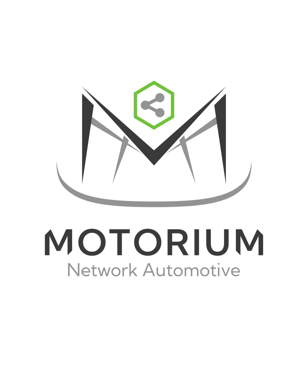
Try it Now!Logo review of Motorium, Network Automotive
 Logo analysis by AI
Logo type:
Style:
Detected symbol:
Detected text:
Business industry:
Review requested by Erik.pilloni
**If AI can recognize or misinterpret it, so can people.
Structured logo review
Legibility
Primary wordmark 'MOTORIUM' is set in a clean, sans-serif font and is highly readable.
Subheading 'Network Automotive' is clearly legible, with good contrast against the white background.
Scalability versatility
The logo is relatively simple and can be used on various backgrounds and at larger sizes such as billboards, car decals, and signage.
Icon could work independently for app icons and social profiles.
Fine, pointed shapes in the 'M' monogram may lose clarity at small sizes and in embroidery.
Hexagon and share icon details may blur in small applications like favicons or stitched patches.

200x250 px

100×125 px

50×62 px
Balance alignment
Elements are centrally aligned and visually balanced, with the monogram and hexagon forming a strong axis.
Good typographic alignment with text below symbol.
The curvature beneath the 'M' introduces mild asymmetry, and the sharp spikes disrupt smooth vertical balance.


Originality
Combining an angular 'M' with network symbolism (share icon in hexagon) has some creative merit.
The hexagonal share/network icon is generic in tech/automotive sectors.
The sharp, spiked 'M' shape is not distinctively original and feels somewhat overused in abstract initial designs.
Logomark wordmark fit
Wordmark and logomark share clean, geometric styling, giving a coherent brand feel.
The technical-modern logomark is slightly more aggressive than the calm, sans-serif wordmark.
Aesthetic look
Modern and crisp aesthetic suitable for technology and automotive industries.
Professional-looking color palette.
Slightly cluttered with the combination of spikes, curves, and hexagon.
Sharp spikes can be perceived as harsh and may not appeal to all audiences.
Dual meaning and misinterpretations
No inappropriate or accidental forms detected; the shapes remain professional and relevant.
Color harmony
Uses a minimal and harmonious color palette with good contrast.
Green accent offers distinction without overwhelming the design.
Eerie Black
#222222
Sonic Silver
#6A6A6A
Atlantis
#8DC641
White
#FFFFFF

