Wondering how your logo performs? 🧐
Get professional logo reviews in seconds and catch design issues in time.
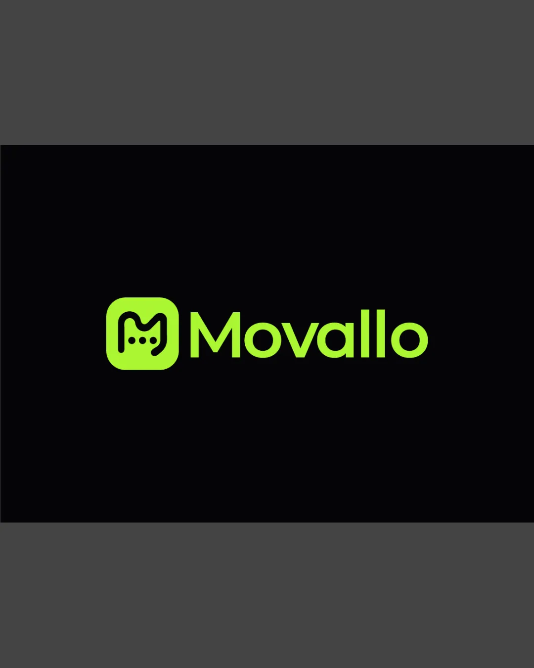
Try it Now!Logo review of Movallo
 Logo analysis by AI
Logo type:
Style:
Detected symbol:
Negative space:
Detected text:
Business industry:
Review requested by Daze2d
**If AI can recognize or misinterpret it, so can people.
Structured logo review
Legibility
Text is highly readable with clean, geometric sans-serif font.
Good contrast between logo and background.
Scalability versatility
Simple icon and wordmark allow it to scale well for digital use like app icons and websites.
Minimal detail means it reproduces cleanly at small sizes.
The three small dots inside the M could become unclear at very small sizes such as on embroidery or small favicons.

200x250 px

100×125 px

50×62 px
Balance alignment
Excellent alignment between logomark and wordmark.
Proportions of icon and text are harmonious and visually balanced.


Originality
Abstract 'M' with messaging motif is thoughtfully customized.
Clever use of negative space for chat bubble.
Rounded square with letterforms is a common trope in tech logos; lacks complete uniqueness.
Logomark wordmark fit
Color, weight, and visual attitude between logomark and wordmark are consistent.
Both elements share a unified design language.
Aesthetic look
Contemporary, youth-oriented color palette and shape.
Clean, uncluttered, and modern aesthetic.
Dual meaning and misinterpretations
Icon is clear and does not resemble inappropriate or unintended imagery.
Color harmony
Well-managed with high-contrast color pairing.
Monochrome lime green keeps it striking and memorable without being overwhelming.
Lime
#A8FF2E
Raisin Black
#111111

