Wondering how your logo performs? 🧐
Get professional logo reviews in seconds and catch design issues in time.
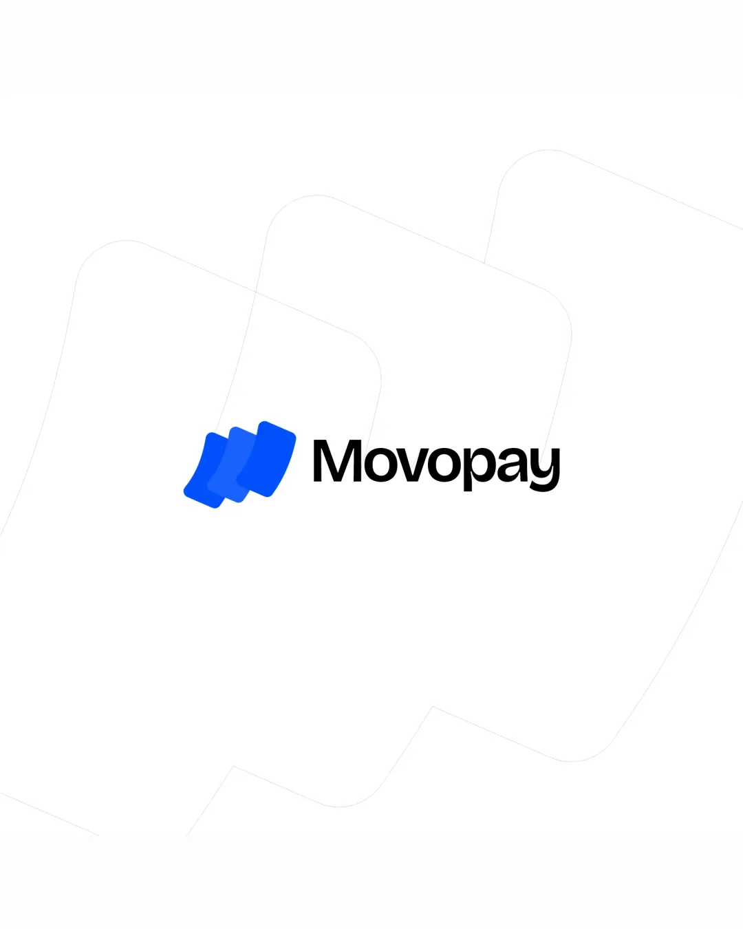
Try it Now!Logo review of Movopay
 Logo analysis by AI
Logo type:
Style:
Detected symbol:
Detected text:
Business industry:
Review requested by Timsilv20
**If AI can recognize or misinterpret it, so can people.
Structured logo review
Legibility
![]() Text is clear and highly readable.
Text is clear and highly readable.![]() Typeface is contemporary with good spacing.
Typeface is contemporary with good spacing.![]() Font weight contrasts well against the background.
Font weight contrasts well against the background.
Scalability versatility
![]() Symbol is simple and retains clarity at small sizes.
Symbol is simple and retains clarity at small sizes.![]() Versatile enough for digital interfaces, app icons, and print materials.
Versatile enough for digital interfaces, app icons, and print materials.
![]() Slight gradient and overlap in the symbol might lose subtlety on very small scale items such as favicons or embroidery.
Slight gradient and overlap in the symbol might lose subtlety on very small scale items such as favicons or embroidery.
200x250 px
100×125 px
50×62 px
Balance alignment
![]() Visual weight between symbol and wordmark is balanced.
Visual weight between symbol and wordmark is balanced.![]() Good alignment between icon and text.
Good alignment between icon and text.

Originality
![]() Abstract card symbol is smartly designed and hints at payment industry.
Abstract card symbol is smartly designed and hints at payment industry.![]() Distinctive layering creates motion and modernity.
Distinctive layering creates motion and modernity.
![]() Layered card motif is becoming increasingly common in fintech, slightly reducing uniqueness.
Layered card motif is becoming increasingly common in fintech, slightly reducing uniqueness.
Logomark wordmark fit
![]() Stylistic unity between symbol and text.
Stylistic unity between symbol and text.![]() Both have a rounded, approachable feel.
Both have a rounded, approachable feel.
Aesthetic look
![]() Minimal, modern look with excellent use of white space.
Minimal, modern look with excellent use of white space.![]() Appealing and well suited to digital-first brands.
Appealing and well suited to digital-first brands.
Dual meaning and misinterpretations
![]() No potential inappropriate or confusing symbolism detected.
No potential inappropriate or confusing symbolism detected.
Color harmony
![]() Limited palette keeps the logo professional and focused.
Limited palette keeps the logo professional and focused.![]() Good contrast between blue symbol and black wordmark.
Good contrast between blue symbol and black wordmark.
Blue
#1668F4
Black
#000000
White
#FFFFFF


