Wondering how your logo performs? 🧐
Get professional logo reviews in seconds and catch design issues in time.
Try it Now!Logo review of Nácar Viajera
 Logo analysis by AI
Logo type:
Style:
Detected symbol:
Detected text:
Business industry:
Review requested by DerekLt
**If AI can recognize or misinterpret it, so can people.
Structured logo review
Legibility
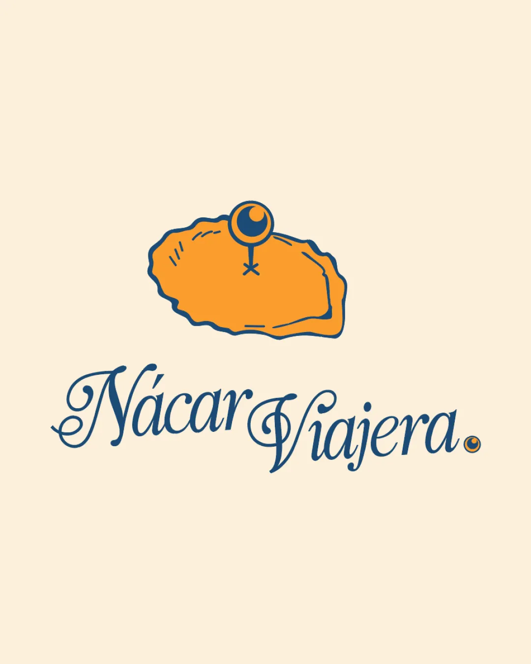
Elegant script font enhances readability.
Distinct separation between words.
Script font may be slightly challenging at smaller sizes.
Scalability versatility
Simple line work ensures clarity on large formats.
Complexity of the symbol might reduce clarity at small sizes.
Script font may lose legibility on extremely small applications.

200x250 px

100×125 px

50×62 px
Balance alignment
Elements feel well integrated and proportionate.
Slight imbalance due to the size contrast between symbol and type.


Originality
Unique combination of oyster shape and location pin.
Creative representation aligns with travel exploration theme.
Symbol could be perceived as somewhat literal.
Aesthetic look
Appealing color palette that is visually pleasing.
Retro style gives a vintage and classy feel.
Dual meaning and misinterpretations
No inappropriate symbols or imagery detected.
Color harmony
Well-coordinated color scheme with strong contrast.


