 View review
Logo score
Logo review ofNas Go!
Review the detailed scores below to see what is working and what should be refined first.
Legibility
Originality
Balance
Scale
Detailed review
Logo performance breakdown
Legibility
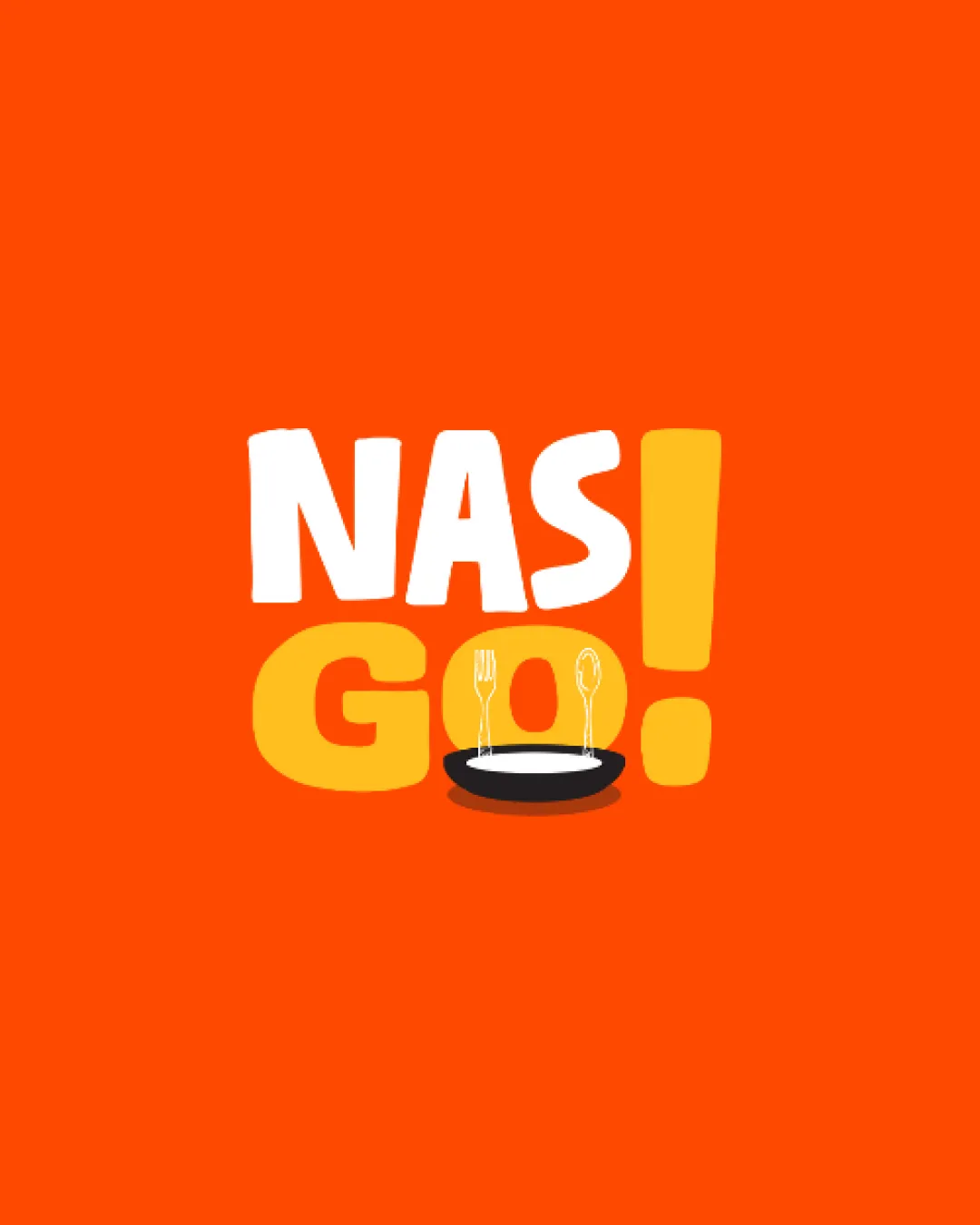
![]() I assume the business name is NAS GO!.
I assume the business name is NAS GO!.![]() Text is bold and clear.
Text is bold and clear.
Originality
![]() Integration of utensils in the symbol is creatively done.
Integration of utensils in the symbol is creatively done.
![]() The use of a plate is somewhat common in the food industry.
The use of a plate is somewhat common in the food industry.
Color harmony
![]() Bright colors enhance visibility and appeal.
Bright colors enhance visibility and appeal.
![]() May limit use in more subdued contexts.
May limit use in more subdued contexts.
Your palette is close. Explore sharper color combinations with Colorfly.design before updating the logo.
Explore palettesBalance alignment
![]() Balanced alignment between text and symbol.
Balanced alignment between text and symbol.

Scalability
![]() Bold design ensures visibility across mediums.
Bold design ensures visibility across mediums.
![]() The smaller details in the symbol might not be clear at very small sizes.
The smaller details in the symbol might not be clear at very small sizes.
200x250 px
100×125 px
50×62 px
Symbol & text fit
![]() Text and symbol fit well together.
Text and symbol fit well together.
Try your own review
Review my logo
Wondering how your logo performs?
Get a clear logo score, key risks, and priority fix ideas before your client or audience sees it.
Keep exploring


