Wondering how your logo performs? 🧐
Get professional logo reviews in seconds and catch design issues in time.
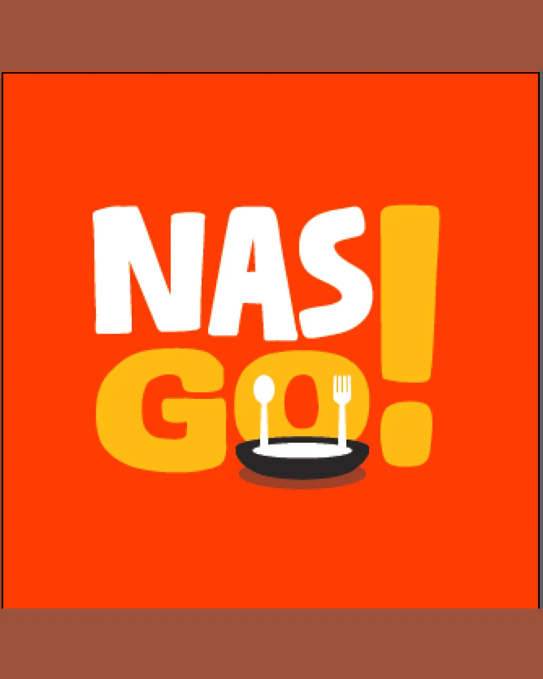
Try it Now!Logo review of NAS GO!
 Logo analysis by AI
Recognized style:
Logo type:
Detected symbol:
Detected text:
Business industry:
Review requested by Kelvinfw
**If AI can recognize or misinterpret it, so can people.
Structured logo review
Legibility
![]() The text is bold and clearly legible.
The text is bold and clearly legible.
Scalability versatility
![]() The design is simple, making it versatile for different sizes.
The design is simple, making it versatile for different sizes.
![]() The details of the spoon and fork might be lost at smaller sizes.
The details of the spoon and fork might be lost at smaller sizes.
200x250 px
100×125 px
50×62 px
Balance alignment
![]() The elements are balanced well across the design.
The elements are balanced well across the design.
![]() The plate could be slightly better aligned with the text.
The plate could be slightly better aligned with the text.

Originality
![]() Unique combination of text and culinary imagery.
Unique combination of text and culinary imagery.
![]() Common elements like plates and utensils reduce some originality.
Common elements like plates and utensils reduce some originality.
Logomark wordmark fit
![]() The text and symbol complement each other effectively.
The text and symbol complement each other effectively.
Aesthetic look
![]() The vibrant colors and playful font give an appealing look.
The vibrant colors and playful font give an appealing look.
Cultural sensitivity dual meaning
![]() No cultural sensitivity issues detected.
No cultural sensitivity issues detected.
Color harmony
![]() The bold colors create a striking presence.
The bold colors create a striking presence.
![]() The contrast might be too intense for some contexts.
The contrast might be too intense for some contexts.


