 View review
Logo score
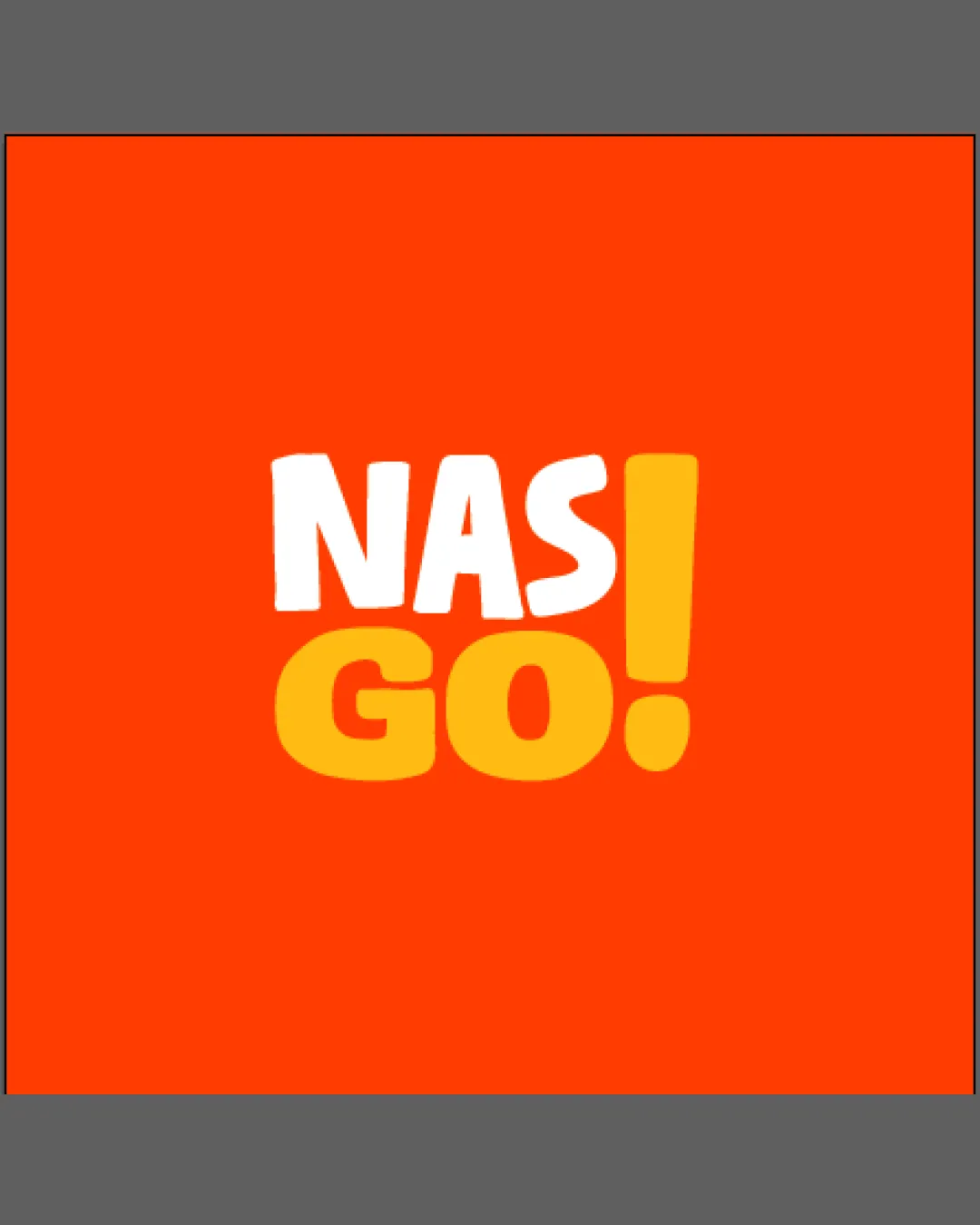
Logo review ofNas Go!
Review the detailed scores below to see what is working and what should be refined first.
Legibility
Originality
Balance
Scale
Detailed review
Logo performance breakdown
Legibility
![]() The text is bold and easily readable against the background.
The text is bold and easily readable against the background.
Originality
![]() The exclamation mark adds a unique touch to the wordmark.
The exclamation mark adds a unique touch to the wordmark.
![]() The use of basic fonts and colors is somewhat standard.
The use of basic fonts and colors is somewhat standard.
Color harmony
![]() The color contrast is effective and eye-catching.
The color contrast is effective and eye-catching.
![]() May not appeal to audiences who prefer subtler color schemes.
May not appeal to audiences who prefer subtler color schemes.
Your palette is close. Explore sharper color combinations with Colorfly.design before updating the logo.
Explore palettesBalance alignment
![]() The words and exclamation mark are well-balanced and aligned.
The words and exclamation mark are well-balanced and aligned.

Scalability
![]() The simple design ensures versatility across various sizes and formats.
The simple design ensures versatility across various sizes and formats.
200x250 px
100×125 px
50×62 px
Try your own review
Review my logo
Wondering how your logo performs?
Get a clear logo score, key risks, and priority fix ideas before your client or audience sees it.
Keep exploring


