Wondering how your logo performs? 🧐
Get professional logo reviews in seconds and catch design issues in time.
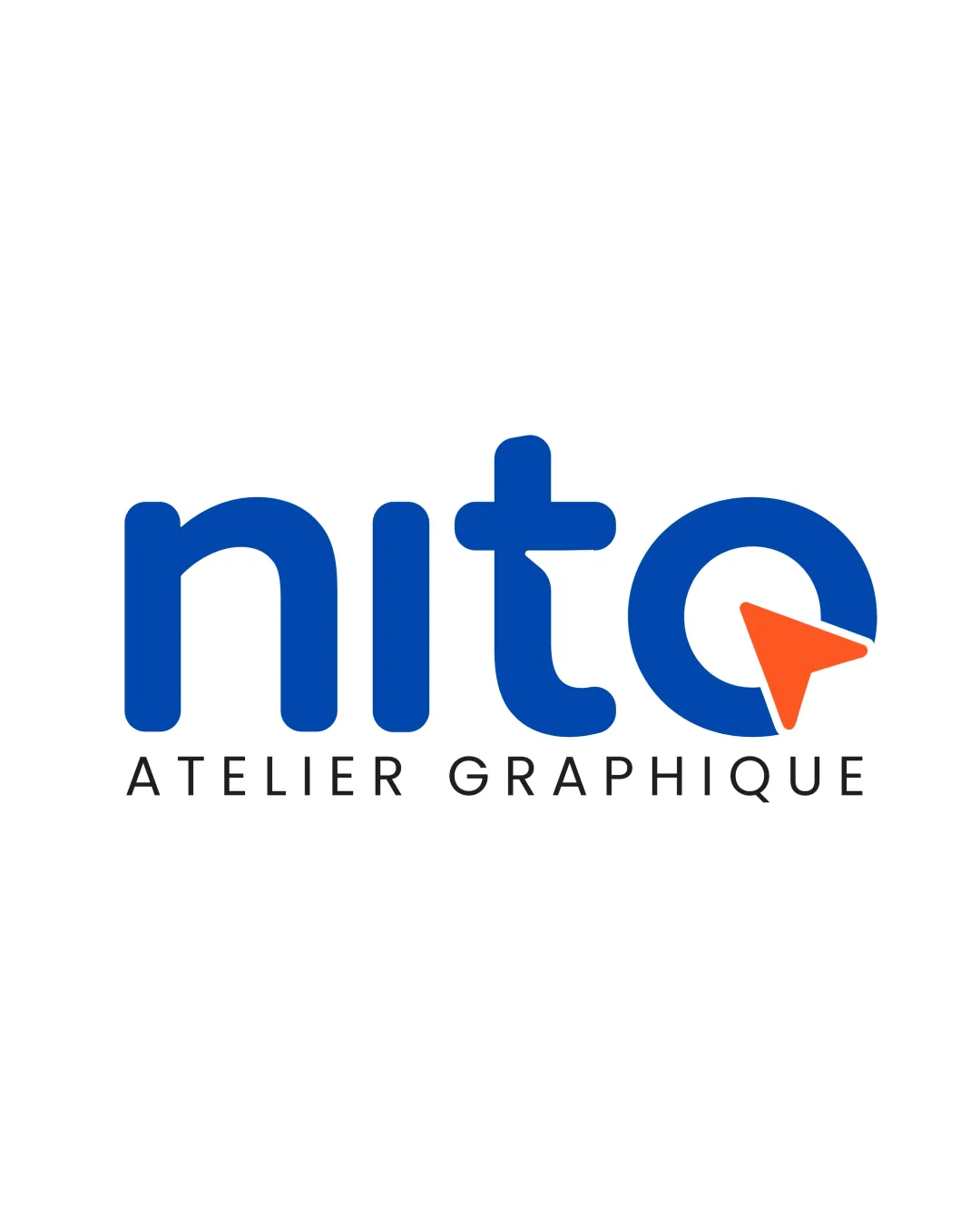
Try it Now!Logo review of nito ATELIER GRAPHIQUE
 Logo analysis by AI
Recognized style:
Logo type:
Detected symbol:
Detected text:
Business industry:
Review requested by Desire
**If AI can recognize or misinterpret it, so can people.
Structured logo review
Legibility
![]() Clear and easy to read, distinct typographical design.
Clear and easy to read, distinct typographical design.
Scalability versatility
![]() Simple design ensures excellent scalability across various mediums.
Simple design ensures excellent scalability across various mediums.
200x250 px
100×125 px
50×62 px
Balance alignment
![]() Well-balanced alignment between text and symbol.
Well-balanced alignment between text and symbol.

Originality
![]() The integration of the arrow in 'o' adds uniqueness.
The integration of the arrow in 'o' adds uniqueness.
![]() The arrow symbol is common in design, slightly affecting originality.
The arrow symbol is common in design, slightly affecting originality.
Logomark wordmark fit
![]() Cohesive integration of the design elements.
Cohesive integration of the design elements.
Aesthetic look
![]() Modern and professional appearance.
Modern and professional appearance.
Cultural sensitivity dual meaning
![]() No cultural sensitivity issues detected.
No cultural sensitivity issues detected.
Color harmony
![]() The use of blue with a contrasting orange creates visual interest.
The use of blue with a contrasting orange creates visual interest.


