Wondering how your logo performs? 🧐
Get professional logo reviews in seconds and catch design issues in time.
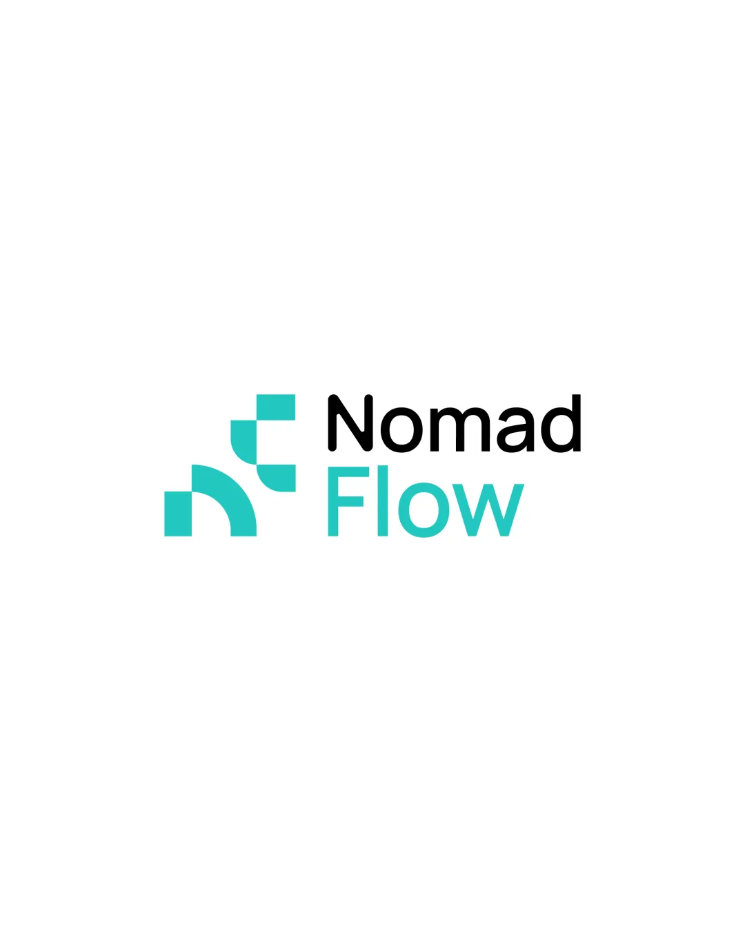
Try it Now!Logo review of Nomad Flow
 Logo analysis by AI
Logo type:
Style:
Detected symbol:
Detected text:
Business industry:
Review requested by Based_w1lly
**If AI can recognize or misinterpret it, so can people.
Structured logo review
Legibility
![]() Text is highly readable due to clear sans-serif font.
Text is highly readable due to clear sans-serif font.![]() Excellent contrast between text and background.
Excellent contrast between text and background.
Scalability versatility
![]() Simple shapes and clean typography scale well to small and large sizes.
Simple shapes and clean typography scale well to small and large sizes.![]() Works on digital screens, business cards, and large signage.
Works on digital screens, business cards, and large signage.
![]() Symbol may lose some impact at extremely small favicon sizes due to low complexity.
Symbol may lose some impact at extremely small favicon sizes due to low complexity.
200x250 px
100×125 px
50×62 px
Balance alignment
![]() Symmetrical arrangement between symbol and wordmark.
Symmetrical arrangement between symbol and wordmark.![]() Well-aligned text and icon, visually harmonious.
Well-aligned text and icon, visually harmonious.
![]() Slight visual weight imbalance: the symbol is compact and dense compared to the more open wordmark, which can cause minor asymmetry.
Slight visual weight imbalance: the symbol is compact and dense compared to the more open wordmark, which can cause minor asymmetry.

Originality
![]() Geometric abstraction offers some unique flair.
Geometric abstraction offers some unique flair.
![]() The style and shapes are reminiscent of many tech and SaaS logos, lacking distinguished uniqueness.
The style and shapes are reminiscent of many tech and SaaS logos, lacking distinguished uniqueness.![]() Similar modular configurations are common in digital/tech branding trends.
Similar modular configurations are common in digital/tech branding trends.
Logomark wordmark fit
![]() Color integration in 'Flow' and icon provides coherence.
Color integration in 'Flow' and icon provides coherence.![]() Modern tone matches between symbol and typeface.
Modern tone matches between symbol and typeface.
![]() The abstract mark feels slightly disconnected from the wordmark's letterforms, and does not visually echo the brand name in any way.
The abstract mark feels slightly disconnected from the wordmark's letterforms, and does not visually echo the brand name in any way.
Aesthetic look
![]() Overall clean, modern, and professional appearance.
Overall clean, modern, and professional appearance.![]() Balanced color distribution and minimalistic geometry.
Balanced color distribution and minimalistic geometry.
![]() The abstraction may come off as generic without a stronger tie to the brand narrative.
The abstraction may come off as generic without a stronger tie to the brand narrative.
Dual meaning and misinterpretations
![]() No inappropriate or misleading symbols detected.
No inappropriate or misleading symbols detected.
Color harmony
![]() Limited palette, strong contemporary color harmony.
Limited palette, strong contemporary color harmony.![]() High contrast ensures good legibility and modern appeal.
High contrast ensures good legibility and modern appeal.
Turquoise
#19CAC7
Black
#000000
White
#FFFFFF


