Wondering how your logo performs? 🧐
Get professional logo reviews in seconds and catch design issues in time.
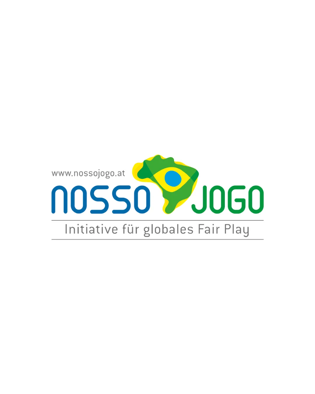
Try it Now!Logo review of NOSSO JOGO
 Logo analysis by AI
Logo type:
Style:
Detected symbol:
Detected text:
Business industry:
Review requested by Sanjaj
**If AI can recognize or misinterpret it, so can people.
Structured logo review
Legibility
![]() Clear and readable text
Clear and readable text![]() Good contrast between text and background
Good contrast between text and background
![]() Slightly busy due to additional text underneath
Slightly busy due to additional text underneath
Scalability versatility
![]() Simple colors enhance scalability
Simple colors enhance scalability
![]() Map detail may be lost at smaller sizes
Map detail may be lost at smaller sizes![]() Additional text may become unreadable when scaled down
Additional text may become unreadable when scaled down
200x250 px
100×125 px
50×62 px
Balance alignment
![]() Good visual balance between text and symbol
Good visual balance between text and symbol
![]() The alignment of additional text may feel slightly disconnected
The alignment of additional text may feel slightly disconnected

Originality
![]() Unique integration of Brazil's map and flag
Unique integration of Brazil's map and flag
![]() Use of national symbols could be considered generic
Use of national symbols could be considered generic
Aesthetic look
![]() Vibrant color scheme
Vibrant color scheme![]() Modern and eye-catching aesthetic
Modern and eye-catching aesthetic
![]() Slightly busy overall appearance
Slightly busy overall appearance
Dual meaning and misinterpretations
![]() No inappropriate symbols or meanings
No inappropriate symbols or meanings
Color harmony
![]() Colors are harmonious and representative
Colors are harmonious and representative
![]() May feel too vibrant if saturation is increased
May feel too vibrant if saturation is increased


