 View review
Logo score
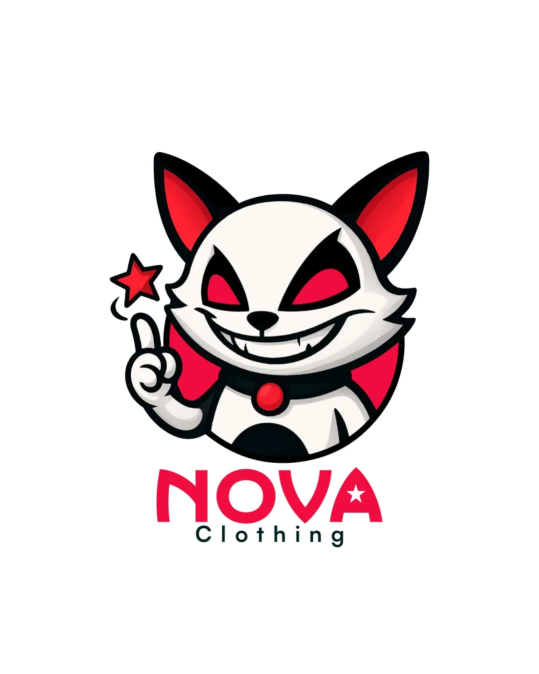
Logo review ofNova Clothing
Review the detailed scores below to see what is working and what should be refined first.
Legibility
Originality
Misread
Balance
Scale
Action plan
What to fix first
The most important fixes to handle before polishing the full presentation.
1
Fix possible misinterpretation
High prioritySharp grin and attitude of the mascot could be misinterpreted as menacing depending on cultural sensitivity.
Impact: High · Effort: Medium
Detailed review
Logo performance breakdown
Legibility
![]() Text 'NOVA' is bold, easy to read, and has strong contrast with the background.
Text 'NOVA' is bold, easy to read, and has strong contrast with the background.![]() 'Clothing' is legible in a simple sans-serif font and well-spaced below the brand name.
'Clothing' is legible in a simple sans-serif font and well-spaced below the brand name.
Originality
![]() Mascot design with mischievous personality and custom star detail is distinctive for a clothing brand.
Mascot design with mischievous personality and custom star detail is distinctive for a clothing brand.![]() Usage of a star inside the 'A' is a subtle, unique touch.
Usage of a star inside the 'A' is a subtle, unique touch.
![]() Mascot character, while lively, relies on common cartoon tropes that could risk feeling generic among streetwear/geekwear mascots.
Mascot character, while lively, relies on common cartoon tropes that could risk feeling generic among streetwear/geekwear mascots.
Color harmony
![]() Limited palette of red, black, and white creates impactful contrast and strong brand presence.
Limited palette of red, black, and white creates impactful contrast and strong brand presence.![]() Colors are harmoniously used between the mascot and text elements.
Colors are harmoniously used between the mascot and text elements.
Rose
#FF2453
White
#FFFFFF
Black
#000000
Rangoon Green
#191C1B
Balance alignment
![]() Mascot and wordmark are centered, creating a strong visual hierarchy.
Mascot and wordmark are centered, creating a strong visual hierarchy.![]() Weight of the mascot correlates with the width of the wordmark, offering an overall balance.
Weight of the mascot correlates with the width of the wordmark, offering an overall balance.
![]() Lower text 'Clothing' is slightly visually disconnected, feeling like an afterthought and less integrated with the energetic mascot above.
Lower text 'Clothing' is slightly visually disconnected, feeling like an afterthought and less integrated with the energetic mascot above.

Scalability
![]() Logo retains clarity at moderate sizes and will work well on apparel hangtags and larger signage.
Logo retains clarity at moderate sizes and will work well on apparel hangtags and larger signage.![]() Bold outlines and limited palette help avoid loss of detail in most print applications.
Bold outlines and limited palette help avoid loss of detail in most print applications.
![]() Thin inner details on the mascot’s mouth, eyes, and star may become illegible at favicon or embroidery scale.
Thin inner details on the mascot’s mouth, eyes, and star may become illegible at favicon or embroidery scale.![]() Mascot complexity and color blending may hinder reproduction on very small promotional items or screen printing.
Mascot complexity and color blending may hinder reproduction on very small promotional items or screen printing.
200x250 px
100×125 px
50×62 px
Misinterpretations
![]() No inappropriate or unintentional negative imagery detected.
No inappropriate or unintentional negative imagery detected.
![]() Sharp grin and attitude of the mascot could be misinterpreted as menacing depending on cultural sensitivity.
Sharp grin and attitude of the mascot could be misinterpreted as menacing depending on cultural sensitivity.
Symbol & text fit
![]() Mascot and logotype stylistically match through similar curves and boldness.
Mascot and logotype stylistically match through similar curves and boldness.
![]() Red color of the mascot is harmonized with the 'NOVA' wordmark.
Red color of the mascot is harmonized with the 'NOVA' wordmark.
Try your own review
Review my logo
Wondering how your logo performs?
Get a clear logo score, key risks, and priority fix ideas before your client or audience sees it.
Keep exploring


