Wondering how your logo performs? 🧐
Get professional logo reviews in seconds and catch design issues in time.
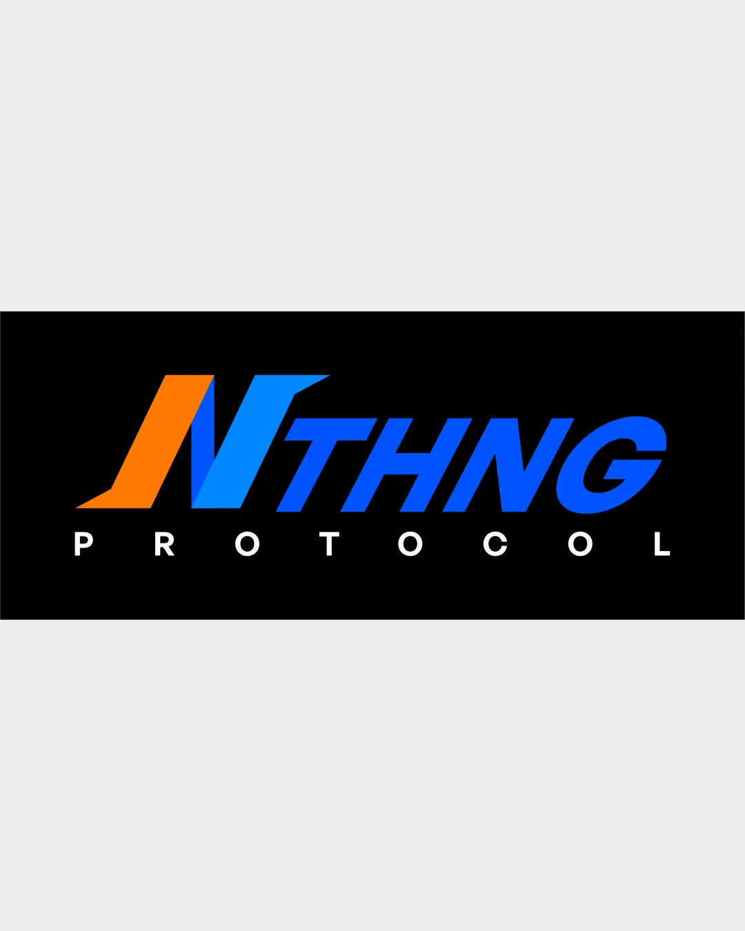
Try it Now!Logo review of NTHNG PROTOCOL
 Logo analysis by AI
Logo type:
Style:
Detected symbol:
Detected text:
Business industry:
Review requested by TomyAlfandi
**If AI can recognize or misinterpret it, so can people.
Structured logo review
Legibility
![]() Main text is clear and easy to read
Main text is clear and easy to read![]() High contrast between text and background
High contrast between text and background
![]() Spacing between 'PROTOCOL' letters is excessive, slightly impacting readability
Spacing between 'PROTOCOL' letters is excessive, slightly impacting readability![]() 'N' stylization could be misread as two shapes at first glance
'N' stylization could be misread as two shapes at first glance
Scalability versatility
![]() Bold forms offer decent reduction capability
Bold forms offer decent reduction capability![]() Works well on digital platforms and banners
Works well on digital platforms and banners
![]() Gradient and color transitions on 'N' may not render well at small sizes or monochrome prints
Gradient and color transitions on 'N' may not render well at small sizes or monochrome prints![]() Excessive width may complicate use on square/circular icons or embroidery
Excessive width may complicate use on square/circular icons or embroidery
200x250 px
100×125 px
50×62 px
Balance alignment
![]() Letter sizes are generally consistent
Letter sizes are generally consistent![]() Overall alignment is visually centered
Overall alignment is visually centered
![]() The dramatically slanted N creates a left-heavy feel
The dramatically slanted N creates a left-heavy feel![]() Visual tension between the negative (orange) and positive (blue) space around the N
Visual tension between the negative (orange) and positive (blue) space around the N

Originality
![]() Stylized N introduces some distinctiveness
Stylized N introduces some distinctiveness![]() Dynamic use of color blending
Dynamic use of color blending
![]() Wordmark formula and font choices are fairly familiar; doesn't feel groundbreaking
Wordmark formula and font choices are fairly familiar; doesn't feel groundbreaking![]() Gradient N approach is seen in many tech logos, reducing originality
Gradient N approach is seen in many tech logos, reducing originality
Logomark wordmark fit
![]() Stylized N is integrated into the wordmark, not an afterthought
Stylized N is integrated into the wordmark, not an afterthought![]() Font choices match in style and line weight
Font choices match in style and line weight
![]() Visual weight of N overshadows the rest of the wordmark slightly
Visual weight of N overshadows the rest of the wordmark slightly![]() Gradient style limited to N, causing some inconsistency with the rest
Gradient style limited to N, causing some inconsistency with the rest
Aesthetic look
![]() Strong color palette and pleasing modern aesthetic
Strong color palette and pleasing modern aesthetic![]() Clean, sleek appearance in alignment with technology trends
Clean, sleek appearance in alignment with technology trends
![]() Gradient feels trendy; risks rapid dating
Gradient feels trendy; risks rapid dating![]() Some crowding among right-side characters (THNG)
Some crowding among right-side characters (THNG)
Dual meaning and misinterpretations
![]() No inappropriate or confusing imagery detected
No inappropriate or confusing imagery detected
Color harmony
![]() Limited palette with effective contrast
Limited palette with effective contrast![]() Colors are vibrant without overwhelming the design
Colors are vibrant without overwhelming the design
![]() Use of both a hot and a cool gradient on a single letter feels visually busy
Use of both a hot and a cool gradient on a single letter feels visually busy![]() Possible clashing between orange and blue in certain applications or prints
Possible clashing between orange and blue in certain applications or prints
Orange
#FF9100
Blue
#2196F3
Black
#000000
White
#FFFFFF


