 View review
Logo score
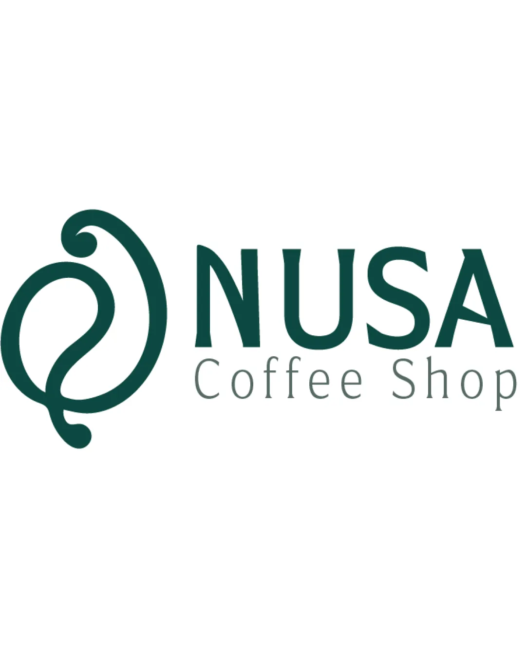
Logo review ofNusa Coffee Shop
Review the detailed scores below to see what is working and what should be refined first.
Legibility
Originality
Misread
Balance
Scale
Detailed review
Logo performance breakdown
Legibility
![]() Primary text 'NUSA' is bold and easily readable, conveying a modern look.
Primary text 'NUSA' is bold and easily readable, conveying a modern look.![]() Subtext 'Coffee Shop' is legible in a lighter gray, offering distinguishable hierarchy without visual clutter.
Subtext 'Coffee Shop' is legible in a lighter gray, offering distinguishable hierarchy without visual clutter.
![]() The lighter subtext may lose visibility on bright backgrounds or at smaller sizes.
The lighter subtext may lose visibility on bright backgrounds or at smaller sizes.![]() Minor kerning inconsistency between letters could be slightly refined.
Minor kerning inconsistency between letters could be slightly refined.
Originality
![]() Logomark hints at both a coffee bean and a leaf, tying together coffee and organic/natural qualities in a visually creative way.
Logomark hints at both a coffee bean and a leaf, tying together coffee and organic/natural qualities in a visually creative way.
![]() Swirling organic shapes are somewhat common in the coffee and health food sector—could use a deeper, unique twist to be truly iconic.
Swirling organic shapes are somewhat common in the coffee and health food sector—could use a deeper, unique twist to be truly iconic.
Color harmony
![]() Single dominant shade of green ensures visual cohesion and brand consistency.
Single dominant shade of green ensures visual cohesion and brand consistency.![]() High legibility contrast against a white background.
High legibility contrast against a white background.
Evening Sea
#184940
White
#FFFFFF
Balance alignment
![]() Good proportional relationship between the symbol and the wordmark.
Good proportional relationship between the symbol and the wordmark.![]() Overall horizontal balance is visually appealing, with the symbol sitting well alongside the strong type.
Overall horizontal balance is visually appealing, with the symbol sitting well alongside the strong type.
![]() The organic curve of the symbol slightly overpowers the typographic elements, especially due to its visual weight on the left.
The organic curve of the symbol slightly overpowers the typographic elements, especially due to its visual weight on the left.

Scalability
![]() Simple, single-color design ensures clarity when scaled down.
Simple, single-color design ensures clarity when scaled down.![]() The symbol and wordmark are both distinguishable at various sizes, suitable for business cards, cup sleeves, and digital icons.
The symbol and wordmark are both distinguishable at various sizes, suitable for business cards, cup sleeves, and digital icons.
![]() Fine curves in the logomark may lose definition when embroidered or used at extreme micro-sizes (favicons, small merchandise pins).
Fine curves in the logomark may lose definition when embroidered or used at extreme micro-sizes (favicons, small merchandise pins).
200x250 px
100×125 px
50×62 px
Misinterpretations
![]() No inappropriate or misleading imagery detected. The symbol is abstract yet relatable to the coffee/organic theme.
No inappropriate or misleading imagery detected. The symbol is abstract yet relatable to the coffee/organic theme.
Symbol & text fit
![]() The rounded logomark style complements the smooth curves in the wordmark.
The rounded logomark style complements the smooth curves in the wordmark.
![]() Slight size disparity; the logomark could be reduced by 10–15% to harmonize better with the text.
Slight size disparity; the logomark could be reduced by 10–15% to harmonize better with the text.
Try your own review
Review my logo
Wondering how your logo performs?
Get a clear logo score, key risks, and priority fix ideas before your client or audience sees it.
Keep exploring


