Wondering how your logo performs? 🧐
Get professional logo reviews in seconds and catch design issues in time.
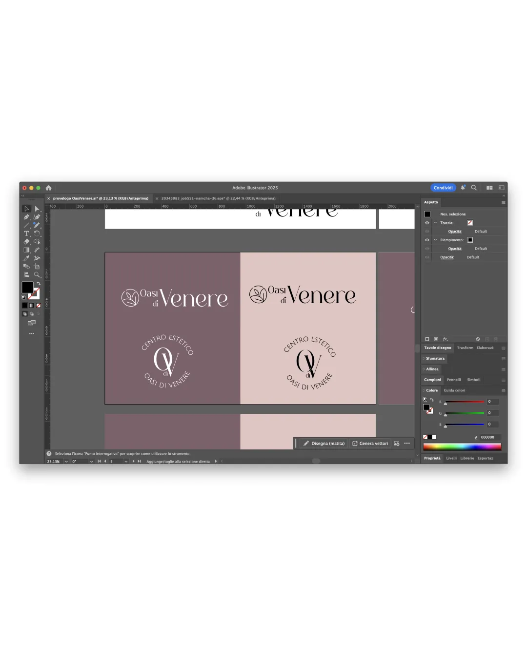
Try it Now!Logo review of Oasi di Venere, CENTRO ESTETICO
 Logo analysis by AI
Logo type:
Style:
Detected symbol:
Negative space:
Detected text:
Business industry:
Review requested by Elisa989898
**If AI can recognize or misinterpret it, so can people.
Structured logo review
Legibility
![]() Serif font is elegant and easy to read in larger contexts.
Serif font is elegant and easy to read in larger contexts.![]() Good contrast between type and background.
Good contrast between type and background.
![]() Thin lines in 'di' and secondary text could lose clarity at small sizes.
Thin lines in 'di' and secondary text could lose clarity at small sizes.![]() Overlapping elements in the monogram may reduce immediate readability.
Overlapping elements in the monogram may reduce immediate readability.
Scalability versatility
![]() Minimalist mark translates well for print and digital use.
Minimalist mark translates well for print and digital use.![]() Logo works in single color scenarios (e.g., embroidery, stamps).
Logo works in single color scenarios (e.g., embroidery, stamps).
![]() Fine lines in the leaf/venus symbol and thin fonts might be lost on very small applications (labels, favicon, pen engraving).
Fine lines in the leaf/venus symbol and thin fonts might be lost on very small applications (labels, favicon, pen engraving).![]() Circular lockup and thin strokes may not hold up on textured surfaces like uniforms or embossed items.
Circular lockup and thin strokes may not hold up on textured surfaces like uniforms or embossed items.
200x250 px
100×125 px
50×62 px
Balance alignment
![]() Text and symbol are aligned elegantly in horizontal and stacked versions.
Text and symbol are aligned elegantly in horizontal and stacked versions.![]() Consistent negative space allocation between symbol and wordmark.
Consistent negative space allocation between symbol and wordmark.
![]() The 'Oasi di' text feels slightly lightweight compared to 'Venere', creating a mild imbalance.
The 'Oasi di' text feels slightly lightweight compared to 'Venere', creating a mild imbalance.![]() Monogram may overpower lighter secondary text in some variants.
Monogram may overpower lighter secondary text in some variants.

Originality
![]() Abstract 'Venus' motif ties nicely into the beauty/esthetic theme.
Abstract 'Venus' motif ties nicely into the beauty/esthetic theme.![]() Monogram and symbol combination is largely distinctive.
Monogram and symbol combination is largely distinctive.
![]() Leaf and feminine silhouette concepts are popular in the beauty industry and risk feeling generic.
Leaf and feminine silhouette concepts are popular in the beauty industry and risk feeling generic.![]() No highly unique twist in letterforms or symbol to set it further apart.
No highly unique twist in letterforms or symbol to set it further apart.
Logomark wordmark fit
![]() The organic flow of the symbol fits aesthetically with the serif font.
The organic flow of the symbol fits aesthetically with the serif font.![]() Both elements communicate elegance and femininity.
Both elements communicate elegance and femininity.
![]() Monogram may be bolder than the very light secondary lines, which causes slight visual tension.
Monogram may be bolder than the very light secondary lines, which causes slight visual tension.![]() Slight stylistic disconnect between geometric O/V and flowing script.
Slight stylistic disconnect between geometric O/V and flowing script.
Aesthetic look
![]() Minimalist line art feels modern and appeals to upscale clientele.
Minimalist line art feels modern and appeals to upscale clientele.![]() Color palette is harmonious and soothing, fitting the beauty sector.
Color palette is harmonious and soothing, fitting the beauty sector.
![]() Design is safe and lacks a truly memorable or bold element.
Design is safe and lacks a truly memorable or bold element.![]() May blend in with other beauty/wellness brands due to overused symbolography.
May blend in with other beauty/wellness brands due to overused symbolography.
Dual meaning and misinterpretations
![]() No unintentional or inappropriate symbols detected.
No unintentional or inappropriate symbols detected.![]() Abstract symbols stay tasteful and professional.
Abstract symbols stay tasteful and professional.
Color harmony
![]() Muted and limited palette exudes sophistication.
Muted and limited palette exudes sophistication.![]() Colors support the elegant, spa-like mood without overwhelming.
Colors support the elegant, spa-like mood without overwhelming.
Careys Pink
#B59698
Pale Pink
#E6D0CC
Old Lavender
#736069
White
#FFFFFF
Black
#000000


