Wondering how your logo performs? 🧐
Get professional logo reviews in seconds and catch design issues in time.
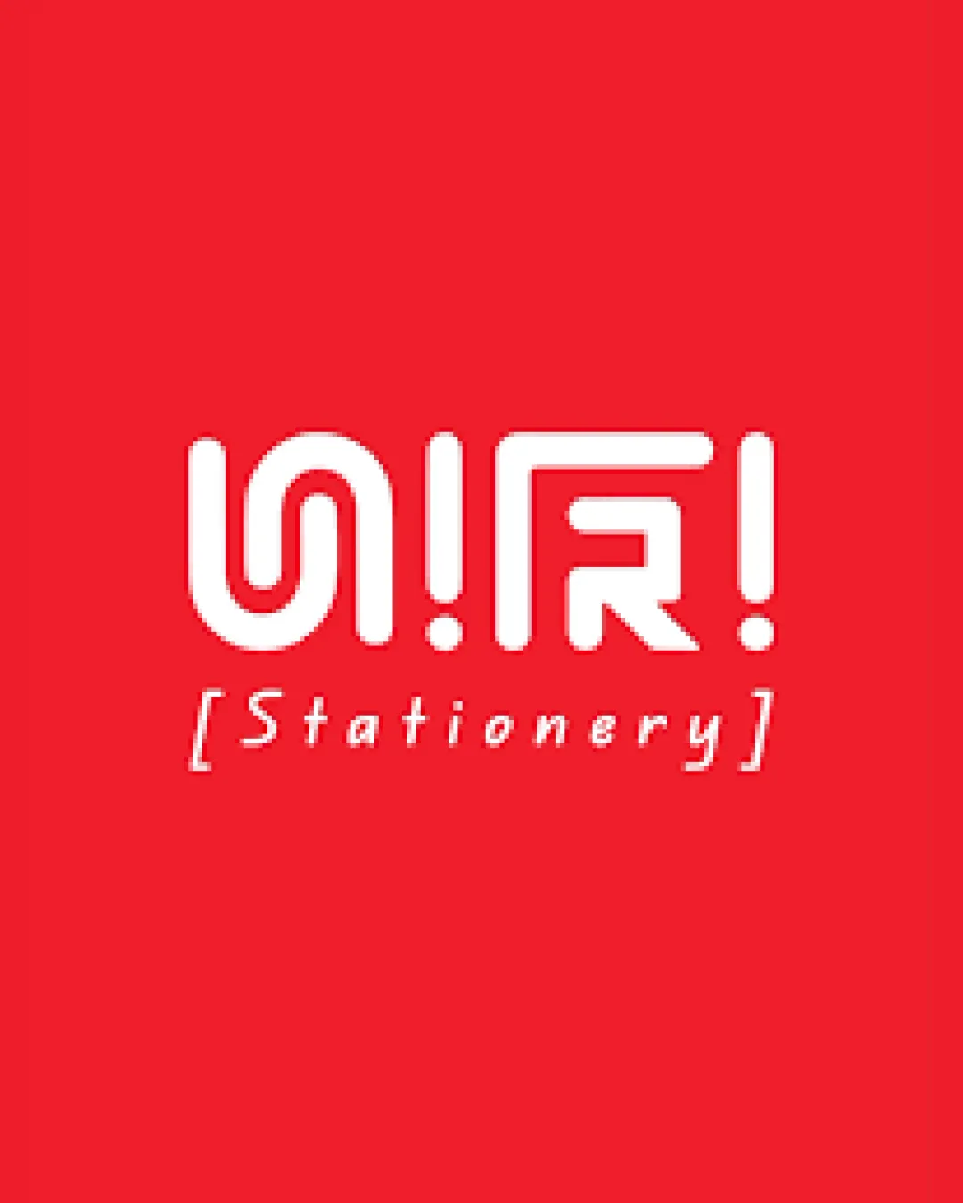
Try it Now!Logo review of ON!R! [Stationery]
 Logo analysis by AI
Logo type:
Style:
Detected symbol:
Detected text:
Business industry:
Review requested by Shahin
**If AI can recognize or misinterpret it, so can people.
Structured logo review
Legibility
![]() Contrasting colors between text and background improve visibility.
Contrasting colors between text and background improve visibility.![]() Simple uppercase letters enhance recognition.
Simple uppercase letters enhance recognition.
![]() Primary text is very difficult to read on first glance; the stylization makes the letters ambiguous.
Primary text is very difficult to read on first glance; the stylization makes the letters ambiguous.![]() Exclamation marks used as separators may confuse readers further.
Exclamation marks used as separators may confuse readers further.![]() Letter 'N' is nearly unrecognizable and could easily be mistaken for another character.
Letter 'N' is nearly unrecognizable and could easily be mistaken for another character.![]() Secondary text 'Stationery' is much clearer, but its disconnected style doesn't help the main mark.
Secondary text 'Stationery' is much clearer, but its disconnected style doesn't help the main mark.
Scalability versatility
![]() Bold, thick strokes will reproduce well in most sizes.
Bold, thick strokes will reproduce well in most sizes.![]() Logo can be adapted to simple horizontal or vertical lockups.
Logo can be adapted to simple horizontal or vertical lockups.
![]() Small-scale uses (like favicons or pen imprints) may cause the stylized word to merge and lose clarity.
Small-scale uses (like favicons or pen imprints) may cause the stylized word to merge and lose clarity.![]() Fine spacing between elements may blend together when scaled down.
Fine spacing between elements may blend together when scaled down.
200x250 px
100×125 px
50×62 px
Balance alignment
![]() Strong visual weight across the wordmark provides unity.
Strong visual weight across the wordmark provides unity.![]() Centered alignment with supporting text feels intentional.
Centered alignment with supporting text feels intentional.
![]() Punctuation marks at the end add visual heaviness that makes the composition feel slightly off-balance.
Punctuation marks at the end add visual heaviness that makes the composition feel slightly off-balance.![]() Negative space between characters is inconsistent.
Negative space between characters is inconsistent.

Originality
![]() Innovative use of typographic and geometric forms.
Innovative use of typographic and geometric forms.![]() Distinctive and memorable approach for the sector.
Distinctive and memorable approach for the sector.
![]() Over-stylized characters compromise utility; uniqueness comes at the cost of legibility.
Over-stylized characters compromise utility; uniqueness comes at the cost of legibility.![]() Exclamation points as design elements are not wholly original, though their execution is unique here.
Exclamation points as design elements are not wholly original, though their execution is unique here.
Logomark wordmark fit
![]() Supporting word 'Stationery' provides necessary context.
Supporting word 'Stationery' provides necessary context.
![]() Disconnect in style and spacing between the primary custom word and the serif subtext.
Disconnect in style and spacing between the primary custom word and the serif subtext.![]() Visual hierarchy between the two elements is awkward, leading to tension.
Visual hierarchy between the two elements is awkward, leading to tension.
Aesthetic look
![]() Modern and dynamic aesthetic creates energy.
Modern and dynamic aesthetic creates energy.![]() Color palette is eye-catching and bold.
Color palette is eye-catching and bold.
![]() The main shape feels busy and slightly forced.
The main shape feels busy and slightly forced.![]() Abundance of exclamation marks and geometric styling make the logo cluttered.
Abundance of exclamation marks and geometric styling make the logo cluttered.![]() Does not exude the simplicity often expected in premium stationery branding.
Does not exude the simplicity often expected in premium stationery branding.
Dual meaning and misinterpretations
![]() No obvious negative or inappropriate double meanings detected.
No obvious negative or inappropriate double meanings detected.
Color harmony
![]() Red and white provide excellent contrast.
Red and white provide excellent contrast.![]() Limited palette keeps the focus on the logo form.
Limited palette keeps the focus on the logo form.
Red
#ED1C24
White
#FFFFFF


