Wondering how your logo performs? 🧐
Get professional logo reviews in seconds and catch design issues in time.
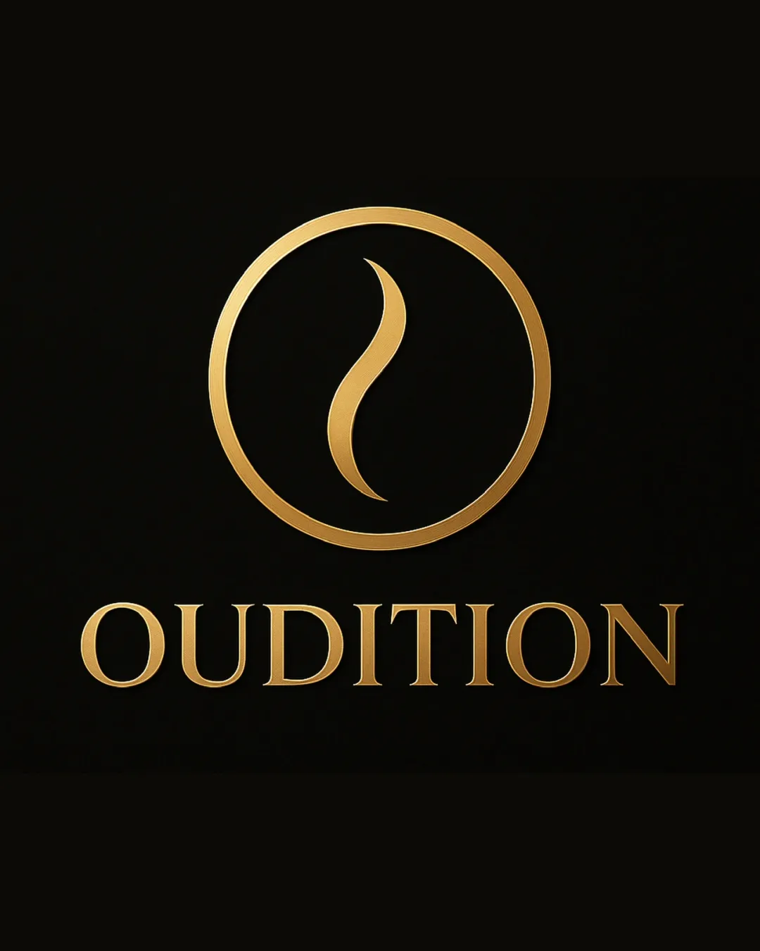
Try it Now!Logo review of OUDITION
 Logo analysis by AI
Logo type:
Style:
Detected symbol:
Detected text:
Business industry:
Review requested by Har28
**If AI can recognize or misinterpret it, so can people.
Structured logo review
Legibility
![]() The serif typeface is highly legible and sharp.
The serif typeface is highly legible and sharp.![]() Excellent contrast between gold text and the dark background.
Excellent contrast between gold text and the dark background.
Scalability versatility
![]() Mark and wordmark are clean and simple, enabling good scalability across large and medium media (e.g., packaging, print ads, billboards).
Mark and wordmark are clean and simple, enabling good scalability across large and medium media (e.g., packaging, print ads, billboards).![]() Could work in monochrome for simple applications.
Could work in monochrome for simple applications.
![]() Gold gradient may lose visual impact or legibility in very small sizes or single-color printing, such as on business cards or embroidery.
Gold gradient may lose visual impact or legibility in very small sizes or single-color printing, such as on business cards or embroidery.![]() Thin curves in the symbol might blur or disappear at small scales.
Thin curves in the symbol might blur or disappear at small scales.
200x250 px
100×125 px
50×62 px
Balance alignment
![]() Strong visual balance between symbol and wordmark.
Strong visual balance between symbol and wordmark.![]() Circular mark is well centered above the text for a harmonious, unified look.
Circular mark is well centered above the text for a harmonious, unified look.

Originality
![]() Abstract symbol hints at fragrance or oud with an elegant twist.
Abstract symbol hints at fragrance or oud with an elegant twist.![]() Use of a single refined symbol distinguishes the brand from generic industry icons.
Use of a single refined symbol distinguishes the brand from generic industry icons.
![]() Flame- or scent-trail style mark is somewhat common among luxury fragrance or scent-based brands; the idea is not entirely unique.
Flame- or scent-trail style mark is somewhat common among luxury fragrance or scent-based brands; the idea is not entirely unique.
Logomark wordmark fit
![]() Gold gradient effect is consistent between mark and text, maintaining stylistic unity.
Gold gradient effect is consistent between mark and text, maintaining stylistic unity.![]() Both symbol and logotype feel premium and high-end.
Both symbol and logotype feel premium and high-end.
Aesthetic look
![]() Sophisticated, upscale, and minimal aesthetic.
Sophisticated, upscale, and minimal aesthetic.![]() Elegant gold gradient fits luxury/fragrance industry norms.
Elegant gold gradient fits luxury/fragrance industry norms.
Dual meaning and misinterpretations
![]() No inappropriate dual meanings detected; symbol is abstract but not ambiguous or problematic.
No inappropriate dual meanings detected; symbol is abstract but not ambiguous or problematic.
Color harmony
![]() Gold-on-black creates a timeless, luxurious impression.
Gold-on-black creates a timeless, luxurious impression.![]() Consistent use of gold gradient for both elements promotes harmony.
Consistent use of gold gradient for both elements promotes harmony.
Teak
#B7996E
Karaka
#1E1302


