Wondering how your logo performs? 🧐
Get professional logo reviews in seconds and catch design issues in time.
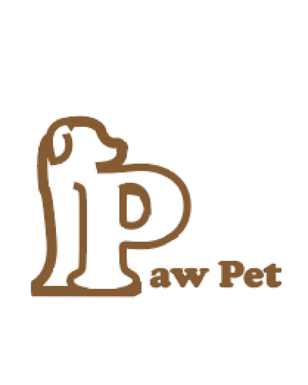
Try it Now!Logo review of Paw Pet
 Logo analysis by AI
Logo type:
Style:
Detected symbol:
Negative space:
Detected text:
Business industry:
Review requested by Madhvi_712
**If AI can recognize or misinterpret it, so can people.
Structured logo review
Legibility
![]() Text is clear and readable in both small and large formats
Text is clear and readable in both small and large formats![]() Font weight maintains good contrast against background
Font weight maintains good contrast against background
Scalability versatility
![]() Simple linework enhances adaptability to multiple formats including business cards and product labels
Simple linework enhances adaptability to multiple formats including business cards and product labels
![]() Very thin outline may lose visibility in extremely small applications such as embroidery or favicons
Very thin outline may lose visibility in extremely small applications such as embroidery or favicons![]() May not be prominent enough on busy or colored backgrounds
May not be prominent enough on busy or colored backgrounds
200x250 px
100×125 px
50×62 px
Balance alignment
![]() The P and dog outline are visually cohesive and unified
The P and dog outline are visually cohesive and unified
![]() The logomark is significantly larger and dominates the wordmark, making the text feel secondary
The logomark is significantly larger and dominates the wordmark, making the text feel secondary![]() Alignment between the logomark and wordmark is slightly off—'P' overshadows the rest of the text
Alignment between the logomark and wordmark is slightly off—'P' overshadows the rest of the text

Originality
![]() Creative integration of a dog silhouette into the letter P enhances brand recall
Creative integration of a dog silhouette into the letter P enhances brand recall![]() Appropriate and relevant to industry
Appropriate and relevant to industry
![]() Animal outlines combined with letterforms are fairly common in the pet industry
Animal outlines combined with letterforms are fairly common in the pet industry
Logomark wordmark fit
![]() Both logomark and wordmark use similar line thickness, providing some visual harmony
Both logomark and wordmark use similar line thickness, providing some visual harmony
![]() Logomark size and playful style feel slightly misaligned with the strong, blocky serif wordmark
Logomark size and playful style feel slightly misaligned with the strong, blocky serif wordmark![]() Hierarchy feels skewed toward the symbol, diminishing the wordmark’s importance
Hierarchy feels skewed toward the symbol, diminishing the wordmark’s importance
Aesthetic look
![]() Playful, friendly appearance suits the pet industry
Playful, friendly appearance suits the pet industry![]() Minimal color usage keeps the design clean
Minimal color usage keeps the design clean
![]() Outline could be smoother and more refined to enhance professionalism
Outline could be smoother and more refined to enhance professionalism
Dual meaning and misinterpretations
![]() Dog silhouette and letter P are immediately recognizable and do not suggest anything inappropriate
Dog silhouette and letter P are immediately recognizable and do not suggest anything inappropriate
Color harmony
![]() Single warm color is cohesive and well-suited for the industry
Single warm color is cohesive and well-suited for the industry![]() Contrast with the white background is excellent
Contrast with the white background is excellent
Brown
#8B5A2B
White
#FFFFFF


