Wondering how your logo performs? 🧐
Get professional logo reviews in seconds and catch design issues in time.
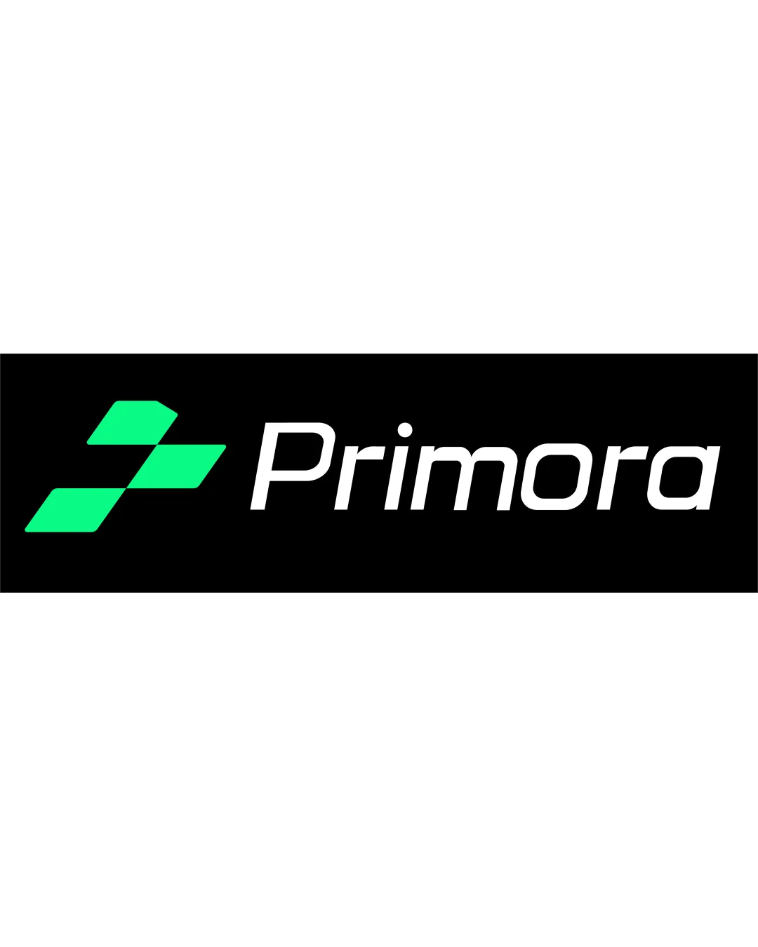
Try it Now!Logo review of Primora
 Logo analysis by AI
Logo type:
Style:
Detected symbol:
Detected text:
Business industry:
Review requested by Vinn012
**If AI can recognize or misinterpret it, so can people.
Structured logo review
Legibility
![]() Text is clear and easy to read due to its sans-serif, italicized font choice.
Text is clear and easy to read due to its sans-serif, italicized font choice.![]() Good contrast between white text and black background enhances readability.
Good contrast between white text and black background enhances readability.
![]() Letter spacing is slightly tight, especially between the 'm' and 'o', which could affect legibility at very small sizes.
Letter spacing is slightly tight, especially between the 'm' and 'o', which could affect legibility at very small sizes.![]() The italicized nature may reduce readability in rapid-glance scenarios.
The italicized nature may reduce readability in rapid-glance scenarios.
Scalability versatility
![]() Simple geometric logomark ensures clarity at small sizes and works well for digital icons and app buttons.
Simple geometric logomark ensures clarity at small sizes and works well for digital icons and app buttons.![]() High-contrast design supports printing on most media including billboards and packaging.
High-contrast design supports printing on most media including billboards and packaging.
![]() Thinness of the wordmark may present challenges for embroidery or very compact print applications.
Thinness of the wordmark may present challenges for embroidery or very compact print applications.![]() May lose impact if the logomark or text is used alone without the other.
May lose impact if the logomark or text is used alone without the other.
200x250 px
100×125 px
50×62 px
Balance alignment
![]() Symmetrical logomark and left alignment with wordmark create a harmonious, balanced composition.
Symmetrical logomark and left alignment with wordmark create a harmonious, balanced composition.![]() Proper spacing between logomark and wordmark contributes to visual balance.
Proper spacing between logomark and wordmark contributes to visual balance.

Originality
![]() Abstract, geometric logomark is modern and visually dynamic.
Abstract, geometric logomark is modern and visually dynamic.
![]() Arrow/checkmark motifs are common in technology and startup branding, making the symbol feel somewhat generic.
Arrow/checkmark motifs are common in technology and startup branding, making the symbol feel somewhat generic.![]() No unique typographic treatment of the wordmark limits distinctiveness.
No unique typographic treatment of the wordmark limits distinctiveness.
Logomark wordmark fit
![]() Both the logomark and wordmark have a modern, streamlined feel, supporting strong brand cohesion.
Both the logomark and wordmark have a modern, streamlined feel, supporting strong brand cohesion.![]() Visual weight distribution between symbol and type is well-balanced.
Visual weight distribution between symbol and type is well-balanced.
Aesthetic look
![]() Clean, minimal aesthetic is visually appealing and on-trend for the tech industry.
Clean, minimal aesthetic is visually appealing and on-trend for the tech industry.![]() Limited color palette adds to the modern look.
Limited color palette adds to the modern look.
![]() Use of commonly seen geometric forms lessens overall brand memorability.
Use of commonly seen geometric forms lessens overall brand memorability.
Dual meaning and misinterpretations
![]() No inappropriate or confusing secondary imagery present in the symbol.
No inappropriate or confusing secondary imagery present in the symbol.
Color harmony
![]() The green and black/white combination is clean and visually pleasing.
The green and black/white combination is clean and visually pleasing.![]() Efficient use of only two primary colors prevents visual clutter.
Efficient use of only two primary colors prevents visual clutter.
Medium
#21EBA6
Black
#000000
White
#FFFFFF


