 View review
Logo score
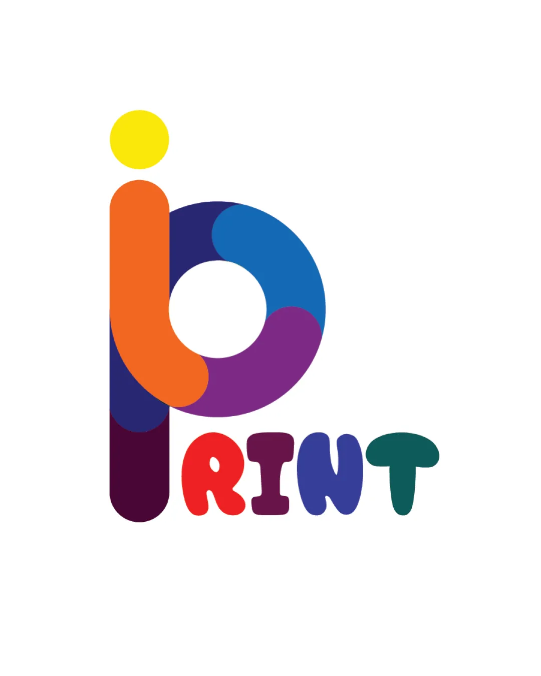
Logo review ofPrint
Review the detailed scores below to see what is working and what should be refined first.
Legibility
Originality
Misread
Balance
Scale
Detailed review
Logo performance breakdown
Legibility
![]() The word 'PRINT' is clear and reasonably easy to read.
The word 'PRINT' is clear and reasonably easy to read.![]() Font choice is playful and matches the industry.
Font choice is playful and matches the industry.
![]() Some letters in 'PRINT' are slightly uneven in visual weight, which may affect legibility at a distance or at small sizes.
Some letters in 'PRINT' are slightly uneven in visual weight, which may affect legibility at a distance or at small sizes.![]() Multicolor approach can slightly reduce clarity on certain backgrounds.
Multicolor approach can slightly reduce clarity on certain backgrounds.
Originality
![]() The monogram combination with bold playful color scheme is engaging.
The monogram combination with bold playful color scheme is engaging.![]() Letter fusion to create a mark is creative.
Letter fusion to create a mark is creative.
![]() Using multicolored, circular/rounded monograms is a common theme in print industry branding.
Using multicolored, circular/rounded monograms is a common theme in print industry branding.![]() Minor risk of looking generic among other print company logos unless further customized.
Minor risk of looking generic among other print company logos unless further customized.
Color harmony
![]() Vivid palette conveys energy and creativity relevant to print.
Vivid palette conveys energy and creativity relevant to print.![]() Good use of color diversity for the industry sector.
Good use of color diversity for the industry sector.
![]() Color count is somewhat high; can hinder adaptability and brand recall.
Color count is somewhat high; can hinder adaptability and brand recall.![]() Too many strong hues may clash in non-white or complex backdrops.
Too many strong hues may clash in non-white or complex backdrops.
Yellow
#FFD600
Orange
#FF671F
Dark Purple
#61356B
Blue
#0076B6
Purple
#7C2E8E
Red
#ED1C24
Green
#273E3F
Color may be holding this logo back. Explore stronger palette options with Colorfly.design before updating the logo.
Explore palettesBalance alignment
![]() Vertical alignment between logomark and the wordmark is decent.
Vertical alignment between logomark and the wordmark is decent.![]() Overall symmetry between the monogram parts.
Overall symmetry between the monogram parts.
![]() The varying letter widths of 'PRINT' create slight imbalance versus the monogram.
The varying letter widths of 'PRINT' create slight imbalance versus the monogram.![]() The yellow dot (i) appears visually heavy and could be better anchored.
The yellow dot (i) appears visually heavy and could be better anchored.

Scalability
![]() The overall shapes are bold, which generally supports scalability.
The overall shapes are bold, which generally supports scalability.![]() The mark is recognizable at medium to large sizes (posters, storefronts).
The mark is recognizable at medium to large sizes (posters, storefronts).
![]() Multiple colors and gradients can lose impact or become unprintable in small formats (stickers, embroidery, favicons).
Multiple colors and gradients can lose impact or become unprintable in small formats (stickers, embroidery, favicons).![]() Fine internal spacing within the monogram may fill in at smaller sizes.
Fine internal spacing within the monogram may fill in at smaller sizes.
200x250 px
100×125 px
50×62 px
Misinterpretations
![]() No inappropriate or unfortunate symbol associations detected.
No inappropriate or unfortunate symbol associations detected.![]() Monogram remains friendly and non-offensive.
Monogram remains friendly and non-offensive.
Symbol & text fit
![]() Playful style is consistent between both elements.
Playful style is consistent between both elements.
![]() Rounded, thick lines create visual unity.
Rounded, thick lines create visual unity.
![]() The wordmark is slightly less dominant compared to the monogram, causing a mild hierarchy imbalance.
The wordmark is slightly less dominant compared to the monogram, causing a mild hierarchy imbalance.
![]() Color treatment in the mark is not perfectly mirrored in the wordmark.
Color treatment in the mark is not perfectly mirrored in the wordmark.
Try your own review
Review my logo
Wondering how your logo performs?
Get a clear logo score, key risks, and priority fix ideas before your client or audience sees it.
Keep exploring


