 View review
Logo score
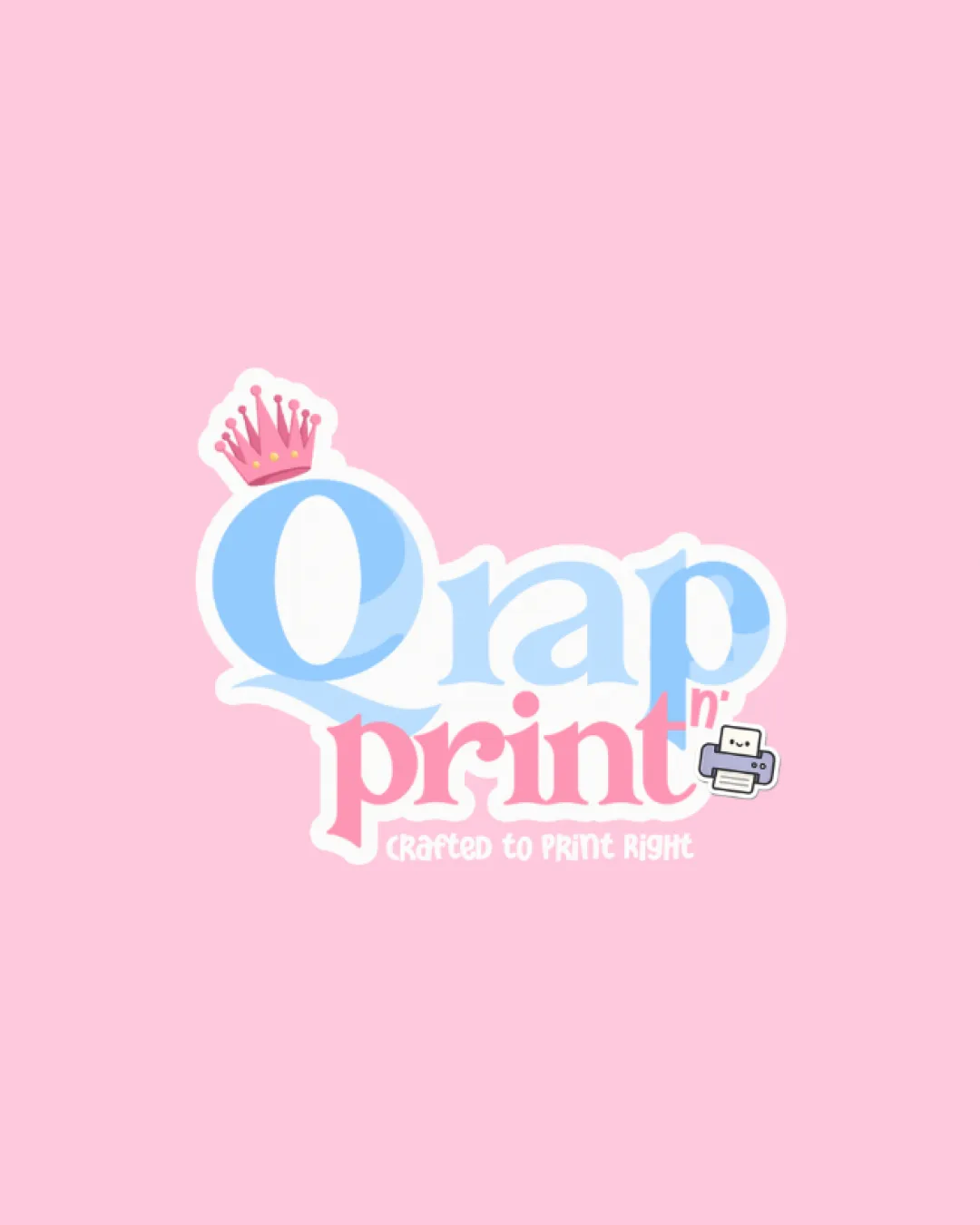
Logo review ofQrap N' Print Crafted To Print Right
Review the detailed scores below to see what is working and what should be refined first.
Legibility
Originality
Misread
Balance
Scale
Action plan
What to fix first
The most important fixes to handle before polishing the full presentation.
1
Fix possible misinterpretation
High priorityThe large 'Q' visually strongly resembles an 'O', leading the brand name to be easily misread as 'Orap', which could be problematic as it closely resembles a vulgar word ('crap').
Impact: High · Effort: Medium
Detailed review
Logo performance breakdown
Legibility
![]() Main text is large and uses contrasting colors against background
Main text is large and uses contrasting colors against background
![]() The large 'Q' can be misread as 'O', leading to a possible misinterpretation as 'Orap' or 'Qrap'.
The large 'Q' can be misread as 'O', leading to a possible misinterpretation as 'Orap' or 'Qrap'.![]() Busy mix of fonts and effects impairs instant readability, especially on smaller sizes.
Busy mix of fonts and effects impairs instant readability, especially on smaller sizes.![]() 'Crafted to Print Right' subtext is too small and low-contrast for clarity.
'Crafted to Print Right' subtext is too small and low-contrast for clarity.
Originality
![]() Use of crown and printer symbol attempt to tie to the printing theme in a whimsical way.
Use of crown and printer symbol attempt to tie to the printing theme in a whimsical way.
![]() Crown and printer are both widely used symbols for their respective industries, lacking a unique or clever twist.
Crown and printer are both widely used symbols for their respective industries, lacking a unique or clever twist.![]() Typography styling is generic and lacks distinctive customization.
Typography styling is generic and lacks distinctive customization.
Color harmony
![]() Soft pastels are visually harmonious and create a welcoming tone.
Soft pastels are visually harmonious and create a welcoming tone.
![]() Mix of light blue, pink, white, and gray; while not clashing, the pastel palette reduces contract and creates low legibility especially between text and background.
Mix of light blue, pink, white, and gray; while not clashing, the pastel palette reduces contract and creates low legibility especially between text and background.![]() Too many colors for versatility; converting to monochrome would result in significant detail loss.
Too many colors for versatility; converting to monochrome would result in significant detail loss.
Light Pink
#F8BBD0
Light Blue
#90CAF9
Pink
#F06292
White
#FFFFFF
Gray
#212121
Color may be holding this logo back. Explore stronger palette options with Colorfly.design before updating the logo.
Explore palettesBalance alignment
![]() Crown and printer icon attempt to balance top left and bottom right visually.
Crown and printer icon attempt to balance top left and bottom right visually.
![]() Crown on 'Q' creates top-heavy imbalance.
Crown on 'Q' creates top-heavy imbalance.![]() Uneven spacing between main words leads to a cluttered look.
Uneven spacing between main words leads to a cluttered look.![]() Subtext is not optically centered or aligned with main text.
Subtext is not optically centered or aligned with main text.

Scalability
![]() Logo design has a playful illustrative element suitable for larger print (packaging, signage).
Logo design has a playful illustrative element suitable for larger print (packaging, signage).
![]() Fine details in the crown and printer icon lose clarity at smaller scales.
Fine details in the crown and printer icon lose clarity at smaller scales.![]() Overlapping elements (crown, 'n', printer) make simplification for icons or monochrome printing difficult.
Overlapping elements (crown, 'n', printer) make simplification for icons or monochrome printing difficult.![]() Complex color transitions reduce effectiveness on business cards and embroidery.
Complex color transitions reduce effectiveness on business cards and embroidery.
200x250 px
100×125 px
50×62 px
Misinterpretations
![]() The large 'Q' visually strongly resembles an 'O', leading the brand name to be easily misread as 'Orap', which could be problematic as it closely resembles a vulgar word ('crap').
The large 'Q' visually strongly resembles an 'O', leading the brand name to be easily misread as 'Orap', which could be problematic as it closely resembles a vulgar word ('crap').![]() The playful style might undermine professionalism depending on print business target audience.
The playful style might undermine professionalism depending on print business target audience.
Symbol & text fit
![]() Symbol elements (crown, printer) are relevant to the printing theme.
Symbol elements (crown, printer) are relevant to the printing theme.
![]() Crown styling does not visually match the playful curve of the main font.
Crown styling does not visually match the playful curve of the main font.
![]() Printer icon feels disconnected from rest of the logo, using a different visual style.
Printer icon feels disconnected from rest of the logo, using a different visual style.
![]() 'n' placement is awkward and visually crowded by the printer icon.
'n' placement is awkward and visually crowded by the printer icon.
Try your own review
Review my logo
Wondering how your logo performs?
Get a clear logo score, key risks, and priority fix ideas before your client or audience sees it.
Keep exploring


