Wondering how your logo performs? 🧐
Get professional logo reviews in seconds and catch design issues in time.
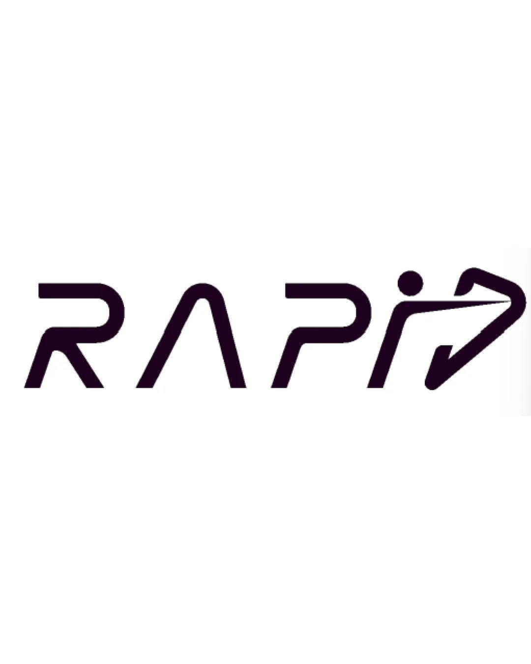
Try it Now!Logo review of RAPID
 Logo analysis by AI
Logo type:
Style:
Detected symbol:
Negative space:
Detected text:
Business industry:
Review requested by Marielizerichard
**If AI can recognize or misinterpret it, so can people.
Structured logo review
Legibility
![]() The word 'RAPID' is generally readable with a futuristic, distinct typeface.
The word 'RAPID' is generally readable with a futuristic, distinct typeface.![]() Stylized forms are uniform and visually cohesive.
Stylized forms are uniform and visually cohesive.
![]() The 'D' is unconventional and may be misread as a 'P' or 'O' by some viewers.
The 'D' is unconventional and may be misread as a 'P' or 'O' by some viewers.![]() The person-and-arrow symbol integrated into the 'D' complicates fast legibility at first glance.
The person-and-arrow symbol integrated into the 'D' complicates fast legibility at first glance.
Scalability versatility
![]() Clean lines and minimal detail will scale reasonably well for digital use and print.
Clean lines and minimal detail will scale reasonably well for digital use and print.![]() Would look good on delivery vans, mobile apps, or web banners.
Would look good on delivery vans, mobile apps, or web banners.
![]() Thin lines and gaps, especially in the 'D' with integrated symbol, may lose clarity at smaller sizes such as favicons or embroidery patches.
Thin lines and gaps, especially in the 'D' with integrated symbol, may lose clarity at smaller sizes such as favicons or embroidery patches.![]() The relatively light line weight risks disappearing on dark or busy backgrounds.
The relatively light line weight risks disappearing on dark or busy backgrounds.
200x250 px
100×125 px
50×62 px
Balance alignment
![]() The type is spaced consistently, and the left-to-right motion is reinforced by the arrow motif.
The type is spaced consistently, and the left-to-right motion is reinforced by the arrow motif.![]() All letters share similar stroke weight and geometry.
All letters share similar stroke weight and geometry.
![]() The person-arrow-heavy 'D' visually outweighs the rest of the logotype, creating a slight imbalance.
The person-arrow-heavy 'D' visually outweighs the rest of the logotype, creating a slight imbalance.

Originality
![]() The integration of a person symbol and arrow into the letterform is creative.
The integration of a person symbol and arrow into the letterform is creative.![]() The 'D' as an abstract representation of delivery speed is distinctive.
The 'D' as an abstract representation of delivery speed is distinctive.
![]() Arrows and running person motifs are somewhat common in delivery/service branding.
Arrows and running person motifs are somewhat common in delivery/service branding.
Aesthetic look
![]() Minimalistic and modern aesthetic is timely for tech and delivery brands.
Minimalistic and modern aesthetic is timely for tech and delivery brands.![]() Monochrome palette allows for flexibility with different applications.
Monochrome palette allows for flexibility with different applications.
![]() Sharp angles may feel mechanical and less approachable.
Sharp angles may feel mechanical and less approachable.![]() Abstract 'D' symbol may not suit more traditional or conservative industries.
Abstract 'D' symbol may not suit more traditional or conservative industries.
Dual meaning and misinterpretations
![]() No inappropriate or ambiguous symbols detected.
No inappropriate or ambiguous symbols detected.![]() Abstract human movement and arrow are clear in intent.
Abstract human movement and arrow are clear in intent.
Color harmony
![]() Monochrome black and white palette is harmonious and versatile.
Monochrome black and white palette is harmonious and versatile.![]() High contrast aids readability on most backgrounds.
High contrast aids readability on most backgrounds.
VeryDarkPurple
#1A1118
White
#FFFFFF


