Wondering how your logo performs? 🧐
Get professional logo reviews in seconds and catch design issues in time.
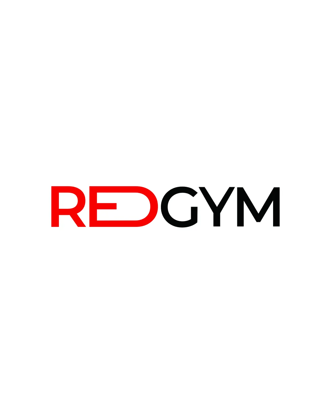
Try it Now!Logo review of RED GYM
 Logo analysis by AI
Logo type:
Style:
Detected text:
Business industry:
Review requested by MarwanDesign
**If AI can recognize or misinterpret it, so can people.
Structured logo review
Legibility
Text is bold and highly readable in both color and form.
Contrast between red and black is strong, aiding quick recognition.
The stylized 'E' in 'RED' may require a moment’s pause to read correctly, especially at a distance or small size.
Scalability versatility
Minimal design ensures the wordmark remains clear at medium to large sizes including signage and apparel.
Simple layout translates well to business cards, social media headers, and website banners.
The thin horizontal bar in the 'E' might be lost on very small applications such as favicons or embroidery.

200x250 px

100×125 px

50×62 px
Balance alignment
Overall alignment is clean and the transition from red to black provides a visual split that is balanced.
Letter height and spacing are consistent.
The 'RED' section feels visually heavier due to color and thickness, which could slightly overpower the 'GYM' segment.


Originality
Custom treatment of the 'E' in 'RED' introduces some unique character.
General wordmark approach and gym color palette are highly common in fitness branding, lacking a truly distinctive twist.
No use of negative space or iconography to add depth.
Aesthetic look
The color split creates a rhythm that is visually appealing.
Typography is modern, clean, and appropriate for the industry.
Aesthetic may appear a bit generic versus competitors using more dynamic or abstract logomarks.
Dual meaning and misinterpretations
No inappropriate or misleading shapes detected.
Color harmony
Color scheme is simple with high contrast.
Red and black pairing is effective for the target industry.
Red
#FF0000
Black
#000000
White
#FFFFFF

