Wondering how your logo performs? 🧐
Get professional logo reviews in seconds and catch design issues in time.
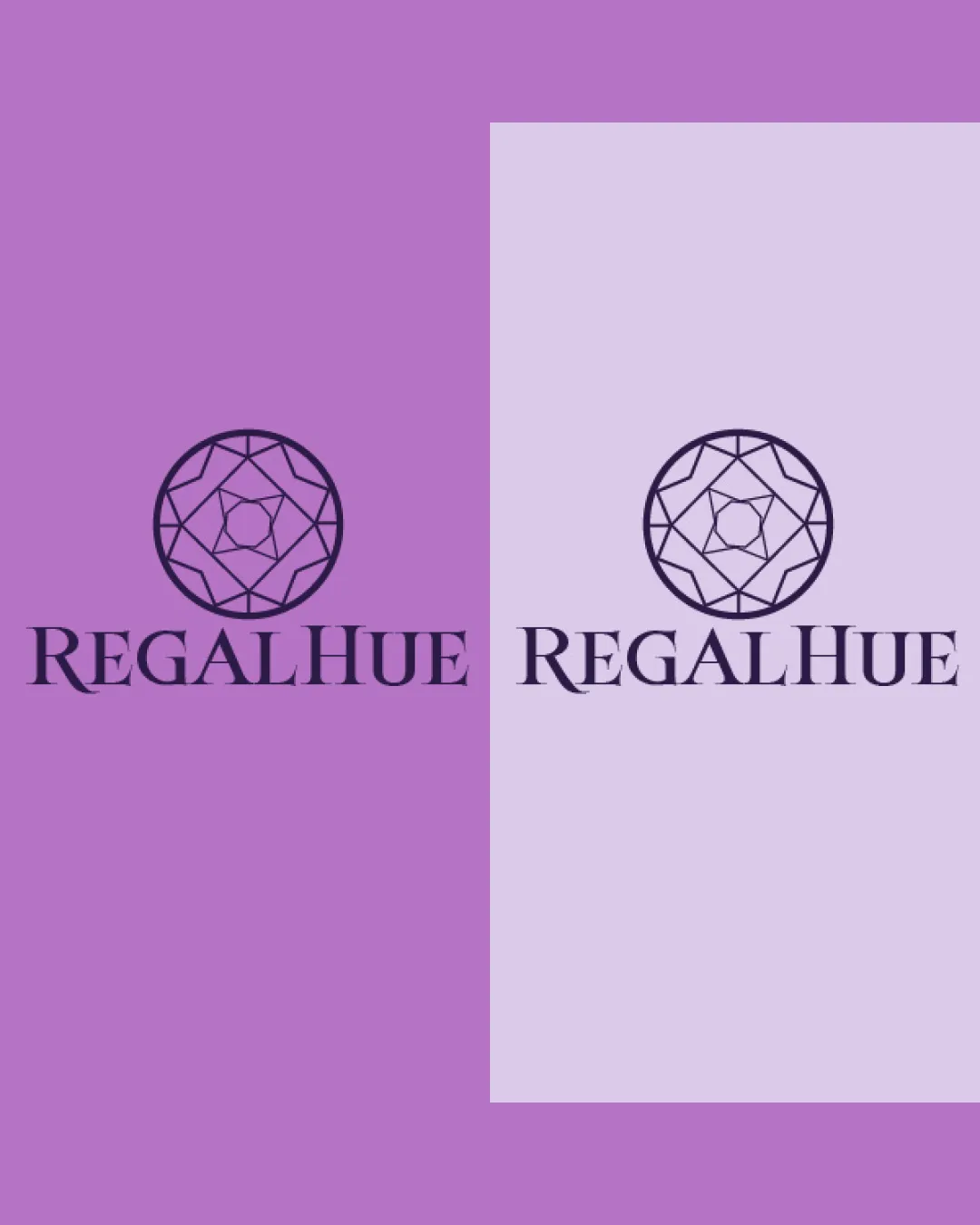
Try it Now!Logo review of REGALHUE
 Logo analysis by AI
Logo type:
Style:
Detected symbol:
Detected text:
Business industry:
Review requested by Anoo
**If AI can recognize or misinterpret it, so can people.
Structured logo review
Legibility
![]() Typography is crisp, highly readable, and nicely spaced.
Typography is crisp, highly readable, and nicely spaced.![]() All letters are clear, with distinguished contrast.
All letters are clear, with distinguished contrast.
Scalability versatility
![]() The geometric symbol is fairly simple and should scale well for business cards, packaging, and jewelry tags.
The geometric symbol is fairly simple and should scale well for business cards, packaging, and jewelry tags.![]() Text remains readable in smaller applications.
Text remains readable in smaller applications.
![]() Thin lines within the diamond illustration might be lost or blurred at tiny sizes, such as on a favicon or embroidery.
Thin lines within the diamond illustration might be lost or blurred at tiny sizes, such as on a favicon or embroidery.
200x250 px
100×125 px
50×62 px
Balance alignment
![]() The logomark sits centrally above the wordmark, establishing clear visual hierarchy.
The logomark sits centrally above the wordmark, establishing clear visual hierarchy.![]() Overall symmetry is consistent.
Overall symmetry is consistent.
![]() The geometric symbol's internal line complexity creates slight visual heaviness compared to the clean type, which could disrupt subtle balance.
The geometric symbol's internal line complexity creates slight visual heaviness compared to the clean type, which could disrupt subtle balance.

Originality
![]() Geometric gemstone rendering suggests luxury and quality relevant to the jewelry sector.
Geometric gemstone rendering suggests luxury and quality relevant to the jewelry sector.![]() Elegant type choice stands out over more generic sans-serif alternatives.
Elegant type choice stands out over more generic sans-serif alternatives.
![]() Diamond/geometric gem icons are highly overused in the jewelry industry, making the symbol feel somewhat generic.
Diamond/geometric gem icons are highly overused in the jewelry industry, making the symbol feel somewhat generic.![]() No particularly unique take on the diamond or distinctive negative space usage.
No particularly unique take on the diamond or distinctive negative space usage.
Logomark wordmark fit
![]() The elegant, regal typeface matches the sophistication of the geometric diamond symbol.
The elegant, regal typeface matches the sophistication of the geometric diamond symbol.![]() Color and weight harmonize well with each other.
Color and weight harmonize well with each other.
Aesthetic look
![]() Clean, sleek layout with a professional, high-end feel.
Clean, sleek layout with a professional, high-end feel.![]() Harmonious combination of type and mark.
Harmonious combination of type and mark.
![]() Could benefit from a touch more personality or modern twist to move away from a stereotypical jewelry logo look.
Could benefit from a touch more personality or modern twist to move away from a stereotypical jewelry logo look.
Dual meaning and misinterpretations
![]() No inappropriate shapes or unintended readings present.
No inappropriate shapes or unintended readings present.
Color harmony
![]() Sophisticated monochromatic palette enhances the regal theme.
Sophisticated monochromatic palette enhances the regal theme.![]() High contrast between mark and backgrounds.
High contrast between mark and backgrounds.
Lilac
#A962C6
Lavender
#E3C9F7
Purple
#241C3D


