 View review
Logo score
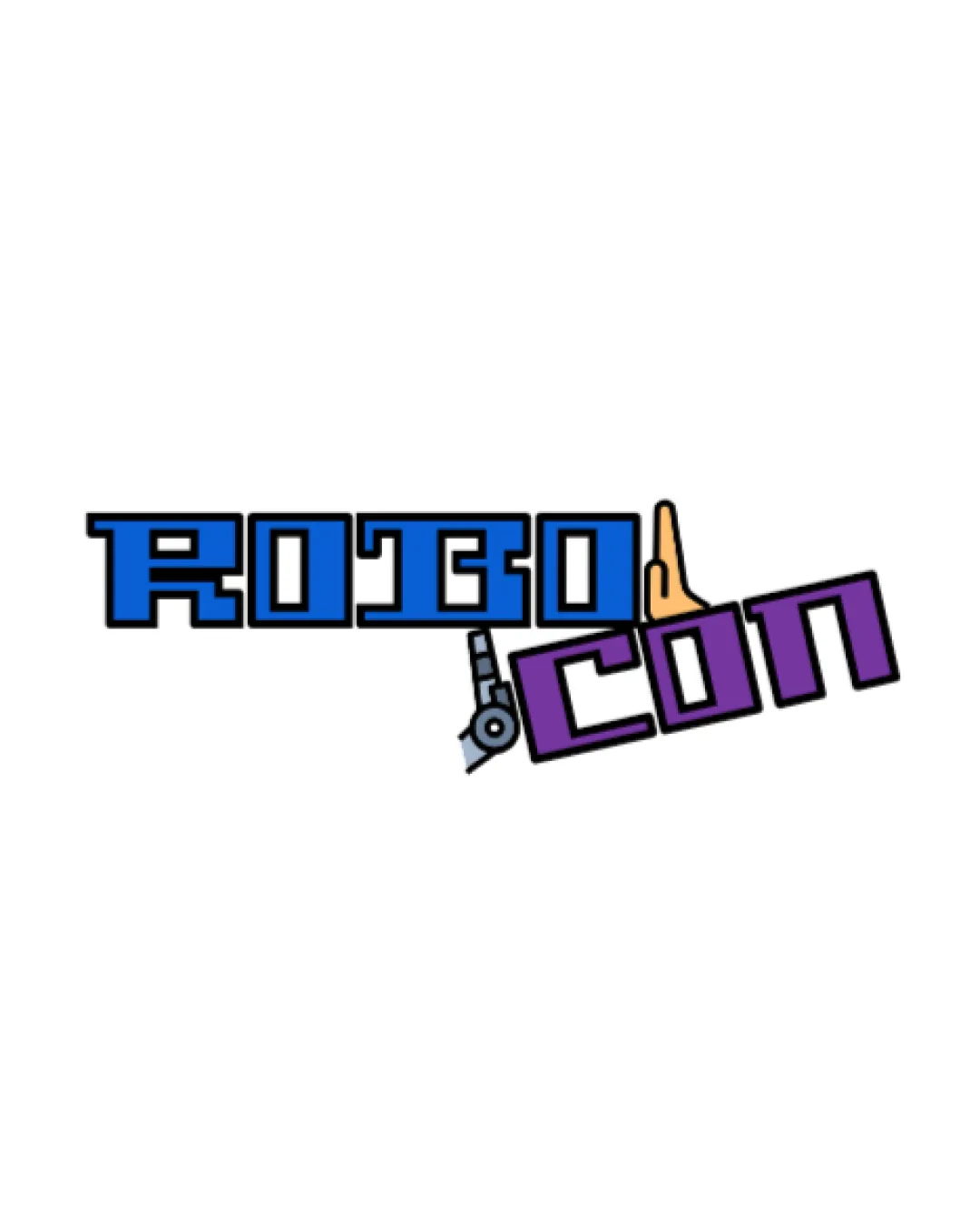
Logo review ofRobo Con
Review the detailed scores below to see what is working and what should be refined first.
Legibility
Originality
Misread
Balance
Scale
Detailed review
Logo performance breakdown
Legibility
![]() Text is clear and easy to read.
Text is clear and easy to read.![]() Font choice complements the robotic theme.
Font choice complements the robotic theme.
![]() Tilted 'CON' might affect readability slightly at smaller sizes.
Tilted 'CON' might affect readability slightly at smaller sizes.
Originality
![]() Unique integration of robotics theme.
Unique integration of robotics theme.![]() Creative use of symbolic elements.
Creative use of symbolic elements.
![]() Elements could be considered slightly generic in robotics industry.
Elements could be considered slightly generic in robotics industry.
Color harmony
![]() Colors work well together and highlight different parts of the logo.
Colors work well together and highlight different parts of the logo.
![]() High contrast may not be suitable for all backgrounds.
High contrast may not be suitable for all backgrounds.
Matisse
#1E5AA8
Affair
#935C9A
TexasRose
#FFBE50
Your palette is close. Explore sharper color combinations with Colorfly.design before updating the logo.
Explore palettesBalance alignment
![]() Symmetrical layout between 'ROBO' and 'CON'.
Symmetrical layout between 'ROBO' and 'CON'.
![]() Tilted 'CON' disrupts balance and alignment.
Tilted 'CON' disrupts balance and alignment.

Scalability
![]() Simple shapes ensure clarity in larger formats.
Simple shapes ensure clarity in larger formats.
![]() May lose detail of robotic elements when scaled down.
May lose detail of robotic elements when scaled down.![]() Complex elements might not translate well to embroidery or small prints.
Complex elements might not translate well to embroidery or small prints.
200x250 px
100×125 px
50×62 px
Misinterpretations
![]() No inappropriate or misleading symbols.
No inappropriate or misleading symbols.
Try your own review
Review my logo
Wondering how your logo performs?
Get a clear logo score, key risks, and priority fix ideas before your client or audience sees it.
Keep exploring


