Wondering how your logo performs? 🧐
Get professional logo reviews in seconds and catch design issues in time.
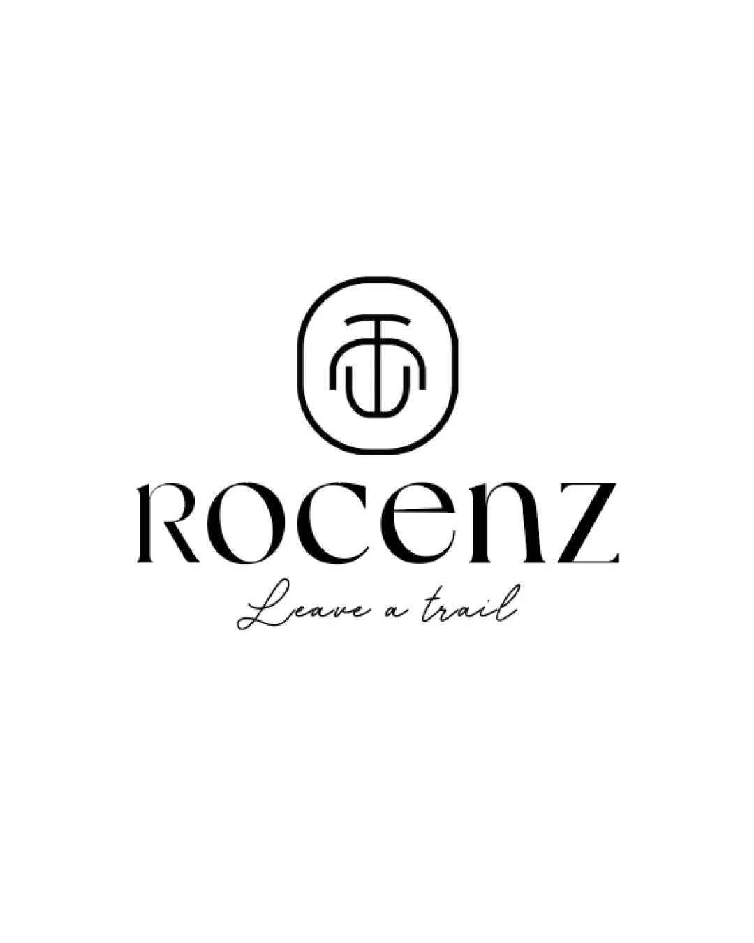
Try it Now!Logo review of ROCENZ, Leave a trail
 Logo analysis by AI
Logo type:
Style:
Detected symbol:
Negative space:
Detected text:
Business industry:
Review requested by 25hk210
**If AI can recognize or misinterpret it, so can people.
Structured logo review
Legibility
![]() ROCENZ wordmark is readable with high contrast against the background.
ROCENZ wordmark is readable with high contrast against the background.![]() Tagline is legible and adds an elegant, complementary touch below.
Tagline is legible and adds an elegant, complementary touch below.
![]() The stylized 'z' may be slightly ambiguous, especially at smaller sizes or from a distance.
The stylized 'z' may be slightly ambiguous, especially at smaller sizes or from a distance.![]() Script font for the tagline is thin and could lose clarity at small scales.
Script font for the tagline is thin and could lose clarity at small scales.
Scalability versatility
![]() Minimalist design allows for some scalability.
Minimalist design allows for some scalability.![]() Single color treatment is versatile for multiple applications such as print, web, and simple merchandise.
Single color treatment is versatile for multiple applications such as print, web, and simple merchandise.
![]() Script tagline will not reproduce well when the logo is scaled down (e.g., as a small app icon or embroidery).
Script tagline will not reproduce well when the logo is scaled down (e.g., as a small app icon or embroidery).![]() Thin lines in the logomark may be lost or appear broken at very small sizes.
Thin lines in the logomark may be lost or appear broken at very small sizes.
200x250 px
100×125 px
50×62 px
Balance alignment
![]() Good central alignment between logomark, wordmark, and tagline.
Good central alignment between logomark, wordmark, and tagline.![]() Symmetry in the monogram provides visual balance.
Symmetry in the monogram provides visual balance.
![]() Minor imbalance with large negative space between logomark and wordmark compared to the tagline spacing.
Minor imbalance with large negative space between logomark and wordmark compared to the tagline spacing.![]() The tagline feels slightly detached from the main body due to different styles and weights.
The tagline feels slightly detached from the main body due to different styles and weights.

Originality
![]() Unique monogram with creative integration of T and C.
Unique monogram with creative integration of T and C.![]() Elegant custom wordmark stands out from generic sans or serif fonts.
Elegant custom wordmark stands out from generic sans or serif fonts.
![]() Circular monogram is a commonly used technique in the fashion industry.
Circular monogram is a commonly used technique in the fashion industry.![]() The style, while elegant, does not drastically break new ground.
The style, while elegant, does not drastically break new ground.
Logomark wordmark fit
![]() Styling between logomark and wordmark is harmonious—both are modern and clean.
Styling between logomark and wordmark is harmonious—both are modern and clean.![]() Logomark scale feels appropriate relative to the wordmark.
Logomark scale feels appropriate relative to the wordmark.
![]() The script tagline introduces a different style that slightly clashes with the geometric sans-serif tone of the logomark and wordmark.
The script tagline introduces a different style that slightly clashes with the geometric sans-serif tone of the logomark and wordmark.
Aesthetic look
![]() Overall modern and elegant visual language.
Overall modern and elegant visual language.![]() Minimalist and stylish, suitable for the fashion industry.
Minimalist and stylish, suitable for the fashion industry.
![]() The monogram may appear generic if not supported by other branding elements.
The monogram may appear generic if not supported by other branding elements.![]() Combination of strong geometric forms and a cursive tagline slightly disrupts visual cohesion.
Combination of strong geometric forms and a cursive tagline slightly disrupts visual cohesion.
Dual meaning and misinterpretations
![]() No unintended negative or inappropriate symbolism is present.
No unintended negative or inappropriate symbolism is present.![]() Monogram is abstract but stays within safe, professional territory.
Monogram is abstract but stays within safe, professional territory.
Color harmony
![]() Clean black and white palette offers strong contrast and classic appeal.
Clean black and white palette offers strong contrast and classic appeal.![]() Simple color scheme increases adaptability for various mediums.
Simple color scheme increases adaptability for various mediums.
Black
#000000
White
#FFFFFF


