Wondering how your logo performs? 🧐
Get professional logo reviews in seconds and catch design issues in time.
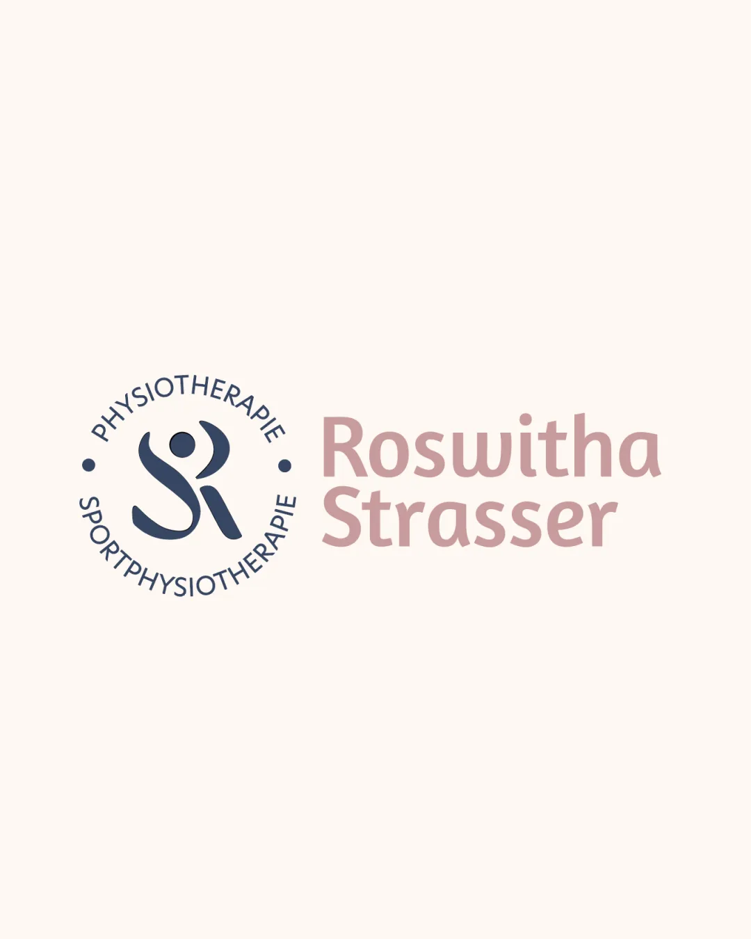
Try it Now!Logo review of Roswitha Strasser, Physiotherapie, Sportphysiother..
 Logo analysis by AI
Logo type:
Style:
Detected symbol:
Negative space:
Detected text:
Business industry:
Review requested by GDNB
**If AI can recognize or misinterpret it, so can people.
Structured logo review
Legibility
![]() Wordmark is clear and easy to read, with good spacing between letters.
Wordmark is clear and easy to read, with good spacing between letters.![]() Secondary text encircling the monogram is legible and not cluttered.
Secondary text encircling the monogram is legible and not cluttered.
Scalability versatility
![]() Clean lines allow clear reproduction at most sizes.
Clean lines allow clear reproduction at most sizes.![]() Simplified human figure avoids thin lines or tiny details.
Simplified human figure avoids thin lines or tiny details.![]() Works well on signage, business cards, and digital formats.
Works well on signage, business cards, and digital formats.
![]() Circular text may become harder to read at very small sizes (e.g., favicons, embroidery).
Circular text may become harder to read at very small sizes (e.g., favicons, embroidery).![]() Color contrast may be lost on monochrome or non-light backgrounds.
Color contrast may be lost on monochrome or non-light backgrounds.
200x250 px
100×125 px
50×62 px
Balance alignment
![]() Good visual balance between symbol and wordmark.
Good visual balance between symbol and wordmark.![]() Circular text is well-proportioned with inner monogram.
Circular text is well-proportioned with inner monogram.
![]() Circular logomark and blocky wordmark layouts could create perceived imbalance on certain banners or merchandise.
Circular logomark and blocky wordmark layouts could create perceived imbalance on certain banners or merchandise.

Originality
![]() Stylized merging of 'S' and 'R' into a human figure is creative and relevant to the field.
Stylized merging of 'S' and 'R' into a human figure is creative and relevant to the field.![]() Subtle use of negative space.
Subtle use of negative space.
![]() Combination of initials into human shapes is somewhat common in healthcare branding—noticeable but not groundbreaking.
Combination of initials into human shapes is somewhat common in healthcare branding—noticeable but not groundbreaking.
Logomark wordmark fit
![]() Stylistic harmony between the curved monogram and the rounded sans-serif wordmark.
Stylistic harmony between the curved monogram and the rounded sans-serif wordmark.![]() Color palette ties both elements together.
Color palette ties both elements together.
Aesthetic look
![]() Modern, friendly, and trustworthy aesthetic.
Modern, friendly, and trustworthy aesthetic.![]() Subdued colors are calming and professional.
Subdued colors are calming and professional.
![]() Layout is safe and conventional; could push the boundary more for a unique presence.
Layout is safe and conventional; could push the boundary more for a unique presence.
Dual meaning and misinterpretations
![]() Human figure is clear and does not resemble inappropriate symbols.
Human figure is clear and does not resemble inappropriate symbols.
Color harmony
![]() Muted color scheme matches industry tone and is visually cohesive.
Muted color scheme matches industry tone and is visually cohesive.![]() Excellent contrast with a light background.
Excellent contrast with a light background.
East Bay
#374551
Careys Pink
#C6AAA6
Soft Beige
#F8F3EE


